
- 1[react] react的虚拟DOM和vue的虚拟DOM有什么区别?_vue虚拟dom和react虚拟dom什么区别
- 2VSCode C/C++ 编译调试_vs code 编译调试c++
- 3Spring Boot全局异常处理_springboot全局异常处理
- 4RabbitMQ_rbootmq\
- 5flask框架简单web服务真实项目实践_flask web开发实战
- 6Git 分布式版本控制工具 1 概述
- 7Codeforces Round #704 (Div. 2) A-E题解
- 8S5P6818教学实验箱_嵌入式系统_Cortex-A53:TL6818-PlusTEB_s5p6818 可以做哪些项目
- 9linux php环境搭建_实操PHP测试环境搭建
- 10adb 拉取指定的文件_adb pull 指定后缀
CSS3整理(2)
赞
踩
1.web字体
基本用法
可以通过@font-face指定字体的具体地址,浏览器会自动下载该字体,这样就不会依赖用户电脑上的字体
简写方式:
 @font-face {
            font-family: "情书字体";
            src: url("./font1/方正手迹.ttf");
        }
        .font1 {
            font-family: "情书字体";
        }
- 1
- 2
- 3
- 4
- 5
- 6
- 7
高兼容性写法:
        @font-face {
            font-family: "任齐石";
            font-display: swap;
            src: url('./font2/webfont.eot'); /* IE9 */
            src: url('./font2/webfont.eot?#iefix') format('embedded-opentype'), /* IE6-IE8 */
                url('./font2/webfont.woff2') format('woff2'),
                url('./font2/webfont.woff') format('woff'), /* chrome、firefox */
                url('./font2/webfont.ttf') format('truetype'), /* chrome、firefox、opera、Safari, Android, iOS 4.2+*/
                url('./font2/webfont.svg#webfont') format('svg'); /* iOS 4.1- */
        }
        .font2 {
            font-family: "任齐石";
            font-size: 2em;
        }
- 1
- 2
- 3
- 4
- 5
- 6
- 7
- 8
- 9
- 10
- 11
- 12
- 13
- 14
定制字体
中文的字体文件很大,使用完整的字体文件不现时,通常针对某几个文字进行单独定制
阿里web字体定制工具:https://www.iconfont.cn/webfont
字体图标
相比图片更加清晰
灵活性更高,更方便改变颜色大小风格等
兼容性好。ie也能支持
阿里图标官网地址:
https://www.iconfont.cn/
2.2D变换
2D位移:transform: translate(50px,50px)
2D位移可以改变元素的位置
位移对行内元素无效
       .outer {
            width: 200px;
            height: 200px;
            border: 2px solid black;
            margin: 0 auto;
            position: relative;
        }
        .inner1 {
            width: 200px;
            height: 200px;
            background-color: skyblue;

            /* 水平位移 */
            transform: translateX(100px);

            /* 垂直位移 */
            /* transform: translateY(100px); */

            /* 水平+垂直位移 */
            /* transform: translate(50px,50px); */
        }

- 1
- 2
- 3
- 4
- 5
- 6
- 7
- 8
- 9
- 10
- 11
- 12
- 13
- 14
- 15
- 16
- 17
- 18
- 19
- 20
- 21
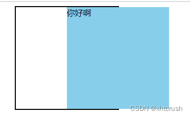
位移配合定位可以实现元素水平垂直居中
      .inner2 {
            width: 60px;
            height: 60px;
            background-color: orange;
            position: absolute;
            left: 50%;
            top: 50%;
            transform: translate(-50%,-50%);
        }
- 1
- 2
- 3
- 4
- 5
- 6
- 7
- 8
- 9
2D缩放:transform: scaleX(0.5) scaleY(0.5);
让元素放大或缩小
scaleX:设置水平方向的缩放比例,1表示不缩放,大于1放大,小于1缩小
scaleY:设置垂直方向的缩放比例,1表示不缩放,大于1放大,小于1缩小
scale:一个值表示水平和垂直方向同时设置缩放,两个值分别代表:水平缩放,垂直缩放
.inner {
            width: 200px;
            height: 200px;
            background-color: skyblue;
            transform: scale(0.5);
            /* transform: scaleX(0.5) scaleY(0.5); */
            /* transform: scaleY(0.5); */
        }
- 1
- 2
- 3
- 4
- 5
- 6
- 7
- 8
2D旋转:transform: rotateZ(-30deg);
让元素在二维平面内顺时针或逆时针旋转
在二维平面rotatedZ和rotate一样
角度值deg,正值顺时针,负值逆时针
       .inner {
            width: 200px;
            height: 200px;
            background-color: skyblue;

            transform: rotateZ(-30deg);

            /* transform: rotate(-30deg); */
        }
- 1
- 2
- 3
- 4
- 5
- 6
- 7
- 8
- 9
扭曲: transform: skew(30deg,30deg);
.inner {
            width: 200px;
            height: 200px;
            background-color: skyblue;
            transform: skewX(30deg);
            transform: skewY(30deg);
            transform: skew(30deg,30deg);
        }
- 1
- 2
- 3
- 4
- 5
- 6
- 7
- 8
多重变换
多个变换可以同时使用一个transform来编写=
 .inner {
            width: 200px;
            height: 200px;
            background-color: skyblue;
            transform: translate(100px,100px) rotate(30deg);
        }
- 1
- 2
- 3
- 4
- 5
- 6
变换原点:transform-origin
元素变换时,默认的原点是元素的中心,使用transform-origin可以设置变换原点
       .inner {
            width: 200px;
            height: 200px;
            background-color: skyblue;
            /* 通过关键词调整变换原点 */
            /* transform-origin: left top; */

            /* 通过具体像素值调整变换原点 */
            /* transform-origin: 50px 50px; */

            /* 通过百分比调整变换原点 */
            /* transform-origin: 25% 25%; */

            /* 只给一个值  */
            /* transform-origin: left; */

            transform-origin: left top;

            /* 变换原点对旋转,缩放有影响 */
            /* transform: rotate(60deg); */
            transform: scale(0.5);
        }
- 1
- 2
- 3
- 4
- 5
- 6
- 7
- 8
- 9
- 10
- 11
- 12
- 13
- 14
- 15
- 16
- 17
- 18
- 19
- 20
- 21
- 22
3.3D变换
开启3D空间与设置景深
重要原则:元素进行3D变换父元素必须开启3D空间
使用transform-style开启3D空间
flat:让子元素位于此元素的二维平面内(2D空间默认值)
preserve-3d:让子元素位于此元素的三维平面内(3D空间)
景深:perspective(none:不指定透视默认值)
指观察者与z=0平面的距离,能让发生3D变换的元素产生透视效果,看起来更加立体
            margin-top: 100px;
            /* 开启3D空间 */
            transform-style: preserve-3d;
            /* 设置景深(有了透视效果,近大远小) */
            perspective: 500px;
- 1
- 2
- 3
- 4
- 5
透视点的位置:perspective-origin
设置观察者的位置(通常不需要调整透视点的位置)
            /* 设置透视点的位置 */
            perspective-origin: 102px 102px;
- 1
- 2
3D位移:transform: translate3d(50%,50%,100px);
在2D的基础上让元素可以沿着Z轴位移
transform: translate3d(50%,50%,100px);
第一个参数对应X轴,第二个参数对应Y轴,第三个参数对应Z轴
           .inner {
            width: 200px;
            height: 200px;
            background-color: skyblue;
            /* transform: translateZ(200px); */
            transform: translate3d(50%,50%,100px);
        }
- 1
- 2
- 3
- 4
- 5
- 6
- 7
3D旋转:transform: rotate3d(0,0,0,30deg);
在2D的基础上,让元素可以沿着X轴和Y轴旋转
角度:(deg)正顺负逆
transform: rotate3d(0,0,0,30deg);
前三个分别表示X,Y,Z轴,最后一个表示旋转的角度(这四个参数都不能省略)
       .inner {
            width: 200px;
            height: 200px;
            background-color: skyblue;
            /* transform: rotateX(0deg); */
            /* transform: rotateY(0deg); */
            transform: rotate3d(0,0,0,30deg);
        }
- 1
- 2
- 3
- 4
- 5
- 6
- 7
- 8
3D缩放:transform: scale3d(1,1,1) ;
在2D的基础上,让元素沿着Z轴缩放
 .inner {
            width: 200px;
            height: 200px;
            background-color: skyblue;
            /* transform: scaleZ(4) rotateY(30deg); */
            transform: scale3d(1,1,1) rotateY(30deg);
        }
- 1
- 2
- 3
- 4
- 5
- 6
- 7
多重变换
        .inner {
            width: 200px;
            height: 200px;
            background-color: skyblue;
            /* transform-origin: 202px 50px; */
            /* transform: rotateX(-45deg); */
            transform: translateZ(100px) scaleZ(3) rotateY(45deg);
        }
- 1
- 2
- 3
- 4
- 5
- 6
- 7
- 8
4.过渡:transition
基本使用
设置哪个属性需要过渡效果:
transition-property: weight,height;
设置过渡时间 :(也可以设置一个,让所有人都用)
transition-duration: 1s,5s;
       .box1 {
            width: 200px;
            height: 200px;
            background-color: rgb(11, 143, 183);
            opacity: 0.5;
            /* 设置哪个属性需要过渡效果 */
            transition-property: width,height,background-color;

            /* 让所有能过渡的属性都过渡 */
            transition-property: all;

            /* 分别设置过渡时间 */
            transition-duration: 1s,5s;

             /* 设置一个过渡时间,所有人都用 */
             transition-duration: 1s;

        }
- 1
- 2
- 3
- 4
- 5
- 6
- 7
- 8
- 9
- 10
- 11
- 12
- 13
- 14
- 15
- 16
- 17
- 18
transition-delay:指定开始过渡的延迟时间
单位是:s 或 ms
transition-timing-function:设置过渡的类型
ease:平缓过度(默认值)
linear:线性过渡
ease-in:慢——快
ease-out:快——慢
ease-in-out:慢——快——慢
step-start:等同于step(1,start)
step-end:等同于step(1,end)
steps(20,start):第一个参数必须为正整数指定函数的步数,第二个取值可以是start或end,指定每一步的值发生变化的时间点,第二个参数默认值是end
cubic-bezier(.83,.86,.95,1.32):特定的贝塞尔曲线类型
贝赛尔曲线
https://cubic-bezier.com
.box1 {
            background-color: rgb(99, 99, 203);
            transition-timing-function: ease;
        }
        .box2 {
            background-color: rgb(212, 45, 148);
            transition-timing-function: linear;
        }
        .box3 {
            background-color: rgb(246, 152, 38);
            transition-timing-function: ease-in;
        }
        .box4 {
            background-color: rgb(210, 48, 48);
            transition-timing-function: ease-out;
        }
- 1
- 2
- 3
- 4
- 5
- 6
- 7
- 8
- 9
- 10
- 11
- 12
- 13
- 14
- 15
- 16
transition复合属性
过渡时间,过渡属性,延迟时间,过渡类型
transition: 5s all 0.5s linear;
- 1
5.动画
动画的基本使用
第一步:定义关键帧
简单定义方式:
/* 定义一个动画(定义一组关键帧)——第一种方式 */
        @keyframes wangyoudong{
            /* 第一帧 */
            from {

            }
            /* 最后一帧 */
            to {
                transform: translate(800px);
                background-color: blue;
            }
        }
- 1
- 2
- 3
- 4
- 5
- 6
- 7
- 8
- 9
- 10
- 11
- 12
完整定义方式:
/* 定义一个动画(定义一组关键帧)——第二种方式 */
         @keyframes wangyoudong2{
            /* 第一帧 */
            0% {

            }
            20% {
                background-color: aquamarine;
            }
            40% {
                background-color: rgb(41, 114, 178);
            }
            60% {
                background-color: rgb(230, 232, 95);
            }
            80% {
                background-color: rgb(107, 220, 90);
            }
            /* 最后一帧 */
            100% {
                transform: translate(800px) rotate(360deg);
                background-color: rgb(142, 28, 181);
                border-radius: 50%;
            }
        }
- 1
- 2
- 3
- 4
- 5
- 6
- 7
- 8
- 9
- 10
- 11
- 12
- 13
- 14
- 15
- 16
- 17
- 18
- 19
- 20
- 21
- 22
- 23
- 24
- 25
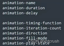
第二步:给元素应用动画
animation-name:给元素指定具体的动画(具体的关键帧)
animation-duration:设置动画持续时间
animation-delay:设置动画延迟时间
      .inner {
            width: 100px;
            height: 100px;
            background-color: plum;
            /* 应用动画到元素 */
            animation-name: wangyoudong2;
            /* 动画持续时间 */
            animation-duration: 3s;
            /* 动画延迟时间 */
            animation-delay: 0.2s;
        }
- 1
- 2
- 3
- 4
- 5
- 6
- 7
- 8
- 9
- 10
- 11
动画的其他属性
animation-timing-function:设置动画的类型(与过渡类型一样)
animation-iteration-count:指定动画的播放次数(number:动画循环次数,infinite:无限循环)
animation-direction:设置动画的方向(normal:正常方向(默认),reverse:反方向运行,alternate:动画先正常运行再反向运行,并持续交替运行,alternat-reverse:动画先反向运行再正方向运行,并持续交替运行)
animation-fill-mode: 动画以外的状态(不发生动画的时候在哪里),forwards:设置对象状态为动画结束时的状态,backwards:设置对象状态为动画开始时的状态
animation-play-state: 动画播放状态(running:运动(默认值),paused:暂停)这个属性一般单独使用
           /* 设置动画的方式,类型 */
            animation-timing-function: linear;

            /* 动画播放的次数 */
            animation-iteration-count: infinite;

            /* 动画的方向 */
            animation-direction: alternate;

            /* 动画以外的状态(不发生动画的时候在哪里) */
            /* animation-fill-mode: forwards; */
- 1
- 2
- 3
- 4
- 5
- 6
- 7
- 8
- 9
- 10
- 11
 .outer:hover .inner {
            /* 动画播放状态 */
            animation-play-state: paused;
        }
- 1
- 2
- 3
- 4
动画的复合属性
只设置一个时间表示:duration,设置两个时间分别为:duration和delay,其他属性没有数量和顺序要求
 .inner {
            width: 100px;
            height: 100px;
            background-color: rgb(74, 51, 229);
            animation: wangyoudong 1s 0.2s linear infinite alternate forwards ;
        }
- 1
- 2
- 3
- 4
- 5
- 6
6.多列布局
        .outer {
            width: 900px;
            margin: 0 auto;

            /* 直接指定列数,值是数字 */
            /* column-count: 3; */

            /* 指定每列的宽度,值是长度,会自动计算列数 */
            /* column-width: 250px; */

            /* 复合属性,能同时指定列宽和列数(不推荐使用) */
            columns: 4;

            /* 调整列间距 */
            column-gap: 20px;

            /* 每一列边框宽度(列与列之间的边框宽度) */
            /* column-rule-width: 2px; */

            /* 每一列边框风格 */
            /* column-rule-style: dashed; */

            /* 每一列边框颜色 */
            /* column-rule-color: red; */

            /* 边框相关的复合属性 */
            column-rule: 2px dashed red;

        }
- 1
- 2
- 3
- 4
- 5
- 6
- 7
- 8
- 9
- 10
- 11
- 12
- 13
- 14
- 15
- 16
- 17
- 18
- 19
- 20
- 21
- 22
- 23
- 24
- 25
- 26
- 27
- 28
- 29
- 30
column-span:指定是否跨列,值:none,all
 h1 {
            column-span: all;
            text-align: center;
            font-size: 50px;
        }
- 1
- 2
- 3
- 4
- 5
7.伸缩盒模型
伸缩容器,伸缩项目
伸缩容器:开启了flex的元素,就是伸缩容器
给元素设置:display: flex 或 display: inline-flex(很少使用),该元素就变为了伸缩容器
一个元素可以同时是伸缩容器和伸缩项目
伸缩项目:伸缩容器所以子元素自动成为了伸缩项目(仅伸缩容器的子元素)
无论原来是哪种元素(块,行内块,行内),一旦成为了伸缩项目都会”块状化“
主轴与侧轴
主轴:伸缩方向沿着主轴排列,主轴默认是水平的,默认方向是:从左到右(左边是起点,右边是终点)
侧轴:与主轴垂直的就是侧轴,侧轴默认是垂直的,默认方向是:从上到下(上边是起点,下边是终点)
主轴方向:flex-direction
       .outer {
            width: 900px;
            height: 600px;
            background-color: #888;
            margin: 0 auto;

            /* 伸缩盒相关属性 */

            /* 将该元素变为了伸缩容器(开启了flex布局) */
            display: flex;

            /* 调整主轴方向:水平从左到右(默认) */
            /* flex-direction: row; */

            /* 调整主轴方向:水平从右到左 */
            /* flex-direction: row-reverse; */

            /* 调整主轴方向: 垂直从上到下*/
            /* flex-direction: column; */

            /* 调整主轴方向:垂直从下到上 */
            flex-direction: column-reverse;
        }
- 1
- 2
- 3
- 4
- 5
- 6
- 7
- 8
- 9
- 10
- 11
- 12
- 13
- 14
- 15
- 16
- 17
- 18
- 19
- 20
- 21
- 22
- 23
主轴换行方式:flex-wrap
       .outer {
            width: 1000px;
            height: 600px;
            background-color: #888;
            margin: 0 auto;

            /* 伸缩盒相关属性 */

            /* 将该元素变为了伸缩容器(开启了flex布局) */
            display: flex;

            /* 调整主轴方向:水平从左到右(默认) */
            flex-direction: row;

            /* 主轴换行方式:不换行(默认值) */
            /* flex-wrap: nowrap; */

             /* 主轴换行方式:换行 */
             /* flex-wrap: wrap; */

              /* 主轴换行方式:反向换行 */
            flex-wrap: wrap-reverse;

        }
- 1
- 2
- 3
- 4
- 5
- 6
- 7
- 8
- 9
- 10
- 11
- 12
- 13
- 14
- 15
- 16
- 17
- 18
- 19
- 20
- 21
- 22
- 23
- 24
复合属性:flex-flow
复合:flex-direction和flex-wrap
 /* 复合属性(不建议使用) */
             flex-flow: row wrap;
- 1
- 2
- 3
主轴对齐方式:justify-content
             /* 主轴对齐方式:主轴起始位置(默认) */
             /* justify-content: flex-start; */

             /* 主轴对齐方式:中间对齐 */
             /* justify-content: center; */

              /* 主轴对齐方式:主轴结束位置 */
              /* justify-content: flex-end; */

               /* 主轴对齐方式:项目均匀的分布在一行,且项目与项目之间的距离是项目距边缘的两倍 */
             /* justify-content: space-around; */

              /* 主轴对齐方式:项目均匀的分布在一行,且项目与项目之间的距离相等,与边缘没有距离 */
              /* justify-content: space-between; */

               /* 主轴对齐方式:项目均匀分布在一行 */
             justify-content: space-evenly;
- 1
- 2
- 3
- 4
- 5
- 6
- 7
- 8
- 9
- 10
- 11
- 12
- 13
- 14
- 15
- 16
- 17
侧轴对齐方式
只有一行的情况:align-items
 /* 侧轴的对齐方式:侧轴的起始位置对齐 */
             align-items: flex-start;

             /* 侧轴的对齐方式:侧轴的中间位置对齐 */
             /* align-items: center; */

             /* 侧轴的对齐方式:侧轴的结束位置对齐 */
             /* align-items: flex-end; */

             /* 侧轴的对齐方式:侧轴的基线位置对齐 */
             /* align-items: baseline; */

             /* 侧轴的对齐方式:默认:拉伸到整个父容器(前提:伸缩项目不能有高度) */
             /* align-items: stretch; */
- 1
- 2
- 3
- 4
- 5
- 6
- 7
- 8
- 9
- 10
- 11
- 12
- 13
- 14
多行情况:align-content
             /* 侧轴的对齐方式(多行):侧轴起始位置 */
             align-content: flex-start;

            /* 侧轴的对齐方式(多行):中间对齐 */
             /* align-content: center; */

            /* 侧轴的对齐方式(多行):侧轴结束位置 */
             /* align-content: flex-end; */

            /* 侧轴的对齐方式(多行):项目与项目之间的距离是项目距边缘的两倍 */
             /* align-content: space-around; */

            /* 侧轴的对齐方式(多行):项目与项目之间的距离相等,与边缘没有距离 */
             /* align-content: space-between; */

            /* 侧轴的对齐方式(多行):项目均匀分布 */
             /* align-content: space-evenly; */

            /* 侧轴的对齐方式(多行):默认,拉伸(项目没有高度) */
             /* align-content: stretch; */
- 1
- 2
- 3
- 4
- 5
- 6
- 7
- 8
- 9
- 10
- 11
- 12
- 13
- 14
- 15
- 16
- 17
- 18
- 19
- 20
- 21
基准长度:flex-basis
设置伸缩项目在主轴上的基准长度,若主轴是横向的宽失效,若主轴是纵向的高失效
 .inner2 {
            /* 设置伸缩项目在主轴上的基准长度,若主轴是横向的宽失效,若主轴是纵向的高失效 */
            flex-basis: auto;
        }
- 1
- 2
- 3
- 4
伸缩项目的放大比例(伸):flex-grow
默认值为0,即使主轴存在剩余空间,也不拉伸
规则:若所有伸缩项目的flex-grow值都为1,则他们将等分剩余空间(如果有空间)
若三个伸缩项目flex-grow值分别为1,2,3,则分别瓜分到:1/6,2/6,3/6的空间
.inner {
            width: 200px;
            height: 200px;
            background-color: rgb(235, 233, 122);
            border: 1px solid black;
            box-sizing: border-box;
            flex-grow: 1;
        }
- 1
- 2
- 3
- 4
- 5
- 6
- 7
- 8
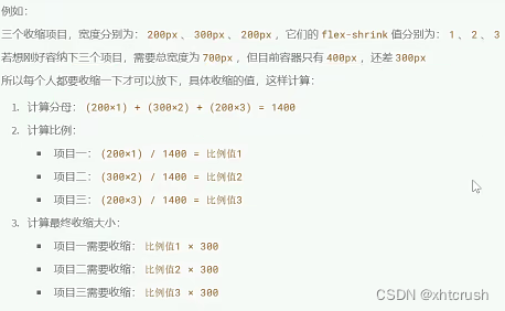
伸缩项目的压缩比例(缩):flex-shrink
定义了项目的压缩比例,默认值为1,如果空间不足,该项目将会缩小
收缩项目的计算
.inner {
            width: 200px;
            height: 200px;
            background-color: rgb(235, 233, 122);
            border: 1px solid black;
            box-sizing: border-box;
            flex-grow: 1;
            /* 默认值:1 */
            flex-shrink: 1;
        }
- 1
- 2
- 3
- 4
- 5
- 6
- 7
- 8
- 9
- 10
flex复合属性
复合:flex-grow,flex-shrink,flex-basis
            /* 伸缩:默认值:0 */
            /* flex-grow: 1; */

            /* 压缩默认值:1 */
            /* flex-shrink: 1; */

            /* 基准长度,默认值:auto */
            /* flex-basis: 100px; */

            /* 可以拉伸和压缩,不设置基准长度,可简写为flex:auto */
            /* flex: 1 1 auto; */
            /* flex: auto; */

            /* 可以拉伸和压缩,设置基准长度为0,可简写为flex:1 */
            /* flex: 1 1 0; */
            /* flex: 1; */

            /* 不可以拉伸和压缩,不设置基准长度,可简写为flex:none */
            /* flex: 0 0 auto; */
            /* flex: none; */

            /* 不可以拉伸,可以压缩,不设置基准长度,可简写为flex:0 auto */
            /* flex: 0 1 auto; */
            flex: 0 auto;
- 1
- 2
- 3
- 4
- 5
- 6
- 7
- 8
- 9
- 10
- 11
- 12
- 13
- 14
- 15
- 16
- 17
- 18
- 19
- 20
- 21
- 22
- 23
- 24
项目排序与单独对齐(order,align-self)
项目排序:order:数值越小,排列越靠前,默认值为0
单独对齐:align-self属性,可以单独调整某个伸缩项目的对齐方式,默认值为0,表示继承父元素的align-item属性
      .inner1{
            order: 3;
        }
        .inner2 {
            order: 2;
            align-self: center;
        }
        .inner3 {
            order: 1;
        }
- 1
- 2
- 3
- 4
- 5
- 6
- 7
- 8
- 9
- 10
7.响应式布局-媒体查询
媒体类型
值完整列表参考:https://developer.mozilla.org/zh-CN/docs/web/CSS/@media
        /* 只有在打印机或打印预览才应用的样式 */
        @media  print{
            h1 {
                background: transparent;
            }
        }

        /* 只有在屏幕上才应用的样式 */
        @media screen {
            h1 {
                font-family: "华文彩云";
            }
        }

        /* 一直都应用的样式 */
        @media all {
            h1 {
                color: blue;
            }
        }
- 1
- 2
- 3
- 4
- 5
- 6
- 7
- 8
- 9
- 10
- 11
- 12
- 13
- 14
- 15
- 16
- 17
- 18
- 19
- 20
媒体特征
值完整列表参考:https://developer.mozilla.org/zh-CN/docs/web/CSS/@media
        /* 检测视口宽度为700px应用如下样式 */
        @media (width:700px) {
            h1 {
                background-color: rgb(93, 93, 184);
            }
        }
        /* 检测视口宽度小于等于600px应用如下样式 */
        @media (max-width:600px) {
            h1 {
                background-color: peru;
            }
        }
        /* 检测视口宽度大于等于900px应用如下样式 */
        @media (min-width:800px) {
            h1 {
                background-color: rgb(76, 171, 101);
            }
        }
        /* 检测视口高度为400px应用如下样式 */
        @media (height:400px) {
            h1 {
                background-color: rgb(44, 175, 158);
            }
        }

        /* 检测屏幕宽度为1536时应用如下样式 */
        @media (device-width:1536px) {
            h1 {
                /* background-color: rgb(198, 109, 45); */
                color: white;
            }
        }
- 1
- 2
- 3
- 4
- 5
- 6
- 7
- 8
- 9
- 10
- 11
- 12
- 13
- 14
- 15
- 16
- 17
- 18
- 19
- 20
- 21
- 22
- 23
- 24
- 25
- 26
- 27
- 28
- 29
- 30
- 31
- 32
运算符
        /* 且运算符 */
        /* @media (min-width:600px) and (max-width:800px) {
            h1 {
                background-color: rgb(86, 75, 167);
            }
        } */
        /* @media screen and (min-width:600px) and (max-width:800px) {
            h1 {
                background-color: rgb(86, 75, 167);
            }
        } */

        /* 或运算符 */
        /* @media (max-width:600px) or (min-width:800px) {
            h1 {
                background-color: rgb(109, 207, 98);
            }
        } */
        /* @media screen and (min-width:600px) and (max-width:800px) {
            h1 {
                background-color: rgb(86, 75, 167);
            }
        } */

        /* 否定运算符 */
        @media not screen {
            h1 {
                background-color: rgb(214, 190, 124);
            }
        }

        /* 肯定运算符(处理IE兼容性问题) */
        @media only screen and (width:700px) {
            h1 {
                background-color: rgb(86, 75, 167);
            }
        }
- 1
- 2
- 3
- 4
- 5
- 6
- 7
- 8
- 9
- 10
- 11
- 12
- 13
- 14
- 15
- 16
- 17
- 18
- 19
- 20
- 21
- 22
- 23
- 24
- 25
- 26
- 27
- 28
- 29
- 30
- 31
- 32
- 33
- 34
- 35
- 36
- 37
- 服务器基线漏洞修复_centos7.9基线配置除root用户超时时间tmoutcentos7.9基线配置除root用户超时时间tmout1、服务器超时设置问题描叙TMOUT的值大于key2且小于等于{key2}且小于等于key2且小于等于{... [详细]
赞
踩
- 如果此处不使用JSON.stringify进行解析,则服务端flask就需要解析。前端和服务端如果都不解析,则会报错。Vue的axios包自带JSON解析功能,但仅限于获取数据,因此发送数据时,还是需要解析后发送的。这里注意代码中的axio... [详细]
赞
踩
- git向GitHubpullpushclone提示Timedout解决本地git向Github远程仓库push等操作提示:Timedout的问题本机情况,这是入职时接手的工作电脑,工作使用的仓库是GitLub,自己学习使用的仓库是GitHu... [详细]
赞
踩
- 粤嵌gec6818开发板上实现智能家居(光照气度,压强,海拔,湿度,温度达到临界值蜂鸣器自动警报等)_智能家居6818智能家居6818一、串口通信及传感器数据采集1.串口及初始化串口是一种简单的通信接口,也是单片机中最常用,最简单的通信方式... [详细]
赞
踩
- 命令描述mvnclean清理项目,删除target目录。编译项目并将生成的JAR/WAR安装到本地仓库。编译项目并将其打包成可分发的JAR/WAR文件。编译项目源代码。mvntest运行项目的单元测试。验证项目,检查所有必要的信息。显示项目... [详细]
赞
踩
- 1、安装dockerdesktop下载dockerdesktop按照完毕后回进行重启,docker还需要wsl2的支持还需要下载wsl2内核的更新包14M左右wsl2_update_x64.msi安装完毕后就可以使用docker了,不需要另... [详细]
赞
踩
- article
com.fasterxml.jackson.core.JsonGenerationException: Can not write a field name, expecting a value
Causedby:com.fasterxml.jackson.core.JsonGenerationException:Cannotwriteafieldname,expectingavalue atcom.fasterxml.jackso... [详细]赞
踩
- 在网上找了个MySQL的错误代码大全放在这,要用时方便0101属于其他进程的专用标志。0102标志已经设置,无法关闭。0103无法再次设置该标志。0104中断时无法请求专用标志。0105此标志先前的所有权已终止。0106请将软盘插入驱动器%... [详细]
赞
踩
- publicclassTestSaveSprite{[MenuItem("Tools/导出AnimationClip")]publicstaticvoidAnimationClipsCopy(){Object[]go=Selection.o... [详细]
赞
踩
- 试题B:平方拆分本题总分:5分【问题描述】将2019拆分为若干个两两不同的完全平方数之和,一共有多少种不同的方法?注意交换顺序视为同一种方法,例如132+252+352=2019与132+352+252=2019视为同一种方法。【答案提交】... [详细]
赞
踩
 本博主将用CSDN记录软件开发求学之路上亲身所得与所学的心得与知识,有兴趣的小伙伴可以关注博主!也许一个人独行,可以走的很快,但是一群人结伴而行,才能走的更远!_mysql安装过程中“configtype”有几种类型?mysql安装过程中“... [详细]
赞
踩
- Xcode下载地址——绝对的官方地址下载方式简单粗暴:2、点击Xcode版本名称稍等几秒即可开始下载1、右键复制链接地址,打开下载软件,新建任务把复制的链接粘贴在地址输入框即可开始下载Xcode2Xcode_2.3.dmg915.0MBXc... [详细]
赞
踩
- 文章目录DockerDesktopforMacDockerDashboard(Docker仪表板)preferences (基础配置)Resources(docker引擎资源配置)DockerEngine(docker引擎)DockerDe... [详细]
赞
踩
- 前言之前经常思考的一个问题,数据库分表后,分页怎么做才是最好的方案呢?今天就来整理一波.由来首先是由来,数据量增大,一张表数据太多的话,会使用分表.同理,一个数据库实例到达瓶颈,所以可能需要分库开始分表分库都需要一个依据.一般都安装主键自增... [详细]
赞
踩
- 3D模型有三种表达方式,体素(Voxel),网格(Mesh),点云(PointCloud)、SDF等,但在实际渲染应用中,主流的表达方式用的是网格。类似下图,任务3D模型都可以用一段段的网格来表示。有了网格我们可以做什么?很简单,我们只需要... [详细]
赞
踩
- 写在前面,这届蓝桥杯,考了2道贪心,1道bfs,1道数论,剩下的都是模拟题,除了最后一题之外,其他题还是都很简单的文章目录试题A:组队试题B:年号字串试题C:数列求值试题D:数的分解试题E:迷宫试题F:特别数的和试题G:完全二叉树的权值试题... [详细]
赞
踩
- 随着业务的不断创新发展,敏捷开发、容器化、云计算等新技术的应用越来越多,与此同时,业务系统架构也变得越来越复杂,传统运维工作将会面临更多、更大的挑战。因此,确保IT系统的持续健康是保障用户体验和业务发展的基础。_围绕架构展示、数据分析等智能... [详细]
赞
踩
- Unity与常规的程序在逻辑上执行函数是有区别的。常规的程序更像是一个面向对象的过程,一直执行某个循环直到完成某个操作,而Unity常将函数的执行权交给脚本主体。当游戏内发生对应事件时,脚本执行某个函数,执行完毕后执行权转交给Unity。U... [详细]
赞
踩
- linux将本地库批量导入到Nexus3.x文章目录linux将本地库批量导入到Nexus3.x1、问题描述2、搭建Nexus私服2.1、官网下载:2.2、上传并解压2.3、修改默认端口2.4、修改内存分配:2.5、启动服务2.6、访问页面... [详细]
赞
踩
- 安装步骤:1、安装系统2、启用Administrator帐户3、进行简单的系统设置4、系统精简5、安装AdobeFlashPlayer6、设置IE主页7、在系统盘(C盘)创建Sysprep目录8、准备好静默安装包(使用装机包定制工具定制)9... [详细]
赞
踩

