
热门标签
热门文章
- 1解决打包过程中出现 ModuleNotFoundError: No module named ‘pydicom.encoders.gdcm‘ 报错的方法_modulenotfounderror: no module named 'pydicom
- 2力扣_面试题:配对交换
- 3React中sass的使用步骤_react 安装sass
- 4【Unity】Asset资源加载详解_unity资源加载
- 5Leetcode 518 零钱兑换 II
- 6Spring Authorization Server入门 (十五) 分离授权确认与设备码校验页面_spring authorization server前后端分离
- 7CentOS 常用操作_centos操作
- 8从零开始学习深度学习技术路线-以语义分割算法Unet为例_深度学习的技术路线
- 9直方图均衡化C++实现_直方图均衡化 c++
- 10vivado编译出错:[vivado 12-1411] Cannot set LOC property of ports
当前位置: article > 正文
Vue3+Ts+Vite项目(第九篇)——基于el-menu封装左侧菜单栏组件,element-plus el-menu二次封装_vue+vite+eleplus项目搭建导航栏
作者:dbjkl | 2024-02-06 12:38:29
赞
踩
vue+vite+eleplus项目搭建导航栏
概述
做什么:封装通用左侧菜单栏组件
怎么做:使用Element-Plus组件库中的el-menu组件进行二次封装
技术栈:Vue3 + Ts + Vite,且采用 setup 语法糖写法
准备工作:请各位自行引入Element-plus组件库,本文中有用到 svg组件,svg组件封装教程请看第五点
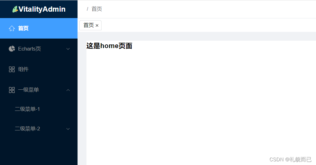
一、先看效果
1.1 静态效果
1.2 动态效果

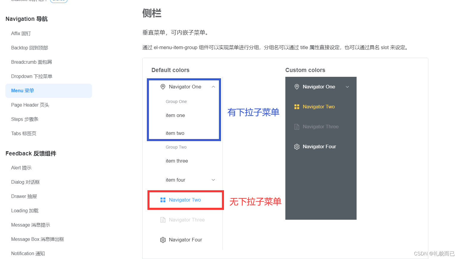
二、核心思路
查看
Element-plus组件库中的el-menu组件,不难发现,菜单栏大致可以分为两类,一类是有子菜单的,一类是无子菜单的。
所以我们将对这两类进行分情况设计,再结合递归,即可完成根据路由列表,动态渲染菜单栏
三、全量代码
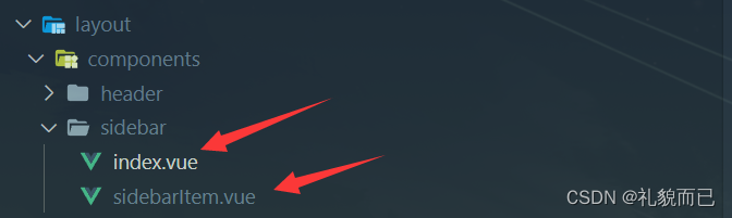
3.1 文件目录结构
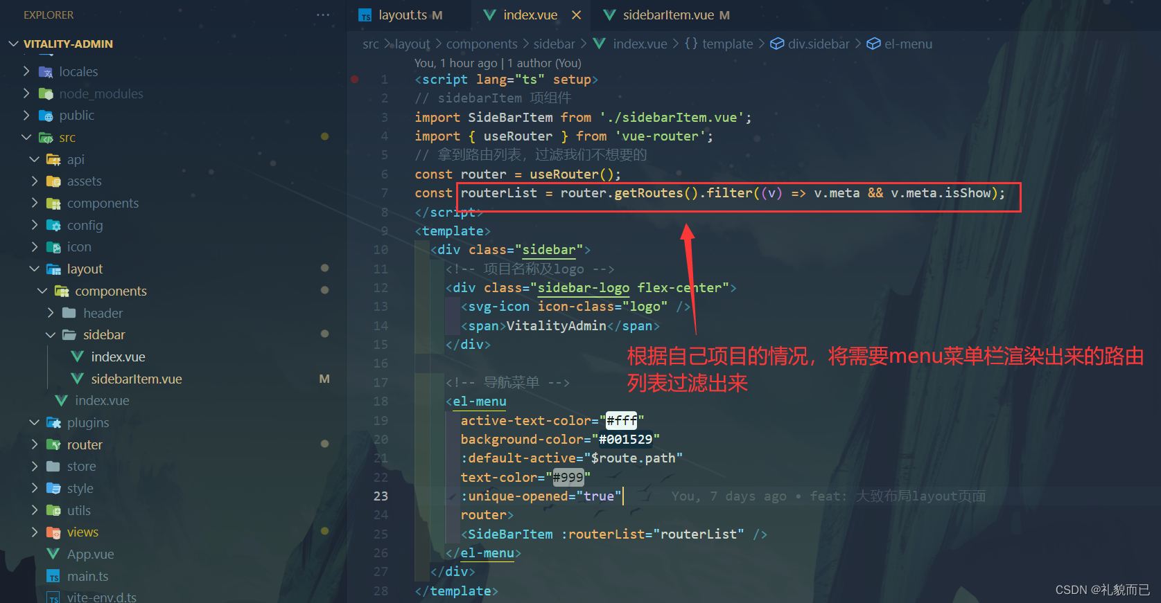
3.2 /sidebar/index.vue 中
<script lang="ts" setup>
// sidebarItem 项组件
import SideBarItem from './sidebarItem.vue';
import { useRouter } from 'vue-router';
// 拿到路由列表,过滤我们不想要的
const router = useRouter();
const routerList = router.getRoutes().filter((v) => v.meta && v.meta.isShow);
</script>
<template>
	<div class="sidebar">
		<!-- 项目名称及logo -->
		<div class="sidebar-logo flex-center">
			<svg-icon icon-class="logo" />
			<span>VitalityAdmin</span>
		</div>

		<!-- 导航菜单 -->
		<el-menu
			active-text-color="#fff"
			background-color="#001529"
			:default-active="$route.path"
			text-color="#999"
			:unique-opened="true"
			router>

            <!-- 引入子组件 -->
			<SideBarItem :routerList="routerList" />
		</el-menu>

		<!-- active-text-color:当前菜单项被选中时,字体的颜色 -->
		<!-- background-color:这个menu菜单的背景色 -->
		<!-- default-active:	当前激活菜单的 index -->
		<!-- text-color:菜单项字体颜色 -->
		<!-- unique-opened:unique-opened	是否只保持一个子菜单的展开 -->
		<!-- router:是否使用 vue-router 的模式,启用该模式会在激活导航时以 index 作为 path 进行路由跳转 -->
	</div>
</template>
<style lang="scss" scoped>
.sidebar {
	height: 100%;
	.sidebar-logo {
		height: 48px;
		background-color: #002140;
		color: #fff;
		font-weight: 700;
		line-height: 48px;
		text-align: center;
		font-size: 20px;
	}
	.el-menu {
		height: calc(100% - 48px);
		border-right: 0;
		overflow: auto;
	}
}
</style>

- 1
- 2
- 3
- 4
- 5
- 6
- 7
- 8
- 9
- 10
- 11
- 12
- 13
- 14
- 15
- 16
- 17
- 18
- 19
- 20
- 21
- 22
- 23
- 24
- 25
- 26
- 27
- 28
- 29
- 30
- 31
- 32
- 33
- 34
- 35
- 36
- 37
- 38
- 39
- 40
- 41
- 42
- 43
- 44
- 45
- 46
- 47
- 48
- 49
- 50
- 51
- 52
- 53
- 54
- 55
- 56
- 57
3.3 /sidebar/sidebarItem.vue 中
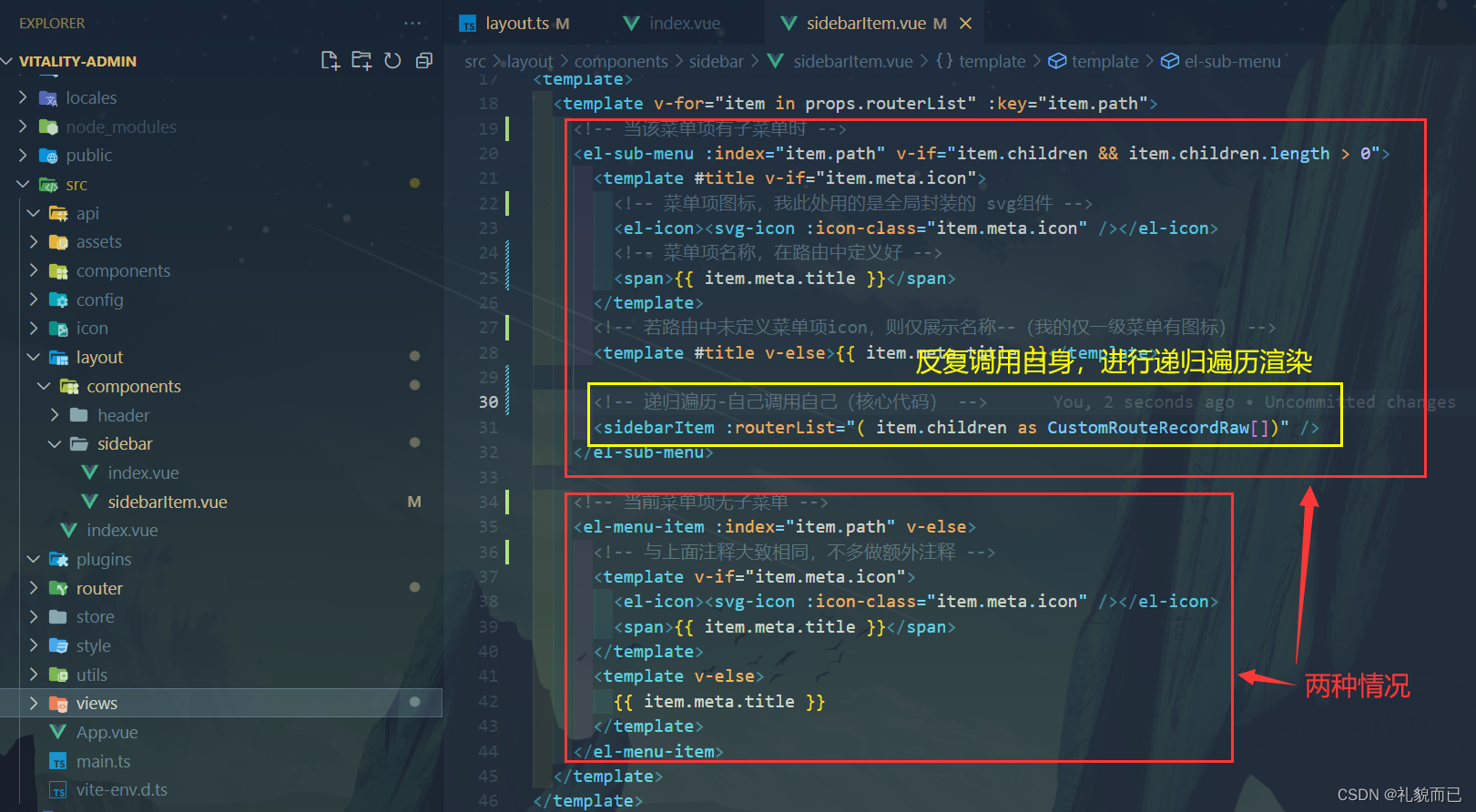
<script setup lang="ts">
import { RouteRecordRaw } from 'vue-router';
// 做类型限制,解决ts类型报错
type CustomRouteRecordRaw = RouteRecordRaw & {
	meta: {
		isShow?: boolean;
	};
};
const props = defineProps({
	// 拿到父组件传递过来的路由列表进行渲染
	routerList: {
		type: Array as () => CustomRouteRecordRaw[],
		required: true
	}
});
</script>
<template>
	<template v-for="item in props.routerList" :key="item.path">
		<!-- 当该菜单项有子菜单时 -->
		<el-sub-menu :index="item.path" v-if="item.children && item.children.length > 0">
			<template #title v-if="item.meta.icon">
				<!-- 菜单项图标,我此处用的是全局封装的 svg组件 -->
				<el-icon><svg-icon :icon-class="item.meta.icon" /></el-icon>
				<!-- 菜单项名称,在路由中定义好 -->
				<span>{{ item.meta.title }}</span>
			</template>
			<!-- 若路由中未定义菜单项icon,则仅展示名称--(我的仅一级菜单有图标) -->
			<template #title v-else>{{ item.meta.title }}</template>

			<!-- 递归遍历-自己调用自己(核心代码) -->
			<sidebarItem :routerList="( item.children as CustomRouteRecordRaw[])" />
		</el-sub-menu>

		<!-- 当前菜单项无子菜单 -->
		<el-menu-item :index="item.path" v-else>
			<!-- 与上面注释大致相同,不多做额外注释 -->
			<template v-if="item.meta.icon">
				<el-icon><svg-icon :icon-class="item.meta.icon" /></el-icon>
				<span>{{ item.meta.title }}</span>
			</template>
			<template v-else>
				{{ item.meta.title }}
			</template>
		</el-menu-item>
	</template>
</template>

<style scoped lang="scss">
.is-active {
	background: #409eff;
	font-weight: 700;
}

.el-menu-item {
	&:hover {
		color: #fff;
		font-weight: 700;
	}
}

.el-menu--collapse {
	.el-menu-item {
		justify-content: center;
	}
}

// 下列代码是用于兼容horizontal所写,酌情删或留
.el-menu--horizontal {
	.el-menu-item.is-active {
		background-color: transparent !important;
		border-bottom: 2px solid #409eff !important;

		.el-icon,
		span {
			color: #409eff !important;
		}
	}

	.el-sub-menu.is-active {
		.el-sub-menu__title {
			border: 0 !important;
		}

		.el-icon,
		span {
			color: #409eff !important;
		}
	}
}
</style>
- 1
- 2
- 3
- 4
- 5
- 6
- 7
- 8
- 9
- 10
- 11
- 12
- 13
- 14
- 15
- 16
- 17
- 18
- 19
- 20
- 21
- 22
- 23
- 24
- 25
- 26
- 27
- 28
- 29
- 30
- 31
- 32
- 33
- 34
- 35
- 36
- 37
- 38
- 39
- 40
- 41
- 42
- 43
- 44
- 45
- 46
- 47
- 48
- 49
- 50
- 51
- 52
- 53
- 54
- 55
- 56
- 57
- 58
- 59
- 60
- 61
- 62
- 63
- 64
- 65
- 66
- 67
- 68
- 69
- 70
- 71
- 72
- 73
- 74
- 75
- 76
- 77
- 78
- 79
- 80
- 81
- 82
- 83
- 84
- 85
- 86
- 87
- 88
- 89
- 90
- 91
- 92
3.4 路由表结构
isShow: true, // 控制当前项是否在菜单栏中渲染出来,比如你写了 login 页面的路由,但是并不希望 login在menu菜单中渲染出来,即可设为false
title: ‘首页’, // menu菜单项的名称,没啥好说的
icon: ‘menu-home’ // menu菜单项的图标,我此处是与封装好的 svg 组件结合使用的
export default [
	{
		path: '/layout',
		name: 'layoutIndex',
		component: () => import('@/layout/index.vue'),
		children: [
			{
				path: '/home',
				name: 'homeIndex',
				component: () => import('@/views/home/index.vue'),
				meta: {
					isShow: true, // 控制当前项是否在菜单栏中渲染出来,比如你写了 login 页面的路由,但是并不希望 login在menu菜单中渲染出来,即可设为false
					title: '首页', // menu菜单项的名称,没啥好说的
					icon: 'menu-home' // menu菜单项的图标,我此处是与封装好的 svg 组件结合使用的
				}
			},
			{
				path: '/echarts',
				name: 'echartIndex',
				// component: () => import('@/views/echarts/index.vue'),
				meta: {
					isShow: true,
					title: 'Echarts页',
					icon: 'menu-echarts'
				},
				children: [
					{
						path: '/echarts/barCharts',
						name: 'barCharts',
						component: () => import('@/views/echarts/barCharts.vue'),
						meta: {
							title: '柱状图'
						}
					},
					{
						path: '/echarts/pieCharts',
						name: 'pieCharts',
						component: () => import('@/views/echarts/pieCharts.vue'),
						meta: {
							title: '饼图'
						}
					}
				]
			},
			{
				path: '/package',
				name: 'packageIndex',
				component: () => import('@/views/package/index.vue'),
				meta: {
					isShow: true,
					title: '组件',
					icon: 'menu-package'
				}
			},
			{
				path: '/menu',
				name: 'menuIndex',
				redirect: '/menu/menu-1',
				meta: {
					isShow: true,
					title: '一级菜单',
					icon: 'menu-package'
				},
				children: [
					{
						path: '/menu/menu-1',
						name: 'menu-1',
						component: () => import('@/views/menu/menu1.vue'),
						meta: {
							title: '二级菜单-1'
						}
					},
					{
						path: '/menu/menu-2',
						name: 'menu-2',
						component: () => import('@/views/menu/menu2.vue'),
						meta: {
							title: '二级菜单-2'
						},
						children: [
							{
								path: '/menu/menu-2/children',
								name: 'menu3',
								component: () => import('@/views/menu/menu3.vue'),
								meta: {
									title: '三级菜单'
								}
							}
						]
					}
				]
			}
		]
	}
];
- 1
- 2
- 3
- 4
- 5
- 6
- 7
- 8
- 9
- 10
- 11
- 12
- 13
- 14
- 15
- 16
- 17
- 18
- 19
- 20
- 21
- 22
- 23
- 24
- 25
- 26
- 27
- 28
- 29
- 30
- 31
- 32
- 33
- 34
- 35
- 36
- 37
- 38
- 39
- 40
- 41
- 42
- 43
- 44
- 45
- 46
- 47
- 48
- 49
- 50
- 51
- 52
- 53
- 54
- 55
- 56
- 57
- 58
- 59
- 60
- 61
- 62
- 63
- 64
- 65
- 66
- 67
- 68
- 69
- 70
- 71
- 72
- 73
- 74
- 75
- 76
- 77
- 78
- 79
- 80
- 81
- 82
- 83
- 84
- 85
- 86
- 87
- 88
- 89
- 90
- 91
- 92
- 93
- 94
- 95
- 96
四、代码讲解
五、SVG组件
本文不展开讲解
svg组件的封装与使用,有需要的朋友欢迎参考下面的svg组件封装教程
svg组件封装教程:http://t.csdnimg.cn/rv1zr
声明:本文内容由网友自发贡献,不代表【wpsshop博客】立场,版权归原作者所有,本站不承担相应法律责任。如您发现有侵权的内容,请联系我们。转载请注明出处:https://www.wpsshop.cn/blog/article/detail/62787
推荐阅读
- 大厂技术高级前端Node进阶点击上方程序员成长指北,关注公众号回复1,加入高级Node交流群作者|褚杏娟核子可乐 近期,React团队正在更新React文档。期间,Vue.js作者尤雨溪发布推特称,新的React文档应该向初学者推荐Vite... [详细]
赞
踩
- 图片如果设计跨域,那么需要在img标签上增加crossorigin,同时对应的图片服务器也要增加允许跨域,缺一不可.第一种,import载入图片。第二种,newImage实例。colorThief+vite+react使用方法 官... [详细]
赞
踩
- 有时候我们希望axios请求实现一些统一的功能,比如携带用户信息,统一的消息处理等,这时候就可以使用axios拦截器在请求发出前和接收到反馈消息后做一些统一的处理。_vue3+vite+ts+axios的路由拦截器vue3+vite+ts+... [详细]
赞
踩
- 生命周期,组件传参【Vue3+Vite】Vue生命周期与组件快速学习第三期文章目录一、Vue生命周期1.1生命周期简介1.2生命周期案例二、Vue组件2.1组件基础2.2组件化入门案例2.3组件之间传递数据2.3.1父传子2.3.2子传父2... [详细]
赞
踩
- 前端跨域解决方案_vitecorsvitecors跨域问题的出现:协议,IP,端口(同源策略)三者有一个不一致,会出现跨域问题跨域问题原因:前端发送请求后,后端获取数据成功,在数据返回时,前端浏览器发现属于跨域,因安全问题,对数据不进行接收... [详细]
赞
踩
- vue3.2+vite+pinia+Ts+elementplus+axios管理系统30分钟你也能搭建一个vue3.2+vite+pinia+Ts+elementplus+axios的后台管理系统demodemo预览最下面有相关文档链接,此... [详细]
赞
踩
- 在权限系统开发中,根据后端返回的菜单列表动态添加路由是非常常见的需求,它可以实现根据用户权限动态加载可访问的页面。本篇文章我们将重点介绍动态添加路由的全过程。_vue3+vite+pinia权限管理vue3+vite+pinia权限管理vu... [详细]
赞
踩
- 答案:事件循环是JavaScript中的一种处理异步操作的方法。在事件循环中,JavaScript引擎不断地检查事件队列,如果有新的事件,就将其加入队列并执行相关的回调函数。当所有的回调函数执行完毕后,再次检查事件队列,如此反复进行。答案:... [详细]
赞
踩
- vue3,vite,elementPlus,ts_使用vue3+elementplus快速搭建项目使用vue3+elementplus快速搭建项目使用vite+vue3创建项目npminitvite@latestmyVue//myVue为项... [详细]
赞
踩
- vite诞生是为了提升web项目运行性能,以更快的速度将应用页面展示给用户。Vite以原生ESM方式提供源码。这实际上是让浏览器接管了打包程序的部分工作:Vite只需要在浏览器请求源码时进行转换并按需提供源码。根据情景动态导入代码,即只在当... [详细]
赞
踩
相关标签

