
热门标签
热门文章
- 1Vue+Video.js播放m3u8视频流
- 2(归并排序思想)leetcode困难315. 计算右侧小于当前元素的个数_java给你一个整数数组 nums ,按要求返回一个新数组 counts 。数组 counts 有该
- 3「自制地图实现carla交通流」sumo与carla百米同步实现交通流仿真_carla 0.9.12 与sumo有关的程序
- 4Java常用类库之BigDecimal_bigdecimal 0.1+0.2
- 5abap 统计内表行数_abap 取内表第几行
- 6微信小程序数据列表渲染:简单易懂wx:for (本地数据渲染案例)(wx:key的作用)_wx:for-item=news
- 7labelimg图像标定工具使用教程_labelimg标签怎么设置
- 8Docke 创建容器与管理_dockere ps -a
- 9Jmeter性能测试之高并发、同步定时器_jmeter怎么测试高并发
- 10python 协程 async/await_python async await
当前位置: article > 正文
WPF实战项目二:设计首页导航条_wpf顶部导航
作者:AllinToyou | 2024-02-16 23:37:03
赞
踩
wpf顶部导航
通过MaterialDesignThemes的github地址,下载代码,将导航条代码复制到MainWindow.xaml中


添加代码到<window..>
- xmlns:materialDesign="http://materialdesigninxaml.net/winfx/xaml/themes"
- TextElement.Foreground="{DynamicResource MaterialDesignBody}"
- TextElement.FontWeight="Regular"
- TextElement.FontSize="13"
- TextOptions.TextFormattingMode="Ideal"
- TextOptions.TextRenderingMode="Auto"
- Background="{DynamicResource MaterialDesignPaper}"
- FontFamily="{DynamicResource MaterialDesignFont}"
设置materialDesign的 x:Name="ColorZone"
添加三个按钮最小化、最大化、关闭,添加头像,设置头像为圆角显示,总体代码如下
- <Window x:Class="WPFProject.MainWindow"
- xmlns="http://schemas.microsoft.com/winfx/2006/xaml/presentation"
- xmlns:x="http://schemas.microsoft.com/winfx/2006/xaml"
- xmlns:d="http://schemas.microsoft.com/expression/blend/2008"
- xmlns:mc="http://schemas.openxmlformats.org/markup-compatibility/2006"
- xmlns:materialDesign="http://materialdesigninxaml.net/winfx/xaml/themes"
- xmlns:local="clr-namespace:WPFProject"
- mc:Ignorable="d"
- WindowStyle="None"
- WindowStartupLocation="CenterScreen"
- TextElement.Foreground="{DynamicResource MaterialDesignBody}"
- TextElement.FontWeight="Regular"
- TextElement.FontSize="13"
- TextOptions.TextFormattingMode="Ideal"
- TextOptions.TextRenderingMode="Auto"
- AllowsTransparency="True"
- Background="{DynamicResource MaterialDesignPaper}"
- FontFamily="{DynamicResource MaterialDesignFont}"
- Title="MainWindow"
- Width="800"
- Height="450">
-
-
- <materialDesign:DialogHost DialogTheme="Inherit"
- Identifier="RootDialog"
- SnackbarMessageQueue="{Binding ElementName=MainSnackbar, Path=MessageQueue}">
-
- <materialDesign:DrawerHost IsLeftDrawerOpen="{Binding ElementName=MenuToggleButton, Path=IsChecked}">
- <materialDesign:DrawerHost.LeftDrawerContent>
- <DockPanel MinWidth="220">
-
- </DockPanel>
- </materialDesign:DrawerHost.LeftDrawerContent>
-
- <DockPanel>
- <materialDesign:ColorZone Padding="16"
- x:Name="ColorZone"
- materialDesign:ElevationAssist.Elevation="Dp4"
- DockPanel.Dock="Top"
- Mode="PrimaryMid">
- <DockPanel LastChildFill="True">
- <StackPanel DockPanel.Dock="Right" Orientation="Horizontal">
- <Image Source="./Images/user.jpg" Height="25" Width="25">
- <Image.Clip><!--裁剪图片-->
- <EllipseGeometry Center="12.5,12.5" RadiusX="12.5" RadiusY="12.5"/>
- </Image.Clip>
- </Image>
- <!--设置水平往右排列-->
- <Button x:Name="BtnMin" Content="—" Style="{StaticResource MaterialDesignFlatMidBgButton}"/>
- <Button x:Name="BtnMax" Content="☐" Style="{StaticResource MaterialDesignFlatMidBgButton}"/>
- <Button x:Name="BtnClose" Content="✕" Style="{StaticResource MaterialDesignFlatMidBgButton}"/>
- </StackPanel>
- <StackPanel Orientation="Horizontal">
- <ToggleButton x:Name="MenuToggleButton"
- AutomationProperties.Name="HamburgerToggleButton"
- IsChecked="False"
- Style="{StaticResource MaterialDesignHamburgerToggleButton}" />
-
- <Button Margin="24,0,0,0"
- materialDesign:RippleAssist.Feedback="{Binding RelativeSource={RelativeSource Self}, Path=Foreground, Converter={StaticResource BrushRoundConverter}}"
- Command="{Binding MovePrevCommand}"
- Content="{materialDesign:PackIcon Kind=ArrowLeft,
- Size=24}"
- Foreground="{Binding RelativeSource={RelativeSource AncestorType={x:Type FrameworkElement}}, Path=(TextElement.Foreground)}"
- Style="{StaticResource MaterialDesignToolButton}"
- ToolTip="Previous Item" />
-
- <Button Margin="16,0,0,0"
- materialDesign:RippleAssist.Feedback="{Binding RelativeSource={RelativeSource Self}, Path=Foreground, Converter={StaticResource BrushRoundConverter}}"
- Command="{Binding MoveNextCommand}"
- Content="{materialDesign:PackIcon Kind=ArrowRight,
- Size=24}"
- Foreground="{Binding RelativeSource={RelativeSource AncestorType={x:Type FrameworkElement}}, Path=(TextElement.Foreground)}"
- Style="{StaticResource MaterialDesignToolButton}"
- ToolTip="Next Item" />
-
- <TextBlock Margin="16,0"
- HorizontalAlignment="Center"
- VerticalAlignment="Center"
- AutomationProperties.Name="Material Design In XAML Toolkit"
- FontSize="22"
- Text="WPFProject" />
- </StackPanel>
- </DockPanel>
- </materialDesign:ColorZone>
- </DockPanel>
- </materialDesign:DrawerHost>
- </materialDesign:DialogHost>
- </Window>
在解决方案窗体下添加图片文件夹,添加头像图片

设置三个按钮的点击事件和拖动导航栏、双击导航栏的点击事件
- public MainWindow()
- {
- InitializeComponent();
-
- BtnMin.Click += (s, e) =>
- {
- this.WindowState = WindowState.Minimized;
- };
- BtnMax.Click += (s, e) =>
- {
- if (this.WindowState == WindowState.Maximized)
- this.WindowState = WindowState.Normal;
- else
- this.WindowState = WindowState.Maximized;
- };
- BtnClose.Click += (s, e) =>
- {
- this.Close();
- };
- ColorZone.MouseMove += (s, e) =>
- {
- if (e.LeftButton == MouseButtonState.Pressed)
- this.DragMove();
- };
- ColorZone.MouseDoubleClick += (s, e) =>
- {
- if (this.WindowState == WindowState.Normal)
- this.WindowState = WindowState.Maximized;
- else
- this.WindowState = WindowState.Normal;
- };
- }
界面显示为: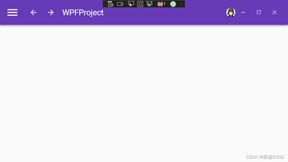
声明:本文内容由网友自发贡献,不代表【wpsshop博客】立场,版权归原作者所有,本站不承担相应法律责任。如您发现有侵权的内容,请联系我们。转载请注明出处:https://www.wpsshop.cn/w/AllinToyou/article/detail/97814
推荐阅读
相关标签

