
热门标签
热门文章
- 1Ajax从零到实战
- 2fastjson2可用jackson注解的说明_fastjson2 注解
- 3android课程设计总结,android开发者模式_andriod通用课程设计总结
- 4Reader开发(一)电子书分页,翻页效果,字体大小调整和基本功能实现_textkit 分页
- 5Hadoop集群的安装_invalid dfs.datanode.data.dir
- 6SQL--limit用法_使用limit查出前三条数据
- 7使用Github Desktop将代码上传到Github_githubdesktop 上传
- 8PyCharm查看运行状态的步骤及方式!_pycharm 运行进度
- 9(一)Pytorch快速搭建神经网络模型(代码+详细注解)_pytorch代码教程
- 10(22)采集微信通讯录好友明细信息-微信UI自动化(.Net+C#)_c#客户端获取通讯录好友wxid和名字
当前位置: article > 正文
WPF自定义控件(教程含源码)-结束iconfont实现带图标的按钮_wpf 图标按钮
作者:weixin_40725706 | 2024-07-14 17:59:13
赞
踩
wpf 图标按钮
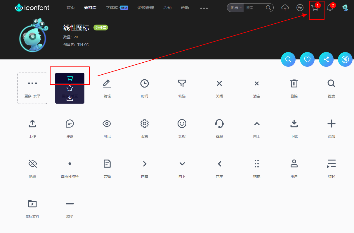
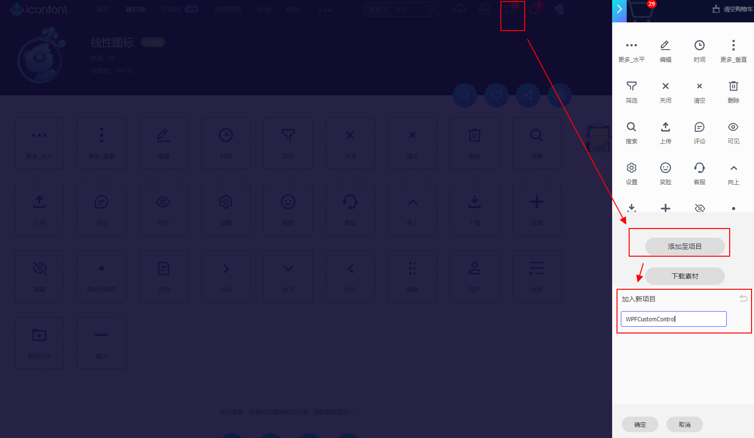
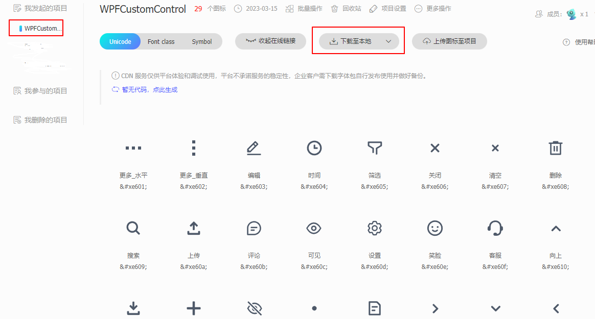
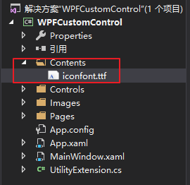
点击下载至本地后即可获取到 iconfont.ttf 字体文件
将字体文件拷贝到项目内, 如下我放在 Contents 文件夹下
在项目内新建资源字典“RText.xaml”,将fontfamily 设置为contents文件夹内的字体
- <ResourceDictionary xmlns="http://schemas.microsoft.com/winfx/2006/xaml/presentation"
- xmlns:x="http://schemas.microsoft.com/winfx/2006/xaml"
- xmlns:local="clr-namespace:WPFCustomControl.Controls">
-
- <Style TargetType="TextBlock" x:Key="RText">
- <Setter Property="FontFamily" Value="/WPFCustomControl;component/Contents/#iconfont" />
- <Setter Property="TextAlignment" Value="Center"/>
- <Setter Property="HorizontalAlignment" Value="Center" />
- <Setter Property="VerticalAlignment" Value="Center" />
- <Setter Property="FontSize" Value="20" />
- <Setter Property="Text" Value="" />
- </Style>
- </ResourceDictionary>
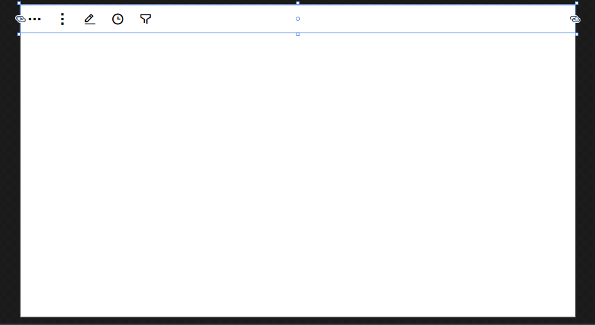
新建一个用户控件, 在里面使用上面新加的样式
- <Grid Background="White">
- <StackPanel>
- <WrapPanel >
- <TextBlock Text="" Style="{StaticResource RText}" Margin="10" />
- <TextBlock Text="" Style="{StaticResource RText}" Margin="10" />
- <TextBlock Text="" Style="{StaticResource RText}" Margin="10" />
- <TextBlock Text="" Style="{StaticResource RText}" Margin="10" />
- <TextBlock Text="" Style="{StaticResource RText}" Margin="10" />
- </WrapPanel>
- </StackPanel>
- </Grid>
效果如下
新建一个RButton类,继承Button。添加依赖属性 Icon。
- public partial class RButton:Button {
- static RButton() {
- DefaultStyleKeyProperty.OverrideMetadata(typeof(RButton), new FrameworkPropertyMetadata(typeof(RButton)));
- }
-
- #region Icon
- public static readonly DependencyProperty IconProperty =
- DependencyProperty.Register("Icon", typeof(string), typeof(RButton), new PropertyMetadata(""));
-
- public string Icon {
- get => (string)GetValue(IconProperty);
- set => SetValue(IconProperty, value);
- }
- #endregion
- }
为RButton 添加新的样式文件, 添加两种样式,一种纯色背景,一种白色背景带边框
- <!--纯色背景-->
- <Style TargetType="local:RButton" x:Key="btn">
- <Setter Property="Foreground" Value="White" />
- <Setter Property="Template">
- <Setter.Value>
- <ControlTemplate TargetType="local:RButton">
- <Border SnapsToDevicePixels="True" Background="{TemplateBinding Background}">
- <WrapPanel VerticalAlignment="Center" HorizontalAlignment="Center">
- <TextBlock Style="{StaticResource RText}" Text="{TemplateBinding Icon}" Margin="0 0 10 0" FontSize="{TemplateBinding FontSize}"/>
- <ContentPresenter SnapsToDevicePixels="True" />
- </WrapPanel>
- </Border>
- </ControlTemplate>
- </Setter.Value>
- </Setter>
- </Style>
-
- <!--白色背景,带边框-->
- <Style TargetType="local:RButton" x:Key="btnBorder">
- <Setter Property="Template">
- <Setter.Value>
- <ControlTemplate TargetType="local:RButton">
- <Border SnapsToDevicePixels="True" Background="White" BorderThickness="1" BorderBrush="{TemplateBinding Foreground}">
- <WrapPanel VerticalAlignment="Center" HorizontalAlignment="Center">
- <TextBlock Style="{StaticResource RText}" Text="{TemplateBinding Icon}" Margin="0 0 10 0" FontSize="{TemplateBinding FontSize}"
- Foreground="{TemplateBinding Foreground}"/>
- <ContentPresenter SnapsToDevicePixels="True" />
- </WrapPanel>
- </Border>
- </ControlTemplate>
- </Setter.Value>
- </Setter>
- </Style>

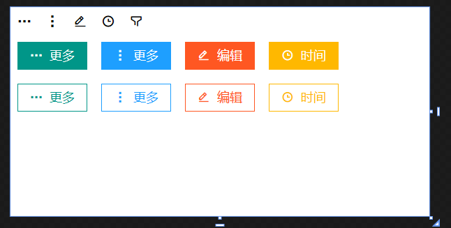
添加用户控件,在界面内使用新增的按钮样式
- <Grid Background="White">
- <StackPanel>
- <WrapPanel >
- <TextBlock Text="" Style="{StaticResource RText}" Margin="10" />
- <TextBlock Text="" Style="{StaticResource RText}" Margin="10" />
- <TextBlock Text="" Style="{StaticResource RText}" Margin="10" />
- <TextBlock Text="" Style="{StaticResource RText}" Margin="10" />
- <TextBlock Text="" Style="{StaticResource RText}" Margin="10" />
- </WrapPanel>
- <WrapPanel >
- <lc:RButton Icon="" Content="更多" Style="{StaticResource btn}" Background="#009688" Height="40" Width="100" Margin="10" FontSize="18"/>
- <lc:RButton Icon="" Content="更多" Style="{StaticResource btn}" Background="#1E9FFF" Height="40" Width="100" Margin="10" FontSize="18"/>
- <lc:RButton Icon="" Content="编辑" Style="{StaticResource btn}" Background="#FF5722" Height="40" Width="100" Margin="10" FontSize="18"/>
- <lc:RButton Icon="" Content="时间" Style="{StaticResource btn}" Background="#FFB800" Height="40" Width="100" Margin="10" FontSize="18"/>
- </WrapPanel>
- <WrapPanel >
- <lc:RButton Icon="" Content="更多" Style="{StaticResource btnBorder}" Foreground="#009688" Height="40" Width="100" Margin="10" FontSize="18"/>
- <lc:RButton Icon="" Content="更多" Style="{StaticResource btnBorder}" Foreground="#1E9FFF" Height="40" Width="100" Margin="10" FontSize="18"/>
- <lc:RButton Icon="" Content="编辑" Style="{StaticResource btnBorder}" Foreground="#FF5722" Height="40" Width="100" Margin="10" FontSize="18"/>
- <lc:RButton Icon="" Content="时间" Style="{StaticResource btnBorder}" Foreground="#FFB800" Height="40" Width="100" Margin="10" FontSize="18"/>
- </WrapPanel>
- </StackPanel>
- </Grid>
最终效果如下

声明:本文内容由网友自发贡献,不代表【wpsshop博客】立场,版权归原作者所有,本站不承担相应法律责任。如您发现有侵权的内容,请联系我们。转载请注明出处:https://www.wpsshop.cn/w/weixin_40725706/article/detail/825856
推荐阅读
相关标签

