
热门标签
热门文章
- 1快速排序算法 C语言实现_c语言完整的快速排序算法
- 2Java Maven项目实现自动化部署到Docker上
- 3计算机网络知识点总结_计算机网络总结
- 4idea启动项目报错:Unable to open debugger port(127.0.0.1:XXXXX)_idea unable to open debug port
- 5深度学习AI美颜系列---AI滤镜特效算法_图像ai滤镜是什么原理
- 6【算法】学习笔记(三)----Morris前序遍历、中序遍历、后序遍历(C++代码)_morris 遍历
- 7解决 ChatGLM.CPP+clBlast 编译错误(也适用于SD.CPP)_glmcpp
- 8数字时钟显示,从00:00-23:59,实现自动计数_00:00/00:03 自动 89 0
- 9Pycharm2016.2注册码(python编码利器)
- 10Android 布局文件之命名空间_kotlin 命名空间
当前位置: article > 正文
Android shape drawable XML 可绘制图形的创建与使用_android 数据图形化 xml
作者:不正经 | 2024-03-17 06:37:47
赞
踩
android 数据图形化 xml
本文链接: http://blog.csdn.net/xietansheng/article/details/54599454
1. 各属性的配置语法
在项目 res/drawable 文件夹中创建一个以 shape 为根节点的 XML 文件,基本语法如下:
<?xml version="1.0" encoding="utf-8"?>
<shape
    xmlns:android="http://schemas.android.com/apk/res/android"
    android:shape=["rectangle" | "oval" | "line" | "ring"]  // 4种形状分别为: 矩形、椭圆、线、圆环
    android:innerRadius="integer"          // 形状为圆环时的 圆环内半径
    android:thickness="integer"            // 形状为圆环时是 圆环的厚度 (外半径 - 内半径)
    android:useLevel=["true" | "false"]>   // 通常为 false, 否则可能图形不显示

    <!-- 宽高尺寸(如果没指定, 通常跟随控件的宽高) -->
    <size
        android:width="integer"
        android:height="integer" />

    <!-- 形状的颜色 -->
    <solid
        android:color="color" />

    <!-- 形状的颜色(用多种颜色梯度渐变来表示, 会被上面的 solid 元素指定的颜色会相互覆盖) -->
    <gradient
        android:startColor="color"        // 渐变的开始颜色
        android:centerColor="integer"     // 渐变的中间过渡颜色
        android:endColor="color"          // 渐变的结束颜色
        android:centerX="float"           // 渐变开始的中心点X坐标(相对于形状的宽度), 值范围 0.0 ~ 1.0
        android:centerY="float"           // 渐变开始的中心点Y坐标(相对于形状的高度), 值范围 0.0 ~ 1.0
        android:angle="integer"           // 渐变方向的角度, 0 为从左到右, 90 为从下到上, 该值必须为 45 的倍数
        android:gradientRadius="integer"  // 渐变的圆半径, 仅在 android:type="radial" 时适用
        android:type=["linear" | "radial" | "sweep"]  // 渐变的类型, 分别为: 线性渐变(默认)、径向渐变、流线型渐变
        android:useLevel=["true" | "false"] />        // 如果形状用作 LevelListDrawable, 则此值为 true; 一般为false

    <!-- 边框 -->
    <stroke
        android:width="integer"           // 边框的厚度
        android:color="color"             // 边框的颜色
        android:dashWidth="integer"
        android:dashGap="integer" />

    <!-- 4个角的角度半径 -->
    <corners
        android:radius="integer"                 // 统一设置4个角的角度半径, 会被下面具体某个角覆盖
        android:topLeftRadius="integer"          // 左上角 角度半径
        android:topRightRadius="integer"         // 右上角 角度半径
        android:bottomLeftRadius="integer"       // 左下角 角度半径
        android:bottomRightRadius="integer" />   // 右下角 角度半径

    <!-- 内边距 -->
    <padding
        android:left="integer"
        android:top="integer"
        android:right="integer"
        android:bottom="integer" />

</shape>
- 1
- 2
- 3
- 4
- 5
- 6
- 7
- 8
- 9
- 10
- 11
- 12
- 13
- 14
- 15
- 16
- 17
- 18
- 19
- 20
- 21
- 22
- 23
- 24
- 25
- 26
- 27
- 28
- 29
- 30
- 31
- 32
- 33
- 34
- 35
- 36
- 37
- 38
- 39
- 40
- 41
- 42
- 43
- 44
- 45
- 46
- 47
- 48
- 49
- 50
- 51
- 52
PS: 以上元素或属性不需要全部使用,某些元素和属性之间存在冲突或被替换或无效,根据具体选择的形状配置使用。
2. 配置形状的引用
1、在项目 res/drawable 文件夹下创建文件 my_shape.xml :
<?xml version="1.0" encoding="utf-8"?>
<shape xmlns:android="http://schemas.android.com/apk/res/android"
    android:shape="rectangle">

    <!-- 边框 -->
    <stroke
        android:color="#00FF00"
        android:width="5dp"/>

    <!-- 形状颜色(如果需要的是空心矩形, 则形状颜色设置为透明) -->
    <solid
        android:color="#FF0000"/>

</shape>
- 1
- 2
- 3
- 4
- 5
- 6
- 7
- 8
- 9
- 10
- 11
- 12
- 13
- 14
PS: 如果需要空心的形状,则必须指明 solid 颜色为透明色,否则某些机器系统中可能会出现黑底。
2、在项目 res/layout 布局文件中引用:
<ImageView
    android:layout_width="300dp"
    android:layout_height="300dp"
    android:src="@drawable/my_shape"/>

<Button
    android:layout_width="wrap_content"
    android:layout_height="wrap_content"
    android:background="@drawable/my_shape"/>
- 1
- 2
- 3
- 4
- 5
- 6
- 7
- 8
- 9
3. 具体形状的配置
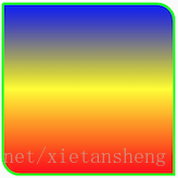
1、矩形 ( rectangle )
<?xml version="1.0" encoding="utf-8"?>
<shape xmlns:android="http://schemas.android.com/apk/res/android"
    android:shape="rectangle">

    <!-- 边框 -->
    <stroke
        android:color="#00FF00"
        android:width="3dp"/>

    <!-- 矩形梯度颜色 -->
    <gradient
        android:startColor="#FF0000"
        android:centerColor="#FFFF00"
        android:endColor="#0000FF"
        android:angle="90"/>

    <!-- 4 个角的角度半径 -->
    <corners
        android:bottomLeftRadius="20dp"
        android:topRightRadius="20dp"/>

</shape>
- 1
- 2
- 3
- 4
- 5
- 6
- 7
- 8
- 9
- 10
- 11
- 12
- 13
- 14
- 15
- 16
- 17
- 18
- 19
- 20
- 21
- 22
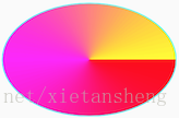
2、椭圆 ( oval )
<?xml version="1.0" encoding="utf-8"?>
<shape xmlns:android="http://schemas.android.com/apk/res/android"
    android:shape="oval">

    <!-- 尺寸(如果宽高相同, 则便是圆) -->
    <size
        android:width="200dp"
        android:height="130dp"/>

    <!-- 边框 -->
    <stroke
        android:color="#00FFFF"
        android:width="1dp"/>

    <!-- 矩形梯度颜色(如果需要椭圆环, 可以用 solid 指定形状颜色为透明) -->
    <gradient
        android:startColor="#FF0000"
        android:centerColor="#FF00FF"
        android:endColor="#FFFF00"
        android:type="sweep"/>

</shape>
- 1
- 2
- 3
- 4
- 5
- 6
- 7
- 8
- 9
- 10
- 11
- 12
- 13
- 14
- 15
- 16
- 17
- 18
- 19
- 20
- 21
- 22
3、线段( line )
<?xml version="1.0" encoding="utf-8"?>
<shape xmlns:android="http://schemas.android.com/apk/res/android"
    android:shape="line">

    <!-- 如果指定尺寸, 则线段为该尺寸宽高的矩形中间的一条线, 没有指定则跟随控件宽高 -->
    <size
        android:width="200dp"
        android:height="100dp"/>

    <!-- 线段的 颜色 和 线宽(厚度) 由 stroke 元素指定-->
    <stroke
        android:color="#000000"
        android:width="5dp"/>

</shape>
- 1
- 2
- 3
- 4
- 5
- 6
- 7
- 8
- 9
- 10
- 11
- 12
- 13
- 14
- 15

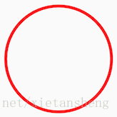
4、圆环 ( ring )
<?xml version="1.0" encoding="utf-8"?>
<shape xmlns:android="http://schemas.android.com/apk/res/android"
    android:shape="ring"
    android:innerRadius="90dp"
    android:thickness="5dp"
    android:useLevel="false">

    <!-- 圆环颜色 -->
    <solid
        android:color="#FF0000"/>

</shape>
- 1
- 2
- 3
- 4
- 5
- 6
- 7
- 8
- 9
- 10
- 11
- 12
PS: 通过配置空心椭圆也可以达到圆环的效果

推荐阅读
相关标签

