
热门标签
热门文章
- 1网络体系结构_系网络
- 2webrtc入门:13.pion webrtc开源的webrtc框架_go2rtc
- 3如何打开服务器的localhost_localhost-server
- 4mac安装java环境(一)_mac java环境
- 5前后端分离项目-后端接口入门开发手记_前后端分离项目搭建
- 6Spring Boot 的默认日志管理与 Logback 配置详解_logback开启debug日志
- 7IDEA2020.3详细安装教程_idea20203详细安装教程
- 8python福建福州天气预报数据可视化大屏全屏系统设计与实现(django框架)
- 9解决联想笔记本电脑经常突然休眠的问题_ideapad突然休眠
- 10/lib64/libc.so.6: version `GLIBC_2.7' not found 解决方案
当前位置: article > 正文
html +js 实现 3D 相册自动旋转+流星雨背景+轮播图_带炫酷背景的自适应3d轮播图
作者:你好赵伟 | 2024-02-21 23:51:41
赞
踩
带炫酷背景的自适应3d轮播图
标题 3D 相册自动旋转+流星雨背景+轮播图
百度网盘
链接:https://pan.baidu.com/s/1ER9g74XdnurAr053RnoVsA
提取码:love
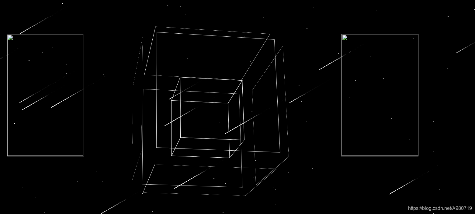
效果图
<!--  -->
<!DOCTYPE html>
<html lang="en">
<head>
    <meta charset="UTF-8">
    <meta name="viewport" content="width=device-width, initial-scale=1.0">
    <meta http-equiv="X-UA-Compatible" content="ie=edge">
    <!-- <embed src="1.mp3" hidden="true" autostart="true" loop="true"> -->
    <title>相册</title>
    <style>
    *{ padding:0; margin:0; list-style:none; border:0;}
    html,body #stars .abc{
            margin: 0;
            padding: 0;
        }
        body,#stars .abc{
            width: 100%;
            height: 100%;
             perspective: 1000px;
            background-color:black;
        }
        .abc
        {
            position:absolute;
             /* overflow: hidden;*/
             margin:20px auto;
        }
         #stars

        {
          position: absolute;

          overflow: hidden;

        }
    .all{
            width:250px;
            height:400px;
            padding:1px;
            border:1px solid #ccc;
            margin:120px 0px 0px 35px;
            position:relative;
            float :left;
             background-size:contain;
        }
        .screen{
          width:250px;
            height:400px;
            overflow:hidden;
            position:relative;
        }
        .screen li{ width:250px;height:400px; overflow:hidden; float:left;}
        .screen ul{ position:absolute; left:0; top:0px; width:3000px;}
        .all1{
           width:250px;
           height:400px;
            padding:1px;
            border:1px solid #ccc;
            margin:120px auto;
            position:relative;
            left:300px;
            float :right;
            background-size:contain;
        }
        .screen1{
           width:250px;
           height:400px;
             padding:0px;
            overflow:hidden;
            position:relative;
        }
        .screen1 li{ width:250px;height:400px;overflow:hidden; float:left;}
        .screen1 ul{ position:absolute; left:-10; top:0px; width:3000px;}

         .album
         {
            width: 546px;
            height: 546px;
         margin: 300px 0px 0px 0px;
         }
        .album,#stars{
            perspective: 2000px;
        }
        .album .photos{
            position:relative ;
            width: 246px;
            height: 246px;
            margin: 0px 300px;
            transform-style: preserve-3d; /*设置3d风格*/
            transform: rotateX(-10deg) rotateY(0deg);
        }
        .album .photos .photo{
            display: inline-block;
            position: absolute;
            width: 200px;
            height: 200px;
            border: 1px solid #fff;
            /*background-color: ;*/
            background-size:contain;
            transition: 2s;
        }
</style>
</head>
<body &g

- 1
- 2
- 3
- 4
- 5
- 6
- 7
- 8
- 9
- 10
- 11
- 12
- 13
- 14
- 15
- 16
- 17
- 18
- 19
- 20
- 21
- 22
- 23
- 24
- 25
- 26
- 27
- 28
- 29
- 30
- 31
- 32
- 33
- 34
- 35
- 36
- 37
- 38
- 39
- 40
- 41
- 42
- 43
- 44
- 45
- 46
- 47
- 48
- 49
- 50
- 51
- 52
- 53
- 54
- 55
- 56
- 57
- 58
- 59
- 60
- 61
- 62
- 63
- 64
- 65
- 66
- 67
- 68
- 69
- 70
- 71
- 72
- 73
- 74
- 75
- 76
- 77
- 78
- 79
- 80
- 81
- 82
- 83
- 84
- 85
- 86
- 87
- 88
- 89
- 90
- 91
- 92
- 93
- 94
- 95
- 96
- 97
- 98
- 99
- 100
- 101
- 102
- 103
声明:本文内容由网友自发贡献,不代表【wpsshop博客】立场,版权归原作者所有,本站不承担相应法律责任。如您发现有侵权的内容,请联系我们。转载请注明出处:https://www.wpsshop.cn/w/你好赵伟/article/detail/127373

