
- 1手机相机里面的m_荣耀V30 PRO详细评测:Matrix Camera相机矩阵开启5G视频时代
- 2HarmonyOS实战—HarmonyOS入门第一课_harmonyos@localhost
- 3假期错题-虽然没啥用_5.一棵完全二叉树上有1000个结点,则该完全二叉树中度为0的结点数为 500 ,度为1的
- 4spring orm框架简介
- 5深度学习:Pytorch安装的torch与torchvision的cuda版本冲突问题与解决历程记录_valueerror: could not find the operator torchvisio
- 6春风十里,不如鸿蒙来袭,未来就业的新风口,等你来约!
- 7华为nova3E升级鸿蒙,华为nova 3e刷机教程_华为nova3e强刷升级更新官方系统包
- 8无人机中的IMU单元(MEMS 三轴加速计、三轴陀螺仪、三轴磁力计)_重力计和三轴加速度计区别
- 9android系统如何自适应屏幕大小
- 10前端——JavaScript(基础知识总结)灵魂_前端里面或者js
必看!uni-app开发项目实战教程(12条常遇到知识点)_un-app扩展组件uni-search-bar怎么据图使用
赞
踩
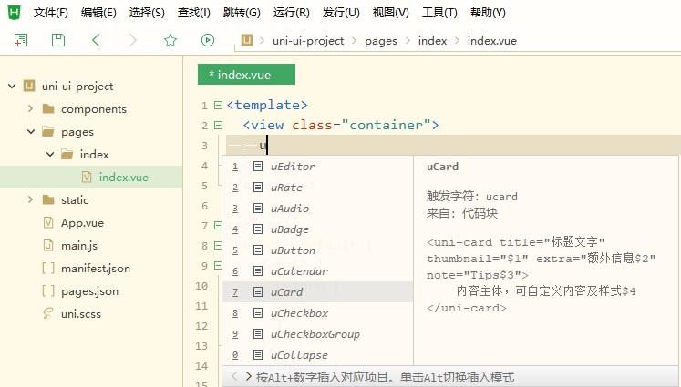
(1)创建项目:选uni-ui项目
在HBuilderX新建uni-app项目的模板中,选择uni ui模板 由于uni-app独特的easycom技术,可以免引用、注册,直接使用各种符合规则的vue组件。
在代码区键入u,拉出各种内置或uni ui的组件列表,选择其中一个,即可使用该组件。
光标放在组件名称上,按F1,可以查阅组件的文档。

(2)引入组件
首先先将扩展组件(uni-ui)插件进行引入

进行引入
(3)使用组件
例如:
制作一个消息列表
就可以使用uni-list的插件
直接输入"u li"就有相对应的组件名
<uni-list></uni-list>
然后里面的制作,就可以按照uni-list的参数进行设置
代码示例:
- <template>
- <view>
- <uni-nav-bar right-icon="personadd" title="我的好友" class="navbar"></uni-nav-bar>
- <uni-search-bar placeholder="搜索好友" @confirm="search" @cancel="cancel" cancel-text="取消" radius="35" >
- <uni-icons slot="searchIcon" color="#999999" size="18" type="search" />
- </uni-search-bar>
- <view v-for="(item,index) in artivelist" :key="index">
- <uni-list >
- <uni-list-item
- thumb="https://vkceyugu.cdn.bspapp.com/VKCEYUGU-dc-site/460d46d0-4fcc-11eb-8ff1-d5dcf8779628.png"
- thumbSize="lg" :title="item.title" :note="item.note" showArrow="true" >
- </uni-list-item>
- </uni-list>
-
- </view>
- </view>
- </template>
-
- <script>
- export default {
- data() {
- return {
- artivelist: [{
- title: '参与参与',
- note: '参与的签名',
- img: 'https://vkceyugu.cdn.bspapp.com/VKCEYUGU-dc-site/460d46d0-4fcc-11eb-8ff1-d5dcf8779628.png'
- },
- {
- title: '鼓捣鼓捣',
- note: '湖人与如图',
- img: 'https://vkceyugu.cdn.bspapp.com/VKCEYUGU-dc-site/460d46d0-4fcc-11eb-8ff1-d5dcf8779628.png'
- },
- {
- title: '有人同意',
- note: '计划体育局',
- img: 'https://vkceyugu.cdn.bspapp.com/VKCEYUGU-dc-site/460d46d0-4fcc-11eb-8ff1-d5dcf8779628.png'
- },
- {
- title: '哈哈哈哈',
- note: '给对方好好',
- img: 'https://vkceyugu.cdn.bspapp.com/VKCEYUGU-dc-site/460d46d0-4fcc-11eb-8ff1-d5dcf8779628.png'
- }
- ]
- }
- },
- methods: {
- search() {},
- cancel() {}
- },
- }
- </script>
-
- <style>
- .navbar {
- opacity: 1;
- font-size: 30rpx;
- font-family: Microsoft YaHei, Microsoft YaHei-Regular;
- font-weight: bold;
- text-align: center;
- color: #25AFA2;
- }
- </style>

(4)扩展组件的样式修改
有两种方法:
第一种:(命名法)
只有一层(就是里面的板块样式是可以一致的),就可以使用直接命名法
然后如果一些情况下,不起效的话,就在css加 !important
例如下面这个,就只是设置大盒子的高度,就可以使用第一种方法
- <uni-list class="news-content" v-for="(item,index) in list" :key="index">
- <uni-list-chat :avatar-circle="true" :title="item.title"
- :avatar="item.src"
- :note="item.note" :time="item.time" :badgeText="item.num"></uni-list-chat>
- </uni-list>
-
-
-
- <style>
- .news-content {
- height: 160rpx;
- }
- </style>
第二种:(源码修改法)
组件里面需要修改的内容比较多,那这个时候,我们可以直接修改这个扩展组件的源码,
在这个输入这个组件的名字
然后进入这个组件里,再ctrl+f,输入你想修改的那个组件参数名,再进行修改css样式
(5)使用导航栏扩展组件
使用导航栏组件时,需要注意的两个点
第一个是:需要用一个大的view进行包裹
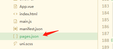
第二个是:需要在page.josn里面,在你加入导航栏组件的那个页面里
加入"navigationStyle":"custom"

(6)如何使用uni-icon组件
type就是icon名
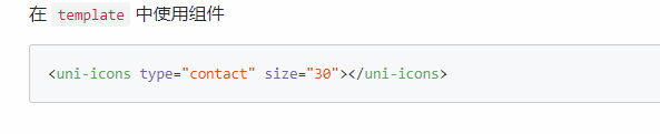

然后就是多看每个组件的参数设置就可以了
如何修改组件:uni-list-item 里面的thmb的方形图片为圆形
也是找到组件的源码,然后进行修改就可以


(7) 如何修改扩展组件的图片?
只需要绑定组件参数,再加"require('相对路径')"
示例:
:thumb="require('相对路径')"
- <uni-list>
- <uni-list-item :thumb="require('static/friend/friend1.jpg')" thumbSize="lg" :title="item.title" :note="item.note" showArrow="true">
- </uni-list-item>
- </uni-list>
(8)顶部导航栏的使用
使用uview的导航栏
https://www.uviewui.com/components/setting.html
安装地址https://ext.dcloud.net.cn/plugin?id=1593
https://www.uviewui.com/components/navbar.html

(9)如何跳转到不同的页面(从一个页面跳转到不同的页面,可返回原来的页面)?
跳转页面(从一个页面跳转到不同的页面,可返回原来的页面)
这个组件自带返回
详情可以参考:navigator官方文档
2种情况:
情况1(标签法):
在某一个标签里面,直接跳转到其他页面
在标签里面,设置点击事件,再写方法,就可以达到效果了
- <view class="user-tip" @click="tohead()">
- 跳转到个人中心页面
- </view>
- methods:{
- tohead() {
- uni.navigateTo({
- url:"/pages/mine/head/head"
- })
- }
- }
情况2(渲染法):
在我们进行排版的时候,如果同一个页面里面的小板块是一样的话,我们会用v-for进行渲染,后期接数据,所以这个时候,就不能直接用标签法,可以使用,渲染跳转地址的方式
首先,在渲染的数组里面,设置好跳转地址的变量(url),然后绑定点击事件 @click="toOtherPage(item.url)",最后把/把跳转地址的变量值,传入方法里面,
让传入的值与我们写的跳转变量地址相一致,就可以达到跳转的效果了
- <!-- 我的相册、赞、收藏、钱包、草稿箱版块 -->
- <view class="user-item">
- <view class="user-item-main-content" v-for="(item,index) in userlist"
- @click="toOtherPage(item.url)" > //绑定点击事件,拿到跳转地址的值,
- <view class="user-item-icon">
- <image :src="item.src" mode=""></image>
- </view>
- <view class="user-item-title">{{item.title}}</view>
- </view>
- </view>
-
-
- <script>
- const app = getApp().globalData;
- export default {
- data() {
- return {
- userlist: [{
- src: '/static/mine/album.png',
- title: '我的相册',
- url:'/pages/mine/album/album' //设置跳转地址变量(url)
- },
- {
- src: '/static/mine/like.png',
- title: '赞/收藏',
- url:'/pages/mine/like/like'
- },
- {
- src: '/static/mine/wallet.png',
- title: '我的钱包',
- url:'/pages/mine/wallet/wallet'
- },
- {
- src: '/static/mine/drafts.png',
- title: '草稿箱',
- url:'/pages/mine/drafts/drafts'
- },
- ]
- }
- },
- onLoad() {
- // this.getData()
- },
- methods:{
- toOtherPage(url){
- uni.navigateTo({
- url:url
- //把跳转地址的变量值,传入方法里面,
- 让传入的值与我们写的跳转变量地址相一致,就可以达到跳转的效果了
- })
- }
-
-
- }
-
-
-
- }
- </script>
(10)如何设置底部栏跳转到指定页面?
首先在目录,pages这个文件夹里面,
右键(选新建页面)新建底部栏(不超过5个)的跳转页面


然后在page.json里面

- "tabBar": {
- "color": "#7A7E83", //文字的颜色
- "selectedColor": "#25AFA2", //点击图标以后,文字的颜色
- "borderStyle": "black",
- "backgroundColor": "#ffffff",
- "height": "50px",
- "fontSize": "10px",
- "iconWidth": "24px",
- "spacing": "3px",
- "list": [{
- "pagePath": "pages/index/index", //跳转的页面
- "iconPath": "static/tabBar/index.png", //页面图标
- "selectedIconPath": "static/tabBar/index.png", //点击时的页面图标
- "text": "首页" //底部栏的文字
- },
- {
- "pagePath": "pages/friend/friend",
- "iconPath": "static/tabBar/friend.png",
- "selectedIconPath": "static/tabBar/friedgHL.png",
- "text": "好友"
- },
-
- {
- "pagePath": "pages/news/news",
- "iconPath": "static/tabBar/info.png",
- "selectedIconPath": "static/tabBar/infoHL.png",
- "text": "消息"
- },
- {
- "pagePath": "pages/mine/mine",
- "iconPath": "static/tabBar/mine.png",
- "selectedIconPath": "static/tabBar/mineHL.png",
- "text": "我的"
- }
- ]
- }
(11)布局
11-1需求:盒子在页面里面,左右有边距,且居中显示
- head {
- width: 700rpx; //页面的默认宽度是750rpx
- height: 100rpx;
- margin: 25rpx auto; //这样写,就是左右对齐,上面有25rpxd 边距
- }
11-2 :弹性(flex)布局
如何让弹性布局里面的最后一个盒子,靠右显示?
只需要一行代码,
如果是最后一个子盒子是有写出来的,就只需要在子盒子里面,加上
margin-left:auto
如果是渲染类型的(就是最后一个盒子没有写出来的),就需要在父盒子处
.父盒子类名:last-child { margin-left:auto }
代码示例:
- <!-- 修改登录密码至退出账号板块 -->
- <view class="user-admin" v-for="(item,index) in adminlist" >
- <view class="user-admin-icon">
- <image :src="item.src" mode=""></image>
- </view>
- <view class="user-admin-title">{{item.title}}</view>
- <u-icon name="arrow-right" color="#25afa2"
- class="user-admin-right-icon" >
- </u-icon>
- </view>
-
-
-
- <script>
- const app = getApp().globalData;
- export default {
- data() {
- return {
- adminlist: [
- {src: '/static/mine/drafts.png',title: '修改登录密码'},
- {src: '/static/mine/v.png',title: 'V标认证'},
- {src: '/static/mine/service.png',title: '客服中心'},
- {src: '/static/mine/feedback.png',title: '问题反馈'},
- {src: '/static/mine/out.png',title: '退出账号'},
- ]
- };
- },
- onLoad() {
- // this.getData()
- },
- }
- </script>
-
-
-
- .user-admin {//这个是父盒子,加上弹性布局
- display: flex;
- flex-wrap: nowrap; //这个是换行
- margin: 0 auto;
- width: 680rpx;
- margin-bottom: 60rpx;
-
- }
- .user-admin-icon {
- width: 40rpx;
- height: 40rpx;
- margin-right: 20rpx;
- }
- .user-admin-icon image {
- width: 40rpx;
- height: 40rpx;
- }
- .user-admin .user-admin-title {
- width: 180rpx;
- margin-left: 20rpx;
- font-size: 30rpx;
- font-family: PingFang SC, PingFang SC-Bold;
- font-weight: 700;
- text-align: left;
- color: #111111;
- }
- .user-admin-right-icon {
- margin-left: auto; //这个就是父盒子里面的最后一个子盒子,只要加上margin-left: auto;就
- 可以达到靠右显示
-
- }
-
-
效果图

(12)scoped 页面样式显示
在每一个页面,都需要加scoped(就是下面写的样式,只在该页面起效果),
然后再看看你是使用less还是sass进行加入
<style scoped lang="scss"></style>
(13)如何设置类型于微博的封面背景图?
- <!-- 页面顶部导航栏 -->
- <view>
- <u-navbar back-icon-name="nav-back" back-icon-color="#FFFFFF" back-text="返回" :background="background"
- class="navbar" :immersive="false" :border-bottom="false">
- <view class="slot-wrap">
- <uni-icons type="search" class="headicon" size="20" color="#ffffff"></uni-icons>
- </view>
- </u-navbar>
- </view>
- <image class="nav-background" src="/static/mine/head/headbanner.png" mode="widthFix" ></image>
-
-
-
- <style scoped lang="scss">
- .navbar {
- opacity: 1;
- font-size: 30px;
- font-family: Microsoft YaHei, Microsoft YaHei-Regular;
- font-weight: bold;
- text-align: left;
- color: #ffffff;
-
- }
-
- .slot-wrap {
- display: flex;
- padding: 0 30rpx;
- margin-left: auto;
- /* 如果您想让slot内容占满整个导航栏的宽度 */
- /* flex: 1; */
- /* 如果您想让slot内容与导航栏左右有空隙 */
- /* padding: 0 30rpx; */
-
- }
-
- .nav-background {
- position: fixed;
- left: 0;
- top: 0;
- width: 100%;
- }
- </style>

