
- 1PHP如何下载对应的XDebug版本_xdebug历史版本下载
- 2HTML生日快乐代码 (粉色主题)(HTML5+CSS3+JS)520表白代码/七夕情人节网页/告白/求婚/生日快乐_生日快乐的链接代码
- 3unity2d人物真实跳跃实现(RigidBody添加力的作用)_unity rigidbody2d.addforce()
- 4matlab实现瑞利信道需要的步骤,瑞利信道Matlab仿真程序
- 5ZooKeeper 集群最少要几台服务器,为什么?_zookeeper最少几台
- 6css的主题,CSS主题切换
- 7python网络编程之websocket_python websocket客户端
- 8Vue3+element ui取消el-select下拉选边框_vue3中使用elementplus选择器的边框如何去掉
- 9Java依赖管理-eclipse中使用maven_eclipse 管理java依赖项
- 10数据预处理_对一个属性的所有遗漏的值军利用一个用零来填补这属于缺失数据处理中的什么
纯CSS画的基本图形(矩形、圆形、三角形、多边形、爱心、八卦等)_长方形变圆形对话框css
赞
踩
今天在css-tricks上看到一篇文章,那篇文章让我不禁心头一震,强大的CSS啊,居然能画出这么多基本的图形。图形包括基本的矩形、圆形、椭圆、三角形、多边形,也包括稍微复杂一点的爱心、钻石、阴阳八卦等。当然有一些需要用到CSS3的属性,所以在你打开这篇文章的时候,我希望你用的是firefox或者chrome,当然IE也能看一部分的。那好,下面就一起来看看我们是如何用纯CSS来画这些图形的,如果你也觉得很震撼,推荐给你的朋友吧。
1、正方形
最终效果:
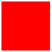
CSS代码如下:
- 1 #square {
- 2 width: 100px;
- 3 height: 100px;
- 4 background: red;
- 5 }
2、长方形
最终效果:

CSS代码如下:
- 1 #rectangle {
- 2 width: 200px;
- 3 height: 100px;
- 4 background: red;
- 5 }
3、圆形
最终效果:
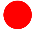
CSS代码如下:
- 1 #circle {
- 2 width: 100px;
- 3 height: 100px;
- 4 background: red;
- 5 -moz-border-radius: 50px;
- 6 -webkit-border-radius: 50px;
- 7 border-radius: 50px;
- 8 }
4、椭圆
最终效果:
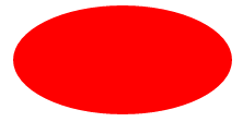
CSS代码如下:
- 1 #oval {
- 2 width: 200px;
- 3 height: 100px;
- 4 background: red;
- 5 -moz-border-radius: 100px / 50px;
- 6 -webkit-border-radius: 100px / 50px;
- 7 border-radius: 100px / 50px;
- 8 }
5、上三角
最终效果:
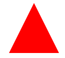
CSS代码如下:
- 1 #triangle-up {
- 2 width: 0;
- 3 height: 0;
- 4 border-left: 50px solid transparent;
- 5 border-right: 50px solid transparent;
- 6 border-bottom: 100px solid red;
- 7 }
6、下三角
最终效果:
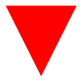
CSS代码如下:
- 1 #triangle-down {
- 2 width: 0;
- 3 height: 0;
- 4 border-left: 50px solid transparent;
- 5 border-right: 50px solid transparent;
- 6 border-top: 100px solid red;
- 7 }
7、左三角
最终效果:

CSS代码如下:
- 1 #triangle-left {
- 2 width: 0;
- 3 height: 0;
- 4 border-top: 50px solid transparent;
- 5 border-right: 100px solid red;
- 6 border-bottom: 50px solid transparent;
- 7 }
8、右三角
最终效果:

CSS代码如下:
- 1 #triangle-right {
- 2 width: 0;
- 3 height: 0;
- 4 border-top: 50px solid transparent;
- 5 border-left: 100px solid red;
- 6 border-bottom: 50px solid transparent;
- 7 }
9、左上三角
最终效果:

CSS代码如下:
- 1 #triangle-topleft {
- 2 width: 0;
- 3 height: 0;
- 4 border-top: 100px solid red;
- 5 border-right: 100px solid transparent;
- 6 }
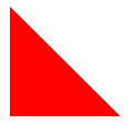
10、右上三角
最终效果:

CSS代码如下:
- 1 #triangle-topright {
- 2 width: 0;
- 3 height: 0;
- 4 border-top: 100px solid red;
- 5 border-left: 100px solid transparent;
- 6
- 7 }
11、左下三角
最终效果:
CSS代码如下:
- 1 #triangle-bottomleft {
- 2 width: 0;
- 3 height: 0;
- 4 border-bottom: 100px solid red;
- 5 border-right: 100px solid transparent;
- 6 }
12、右下三角
最终效果:

CSS代码如下:
- 1 #triangle-bottomright {
- 2 width: 0;
- 3 height: 0;
- 4 border-bottom: 100px solid red;
- 5 border-left: 100px solid transparent;
- 6 }
13、平行四边形
最终效果:

CSS代码如下:
- 1 #parallelogram {
- 2 width: 150px;
- 3 height: 100px;
- 4 margin-left:20px;
- 5 -webkit-transform: skew(20deg);
- 6 -moz-transform: skew(20deg);
- 7 -o-transform: skew(20deg);
- 8 background: red;
- 9 }
14、梯形
最终效果:

CSS代码如下:
- 1 #trapezoid {
- 2 border-bottom: 100px solid red;
- 3 border-left: 50px solid transparent;
- 4 border-right: 50px solid transparent;
- 5 height: 0;
- 6 width: 100px;
- 7 }
15、六角星
最终效果:

CSS代码如下:

16、五角星
最终效果:

CSS代码如下:
17、五角大楼
最终效果:

CSS代码如下:
18、六边形
最终效果:

CSS代码如下:
19、八角形
最终效果:
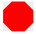
CSS代码如下:
20、爱心
最终效果:

CSS代码如下:
21、无穷大符号
最终效果:
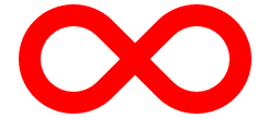
CSS代码如下:
22、鸡蛋
最终效果
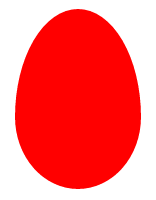
CSS代码如下:
- #egg {
- display:block;
- width: 126px;
- height: 180px;
- background-color: red;
- -webkit-border-radius: 63px 63px 63px 63px / 108px 108px 72px 72px;
- border-radius: 50% 50% 50% 50% / 60% 60% 40% 40%;
- }
23、食逗人(Pac-Man)
最终效果:

CSS代码如下:
- 1 #pacman {
- 2 width: 0px;
- 3 height: 0px;
- 4 border-right: 60px solid transparent;
- 5 border-top: 60px solid red;
- 6 border-left: 60px solid red;
- 7 border-bottom: 60px solid red;
- 8 border-top-left-radius: 60px;
- 9 border-top-right-radius: 60px;
- 10 border-bottom-left-radius: 60px;
- 11 border-bottom-right-radius: 60px;
- 12 }
24、提示对话框
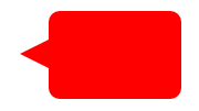
CSS代码如下:
25、12角星
最终效果:
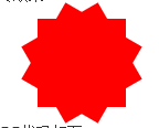
CSS代码如下:
26、8角星
最终效果:

CSS代码如下:
27、钻石
最终效果:
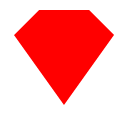
CSS代码如下:
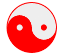
28、阴阳八卦(霸气的这个)
最终效果:
CSS代码如下:
好了,就到这里了,一共28个,个人觉得后面几个比较犀利。
如果我的内容能对你有所帮助,我就很开心啦!

