
热门标签
当前位置: article > 正文
css实现图片边缘模糊效果
作者:weixin_40725706 | 2024-05-23 12:27:20
赞
踩
css实现图片边缘模糊效果
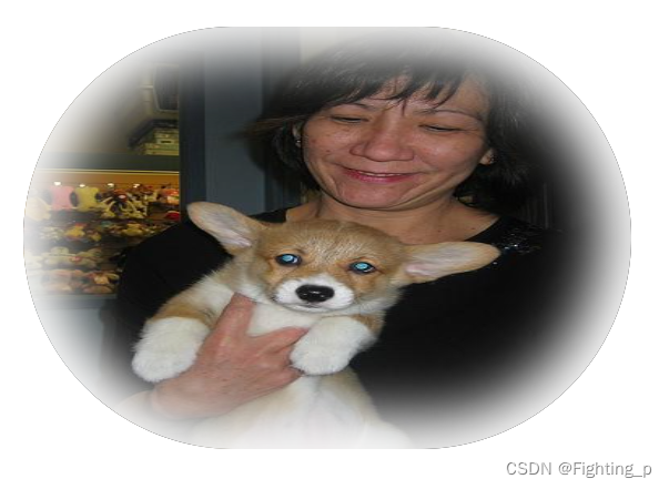
<!DOCTYPE html>
<html lang="en">
  <head>
    <meta charset="UTF-8" />
    <meta name="viewport" content="width=device-width, initial-scale=1.0" />
    <title>Document</title>
    <style>
      * {
        margin: 0;
      }
      html {
        height: 100%;
      }
      body {
        height: 100%;
      }
      .avatar {
        width: 30%;
        height: 30%;
        border-radius: 200px;
        overflow: hidden;
        position: relative;
      }
      .avatar::after {
        /* 【主要代码】 */
        position: absolute;
        content: '';
        width: 100%;
        height: 100%;
        top: 0;
        left: 0;
        border-radius: 200px; /* 避免四个角没有阴影 */
        box-shadow: 0 0 50px 30px #fff inset; /* 【主要代码】 */
      }
      img {
        width: 100%;
        height: 100%;
      }
    </style>
  </head>
  <body>
    <div class="avatar">
      <img src="https://images.dog.ceo/breeds/pembroke/n02113023_6519.jpg" />
    </div>
  </body>
</html>

- 1
- 2
- 3
- 4
- 5
- 6
- 7
- 8
- 9
- 10
- 11
- 12
- 13
- 14
- 15
- 16
- 17
- 18
- 19
- 20
- 21
- 22
- 23
- 24
- 25
- 26
- 27
- 28
- 29
- 30
- 31
- 32
- 33
- 34
- 35
- 36
- 37
- 38
- 39
- 40
- 41
- 42
- 43
- 44
- 45
- 46
- 47
声明:本文内容由网友自发贡献,不代表【wpsshop博客】立场,版权归原作者所有,本站不承担相应法律责任。如您发现有侵权的内容,请联系我们。转载请注明出处:https://www.wpsshop.cn/w/weixin_40725706/article/detail/612830
推荐阅读
相关标签

