
热门标签
热门文章
- 1字节|平台开发实习生面经 技术三面+交叉面试+HR面(已offer)_字节交叉面
- 2Android UI 自定义控件_使用android的fragment碎片控件、textview文本标签控件、recyclerview
- 3Linux系统安全(用户、密码、grub引导密码、增加终端)
- 4.net8 blazor auto模式很爽(三)用.net8的Blazor自动模式测试,到底在运行server还是WebAssembly_blazor auto项目刷新后注入的service会失效
- 5分布式系统开发实战:分布式计算,实战:基于Spark词频统计_分布式词频统计代码
- 6MySQL中的读锁和写锁_mysql 度锁 写锁
- 7鸿蒙HarmonyOS开发-Https 抓包配置_harmony next 怎么抓包_鸿蒙抓包
- 8使用自己的阿里云镜像加速器解决群晖 NAS 中 Docker 时无法从 Docker Hub 拉取镜像的问题_synology docviewer
- 9计算机毕业设计 基于Web的网上购物系统(pc端仿淘宝系统)的设计与实现 Java实战项目 附源码+文档+视频讲解_网上购物系统设计
- 10音频pop音的数学与物理解释_pop音跟频率有关吗?
当前位置: article > 正文
Android使用shape属性绘制边框内渐变色_android shape 渐变色
作者:爱喝兽奶帝天荒 | 2024-06-22 21:48:07
赞
踩
android shape 渐变色
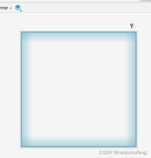
先上效果图
这是使用AndroidStudio绘制的带有渐变色的边框背景色
实现方法
项目中由于UI设计需求,需要给按钮、控件设置带有背景色效果的。以下是UI效果图。
这里我们使用shape属性来绘制背景效果。
shape属性介绍
<?xml version="1.0" encoding="utf-8"?>
<shape
    xmlns:android="http://schemas.android.com/apk/res/android"
    android:shape=["rectangle" | "oval" | "line" | "ring"] > // 定义形状
    <corners //圆角属性
        android:radius="integer"
        android:topLeftRadius="integer"
        android:topRightRadius="integer"
        android:bottomLeftRadius="integer"
        android:bottomRightRadius="integer" />
    <gradient //渐变属性
        android:angle="integer"
        android:centerX="integer"
        android:centerY="integer"
        android:centerColor="integer"
        android:endColor="color"
        android:gradientRadius="integer"
        android:startColor="color"
        android:type=["linear" | "radial" | "sweep"]
        android:useLevel=["true" | "false"] />
    <padding //边距属性
        android:left="integer"
        android:top="integer"
        android:right="integer"
        android:bottom="integer" />
    <size //大小属性
        android:width="integer"
        android:height="integer" />
    <solid //填充属性
        android:color="color" />
    <stroke //描边属性
        android:width="integer"
        android:color="color"
        android:dashWidth="integer"
        android:dashGap="integer" />
</shape>

- 1
- 2
- 3
- 4
- 5
- 6
- 7
- 8
- 9
- 10
- 11
- 12
- 13
- 14
- 15
- 16
- 17
- 18
- 19
- 20
- 21
- 22
- 23
- 24
- 25
- 26
- 27
- 28
- 29
- 30
- 31
- 32
- 33
- 34
- 35
- 36
Shape可以定义控件的一些展示效果,例如圆角,渐变,填充,描边,大小,边距;shape子标签就可以实现这些效果,shape子标签有下面几个属性:
corners,
gradient,
padding,
size,
solid,
stroke:
corners(圆角)
代码
layer-list 是用来创建 图层列表的,通过它能创建出一些特殊的 drawable
<?xml version="1.0" encoding="utf-8"?>
<layer-list xmlns:android="http://schemas.android.com/apk/res/android">
    <!--顶部的渐变色-->
    <item
        android:gravity="top">
        <shape
            xmlns:android="http://schemas.android.com/apk/res/android"
            android:shape="rectangle">
            <gradient
                android:type="linear"
                android:angle="90"
                android:startColor="#0077b3c7"
                android:endColor="#9077b3c7"
                android:useLevel="false"/>

            <size
                android:width="100dp"
                android:height="10dp" />
        </shape>
    </item>

    <!--左侧的渐变色-->
    <item
        android:gravity="left">
        <shape
            xmlns:android="http://schemas.android.com/apk/res/android"
            android:shape="rectangle">
            <gradient
                android:type="linear"
                android:angle="0"
                android:startColor="#9077b3c7"
                android:endColor="#0077b3c7"
                android:useLevel="false"/>
            <size
                android:width="10dp"
                android:height="100dp" />
        </shape>
    </item>

    <!--右侧的渐变色-->
    <item
        android:gravity="right">
        <shape
            xmlns:android="http://schemas.android.com/apk/res/android">
            <gradient
                android:type="linear"
                android:angle="180"
                android:startColor="#9077b3c7"
                android:endColor="#0077b3c7"
                android:useLevel="false"/>

            <size
                android:width="10dp"
                android:height="100dp"/>
        </shape>
    </item>

    <!--底部的渐变色-->
    <item
        android:gravity="bottom">
        <shape
            xmlns:android="http://schemas.android.com/apk/res/android">
            <gradient
                android:type="linear"
                android:angle="90"
                android:centerX="0"
                android:centerY="0"
                android:startColor="#9077b3c7"
                android:endColor="#0077b3c7"
                android:useLevel="false"/>

            <size
                android:width="100dp"
                android:height="10dp" />
        </shape>
    </item>

    <!--边框线-->
    <item>
        <shape
            xmlns:android="http://schemas.android.com/apk/res/android"
            android:shape="rectangle">
            <stroke
                android:width="1dp"
                android:color="@color/button_text_color"/>
        </shape>
    </item>
</layer-list>
- 1
- 2
- 3
- 4
- 5
- 6
- 7
- 8
- 9
- 10
- 11
- 12
- 13
- 14
- 15
- 16
- 17
- 18
- 19
- 20
- 21
- 22
- 23
- 24
- 25
- 26
- 27
- 28
- 29
- 30
- 31
- 32
- 33
- 34
- 35
- 36
- 37
- 38
- 39
- 40
- 41
- 42
- 43
- 44
- 45
- 46
- 47
- 48
- 49
- 50
- 51
- 52
- 53
- 54
- 55
- 56
- 57
- 58
- 59
- 60
- 61
- 62
- 63
- 64
- 65
- 66
- 67
- 68
- 69
- 70
- 71
- 72
- 73
- 74
- 75
- 76
- 77
- 78
- 79
- 80
- 81
- 82
- 83
- 84
- 85
- 86
- 87
- 88
- 89
绘制完毕后,直接到代码中引用即可
结果
声明:本文内容由网友自发贡献,不代表【wpsshop博客】立场,版权归原作者所有,本站不承担相应法律责任。如您发现有侵权的内容,请联系我们。转载请注明出处:https://www.wpsshop.cn/w/爱喝兽奶帝天荒/article/detail/747732
推荐阅读
相关标签

