
- 1Android在一个APP中通过包名或类名启动另一个APP_android 通过packagename,classname startactivity
- 2取消linux密码复杂性,Ubuntu修改密码及密码复杂度策略设置方法
- 32020 年 中英文拼写纠错开源框架梳理_youngcorrector
- 4OpenGL:VisualStudio2022配置OpenGL环境_opengl配置vs2022
- 5FFMpeg 获取音频音量、提高音量
- 6Sora引领AI生成模型新篇章,视频人工AI创造新视野
- 7OpenCV 图像处理 ------ 白平衡算法_opencv白平衡算法
- 8Android--Service之AIDL传递复杂对象_aidl 复杂对象
- 9阿里数据总监分享《阿里数据中台建设实践案例》,PPT 语音讲解!
- 10linux fork() 进程树的两种实现方法_fork进程树
HarmonyOS Codelab 优秀样例——购物应用,体验一次开发多端部署魅力_鸿蒙harmony简单应用-商品列表
赞
踩
一. 样例介绍
本篇Codelab基于自适应布局和响应式布局,实现购物应用在手机、折叠屏、平板不同屏幕尺寸设备上按不同设计显示。通过三层工程结构组织代码,实现一次开发,多端部署 。
手机运行效果如图所示:
折叠屏运行效果图:
平板运行效果图:
相关概念
- 一次开发,多端部署:一套代码工程,一次开发上架,多端按需部署。支撑开发者快速高效的开发支持多种终端设备形态的应用。
- 自适应布局:当外部容器大小发生变化时,元素可以根据相对关系自动变化以适应外部容器变化的布局能力。相对关系如占比、固定宽高比、显示优先级等。当前自适应布局能力有7种:拉伸能力、均分能力、占比能力、缩放能力、延伸能力、隐藏能力、折行能力。自适应布局能力可以实现界面显示随外部容器大小连续变化。
- 响应式布局:当外部容器大小发生变化时,元素可以根据断点、栅格或特定的特征(如屏幕方向、窗口宽高等)自动变化以适应外部容器变化的布局能力。当前响应式布局能力有3种:断点、媒体查询、栅格布局。
- GridRow:栅格容器组件,仅可以和栅格子组件(GridCol)在栅格布局场景中使用。
- GridCol:栅格子组件,必须作为栅格容器组件(GridRow)的子组件使用。
完整示例:gitee源码地址
二. 环境搭建
我们首先需要完成HarmonyOS开发环境搭建,可参照如下步骤进行。
软件要求
- DevEco Studio版本:DevEco Studio 3.1 Release及以上版本。
- HarmonyOS SDK版本:API version 9及以上版本。
硬件要求
- 设备类型:华为手机或运行在DevEco Studio上的华为手机设备模拟器。
- HarmonyOS系统:3.1.0 Developer Release及以上版本。
环境搭建
- 安装DevEco Studio,详情请参考下载和安装软件。
- 设置DevEco Studio开发环境,DevEco Studio开发环境需要依赖于网络环境,需要连接上网络才能确保工具的正常使用,可以根据如下两种情况来配置开发环境:
- 如果可以直接访问Internet,只需进行下载HarmonyOS SDK操作。
- 如果网络不能直接访问Internet,需要通过代理服务器才可以访问,请参考配置开发环境。
- 开发者可以参考以下链接,完成设备调试的相关配置:
三.代码结构解读
本篇Codelab只对核心代码进行讲解,common为公共能力层,feature为功能模块层,本示例分为六个模块,product则为产品层。对于完整代码,我们会在源码下载或gitee中提供。
- ├──common/src/main/ets // 公共能力层
- │ ├──bean
- │ │ ├──CommodityModel.ets // 商品数据实体类
- │ │ ├──OrderModel.ets // 订单数据实体类
- │ │ └──ProductModel.ets // 购物车商品数据实体类
- │ ├──components
- │ │ ├──CommodityList.ets // 商品列表组件
- │ │ ├──CounterProduct.ets // 数量加减组件
- │ │ └──EmptyComponent.ets // 无数据显示组件
- │ ├──constants
- │ │ ├──BreakpointConstants.ets // 断点常量类
- │ │ ├──GridConstants.ets // 栅格常量类
- │ │ └──StyleConstants.ets // 样式常量类
- │ ├──utils
- │ │ ├──BreakpointSystem.ets // 断点工具类
- │ │ ├──CommonDataSource.ets // 数据封装类
- │ │ ├──LocalDataManager.ets // 数据操作管理类
- │ │ ├──Logger.ets.ets // 日志工具类
- │ │ └──Utils.ets // 方法工具类
- │ └──viewmodel
- │ └──ShopData.ets // 商品应用数据
- ├──features // 功能模块层
- │ ├──commoditydetail/src/main/ets // 商品详情内容区
- │ │ ├──bean
- │ │ │ └──TypeModel.ets // 实体类
- │ │ ├──components
- │ │ │ ├──CapsuleGroupButton.ets // 自定义按钮组件
- │ │ │ ├──CommodityDetail.ets // 商品详情组件
- │ │ │ └──SpecificationDialog.ets // 商品规格弹框
- │ │ ├──constants
- │ │ │ └──CommodityConstants.ets // 商品详情区常量类
- │ │ └──viewmodel
- │ │ └──CommodityDetailData.ets // 商品详情数据类
- │ ├──home/src/main/ets // 首页内容区
- │ │ ├──components
- │ │ │ └──Home.ets // 首页内容组件
- │ │ └──viewmodel
- │ │ └──HomeData.ets // 首页数据
- │ ├──newproduct/src/main/ets // 新品内容区
- │ │ ├──components
- │ │ │ └──NewProduct.ets // 新品内容组件
- │ │ └──viewmodel
- │ │ └──NewProductData.ets // 新品数据
- │ ├──orderdetail/src/main/ets // 订单相关内容区
- │ │ ├──components
- │ │ │ ├──AddressInfo.ets // 收件人信息组件
- │ │ │ ├──CommodityOrderItem.ets // 商品订单信息组件
- │ │ │ ├──CommodityOrderList.ets // 商品订单列表组件
- │ │ │ ├──ConfirmOrder.ets // 确认订单组件
- │ │ │ ├──HeaderBar.ets // 标题组件
- │ │ │ ├──OrderDetailList.ets // 订单分类列表组件
- │ │ │ ├──OrderListContent.ets // 订单分类列表内容组件
- │ │ │ └──PayOrder.ets // 支付订单组件
- │ │ ├──constants
- │ │ │ └──OrderDetailConstants.ets // 订单区常量类
- │ │ └──viewmodel
- │ │ └──OrderData.ets // 订单数据
- │ ├──personal/src/main/ets // 我的内容区
- │ │ ├──bean
- │ │ │ └──IconButtonModel.ets // 按钮图标实体类
- │ │ ├──components
- │ │ │ ├──IconButton.ets // 图片按钮组件
- │ │ │ ├──LiveList.ets // 直播列表组件
- │ │ │ └──Personal.ets // 我的内容组件
- │ │ ├──constants
- │ │ │ └──PersonalConstants.ets // 我的常量类
- │ │ └──viewmodel
- │ │ └──PersonalData.ets // 我的数据
- │ └──shopcart/src/main/ets // 购物车内容区
- │ ├──components
- │ │ └──ShopCart.ets // 购物车内容组件
- │ └──constants
- │ └──ShopCartConstants.ets // 购物车常量类
- └──products // 产品层
- └──phone/src/main/ets // 支持手机、平板
- ├──constants
- │ └──PageConstants.ets // 页面常量类
- ├──entryability
- │ └──EntryAbility.ets // 程序入口类
- ├──pages
- │ ├──CommodityDetailPage.ets // 订单详情页
- │ ├──ConfirmOrderPage.ets // 确认订单页
- │ ├──MainPage.ets // 主页
- │ ├──OrderDetailListPage.ets // 订单分类列表页
- │ ├──PayOrderPage.ets // 支付订单页
- │ └──SplashPage.ets // 启动过渡页
- └──viewmodel
- └──MainPageData.ets // 主页数据

四. 应用主框架
4.1 启动页
在工程pages目录中,选中Index.ets,点击鼠标右键 > Refactor > Rename,改名为SplashPage.ets。改名后,修改工程entryability目录下EntryAbility.ets文件中windowStage.loadContent方法第一个参数为pages/SplashPage。在该页面的周期函数aboutToAppear里添加一个2秒的定时任务跳转到主页实现。
- // EntryAbility.ets
- windowStage.loadContent('pages/SplashPage', (err, data) => {
- if (err.code) {
- ...
- }
- });
-
- // SplashPage.ets
- build() {
- Column() {
- ...
- }
- .height(StyleConstants.FULL_HEIGHT)
- .width(StyleConstants.FULL_WIDTH)
- .backgroundColor($r('app.color.page_background'))
- }
-
- aboutToAppear() {
- this.breakpointSystem.register();
- this.timeOutId = setTimeout(() => {
- router.replaceUrl({ url: PageConstants.MAIN_PAGE_URL })
- .catch(err => {
- Logger.error(JSON.stringify(err));
- })
- }, PageConstants.DELAY_TIME);
- }
-
- aboutToDisappear() {
- this.breakpointSystem.unregister();
- clearTimeout(this.timeOutId);
- }
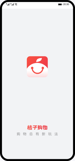
手机运行效果图:
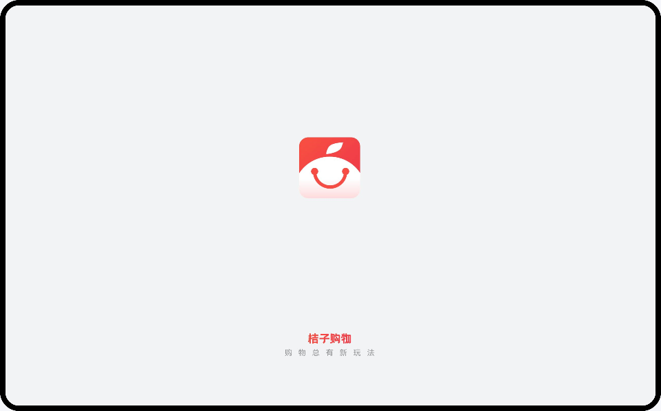
折叠屏运行效果图:
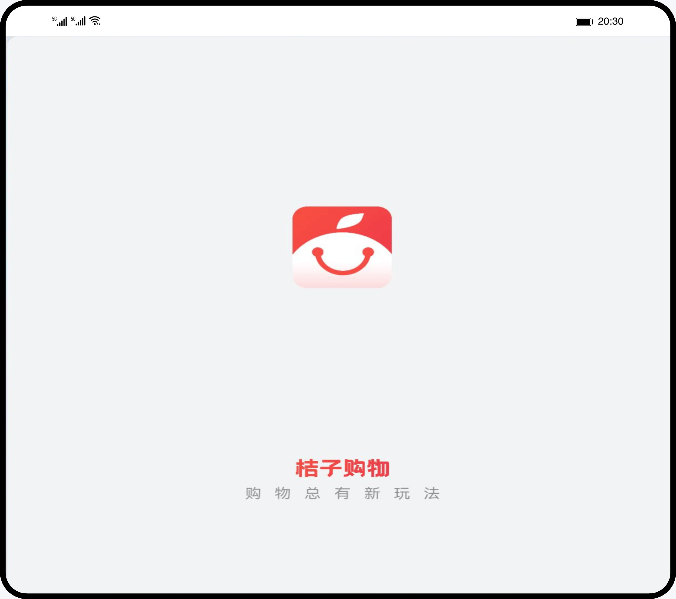
平板运行效果图:
4.2 主页
本篇Codelab主页由Tabs容器组件和四个TabContent子组件组成,四个TabContent页签的内容视图分别为首页(Home)、新品(NewProduct)、购物车(ShopCart)、我的(Personal)。根据用户使用场景,通过响应式布局的媒体查询,监听应用窗口宽度变化,获取当前应用所处的断点值,设置Tabs的页签位置,lg断点如平板则显示侧边栏,其他断点的则显示底部栏。
- /// MainPage.ets
- build() {
- Column() {
- Tabs({
- barPosition: this.currentBreakpoint === BreakpointConstants.BREAKPOINT_LG ?
- BarPosition.Start : BarPosition.End,
- index: this.currentPageIndex
- }) {
- ...
- .barWidth(this.currentBreakpoint === BreakpointConstants.BREAKPOINT_LG ?
- $r('app.float.bar_width') : StyleConstants.FULL_WIDTH)
- .barHeight(this.currentBreakpoint === BreakpointConstants.BREAKPOINT_LG ?
- StyleConstants.SIXTY_HEIGHT : $r('app.float.vp_fifty_six'))
- .vertical(this.currentBreakpoint === BreakpointConstants.BREAKPOINT_LG)
- }
- .backgroundColor($r('app.color.page_background'))
- }
主页页面展示:
五. 页面介绍
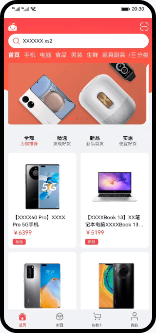
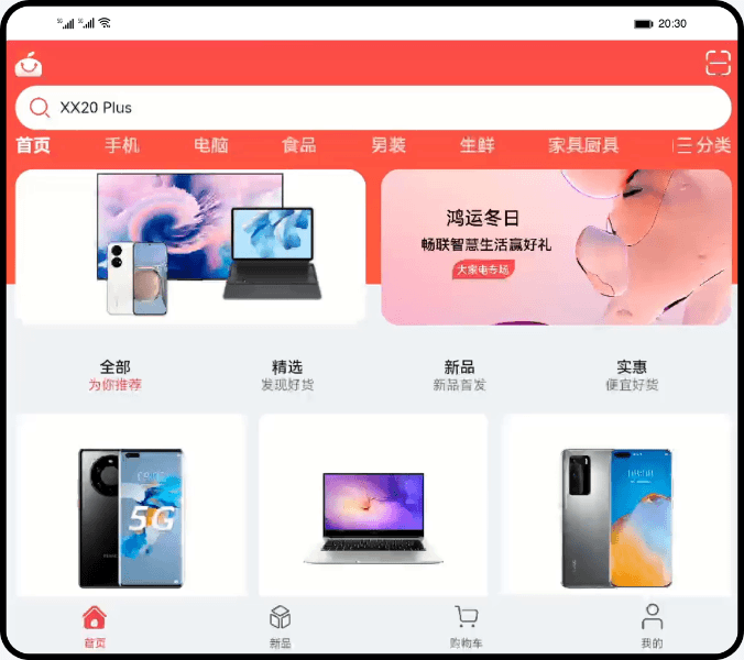
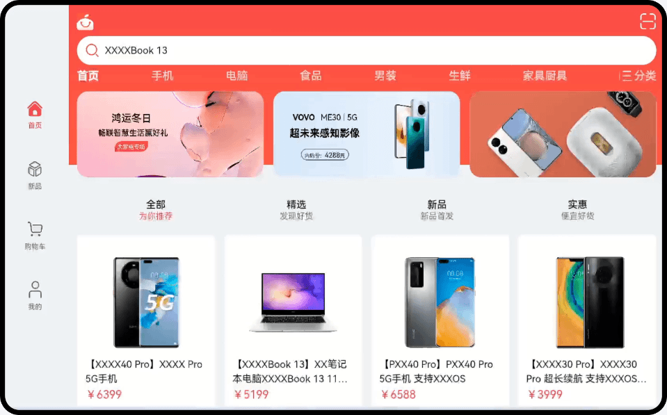
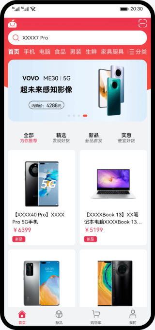
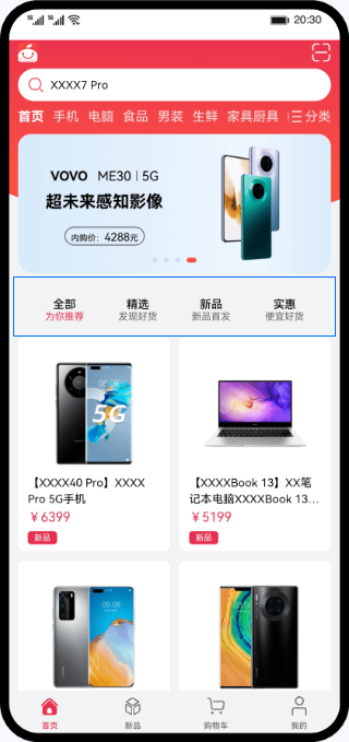
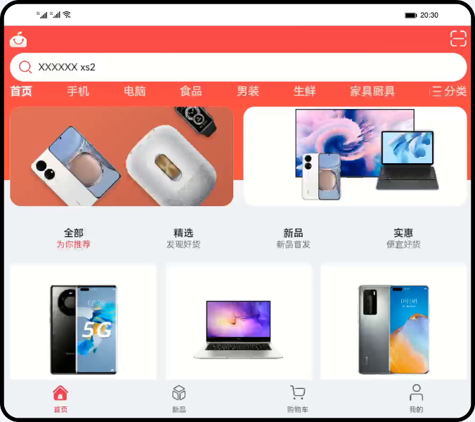
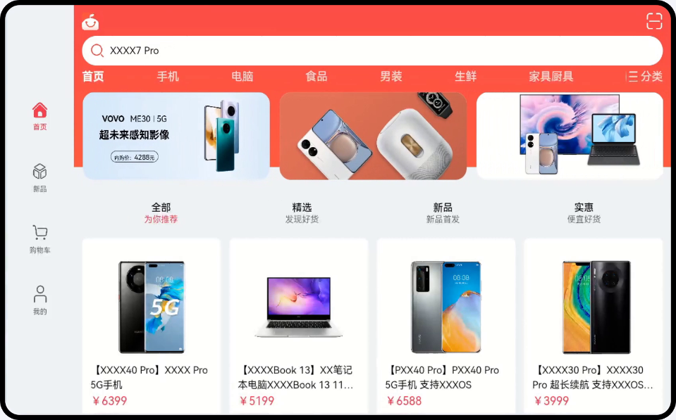
5.1 首页标签页
首页标签页通过自适应布局的均分、拉伸等能力实现搜索框、分类等布局,通过响应式布局的媒体查询、断点能力设置轮播图数、商品列表数。
通过响应式布局的媒体查询,监听应用窗口宽度变化,获取当前应用所处的断点值,设置商品列表列数和轮播图数,lg断点显示4列3张轮播图,md断点显示3列2张轮播图,sm断点显示2列1张轮播图。
- // Home.ets
- @Builder CustomSwiper() {
- Swiper() {
- ForEach(swiperImage, (item: Resource) => {
- Image(item)
- .width(StyleConstants.FULL_WIDTH)
- .aspectRatio(StyleConstants.IMAGE_ASPECT_RATIO)
- }, item => JSON.stringify(item))
- }
- .itemSpace(this.currentBreakpoint === BreakpointConstants.BREAKPOINT_SM ? 0 :
- StyleConstants.ITEM_SPACE)
- .indicator(this.currentBreakpoint === BreakpointConstants.BREAKPOINT_SM)
- .displayCount(this.currentBreakpoint === BreakpointConstants.BREAKPOINT_LG ?
- StyleConstants.DISPLAY_THREE :
- (this.currentBreakpoint === BreakpointConstants.BREAKPOINT_MD ? StyleConstants.DISPLAY_TWO :
- StyleConstants.DISPLAY_ONE))
- }
-
- // Home.ets
- CommodityList({
- commodityList: $commodityList,
- column: this.currentBreakpoint === BreakpointConstants.BREAKPOINT_LG ? StyleConstants.DISPLAY_FOUR :
- (this.currentBreakpoint === BreakpointConstants.BREAKPOINT_MD ?
- StyleConstants.DISPLAY_THREE : StyleConstants.DISPLAY_TWO),
- onClickItem: (data: Commodity) => this.onClickItem(data)
- })
-
- // CommodityList.ets
- build() {
- if (this.commodityList.length > 0) {
- List({ space: StyleConstants.TWELVE_SPACE }) {
- LazyForEach(new CommonDataSource(this.commodityList), (item: Commodity) => {
- ...
- }, item => JSON.stringify(item))
- }
- ...
- .lanes(this.column)
- } else {
- EmptyComponent({ outerHeight: StyleConstants.FIFTY_HEIGHT })
- }
- }
使用自适应布局的均分能力,在Flex布局中设置主轴上的对齐方式为FlexAlign.SpaceAround,使循环渲染的组件之间距离相同,第一个元素到行首的距离和最后一个元素到行尾的距离是相邻元素之间距离的一半。
- // Home.ets
- @Builder ActivityTitle() {
- Flex({ justifyContent: FlexAlign.SpaceAround }) {
- ForEach(activityTitle, (item: ActivityTitleModel, index: number) => {
- Flex({
- direction: FlexDirection.Column,
- justifyContent: FlexAlign.Center,
- alignItems: ItemAlign.Center
- }) {
- ...
- }
- }, item => JSON.stringify(item))
- }
- ...
- }
手机运行效果图:
折叠屏运行效果图:
平板运行效果图:
5.2 新品标签页
新品标签页由轮播图、分类、新品列表组成,通过响应式布局的媒体查询、断点能力和自适应布局的均分能力,实现不同设备类型显示不同效果,实现逻辑同主页。
通过响应式布局的媒体查询,监听应用窗口宽度变化,获取当前应用所处的断点值设置新品列表,sm断点显示2列,md、lg断点显示3列。
- // NewProduct.ets
- @Builder ProductList() {
- List({ space: StyleConstants.TWELVE_SPACE }) {
- LazyForEach(new CommonDataSource(productData), (item: ProductDataModel) => {
- ListItem() {
- ...
- }, item => JSON.stringify(item))
- }
- .lanes(this.currentBreakpoint === BreakpointConstants.BREAKPOINT_SM ?
- StyleConstants.DISPLAY_TWO : StyleConstants.DISPLAY_THREE)
- .padding({ left: $r('app.float.vp_twelve'), right: $r('app.float.vp_twelve') })
- }
手机运行效果图:

折叠屏运行效果图:

平板运行效果图:

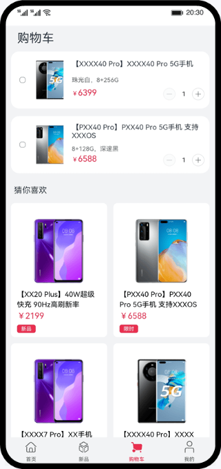
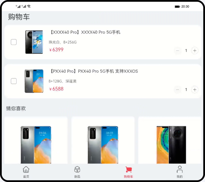
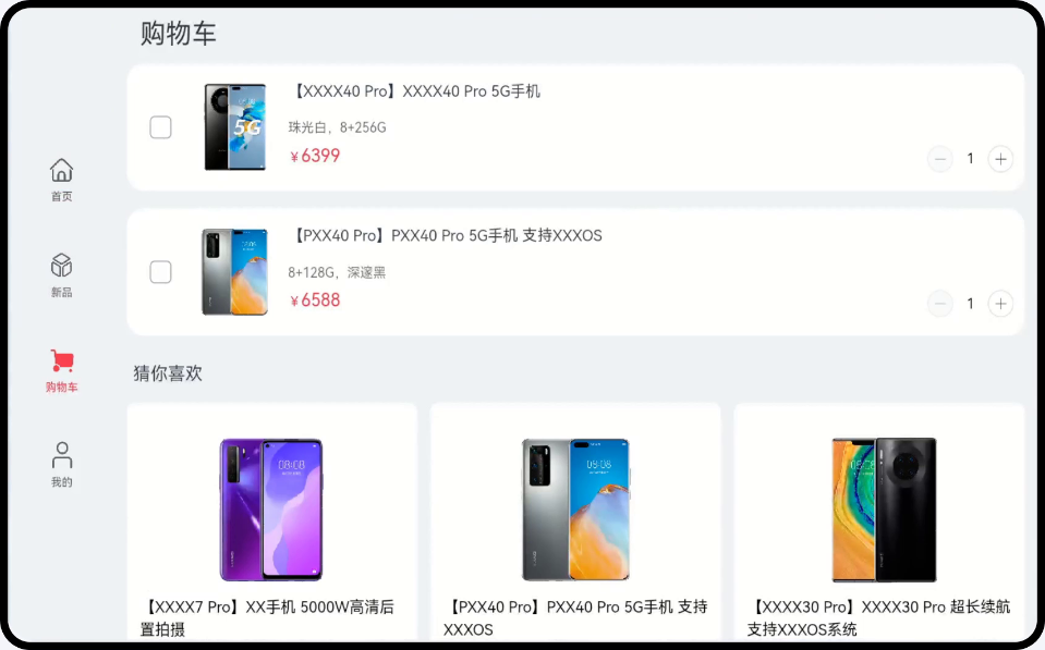
5.3 购物车标签页
购物车标签页,由购物车列表和商品列表组成,商品列表实现逻辑同主页的商品列表,购物车列表使用自适应布局的均分能力实现。
- // ShopCart.ets
- @Builder CartItem(item: Product, index: number) {
- Flex({ direction: FlexDirection.Row, alignItems: ItemAlign.Center }) {
- ...
- Flex({ direction: FlexDirection.Column, justifyContent: FlexAlign.SpaceAround }) {
- Text($r('app.string.commodity_piece_description', item.name, item.description))
- ...
- Text(`${Object.values(item.specifications).join(',')}`)
- ...
- Flex({ justifyContent: FlexAlign.SpaceBetween }) {
- Text() {
- ...
- }
-
- CounterProduct({
- count: item.count,
- onNumberChange: (num: number) => {
- this.onChangeCount(num, item);
- }
- })
- }
- }
- ...
- }
- }
手机运行效果图:
折叠屏运行效果图:
平板运行效果图:
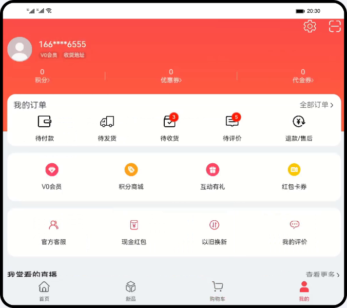
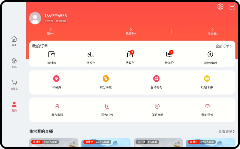
5.4 我的标签页
我的标签页主要由个人信息、我的订单、文字图片按钮、直播列表组成,直播列表实现方案同主页商品列表,其他则使用自适应布局的均分能力,Flex布局设置主轴上的对齐方式为FlexAlign.SpaceAround。
- // Personal.ets
- @Builder Order() {
- Flex({direction: FlexDirection.Column}) {
- Flex({
- justifyContent: FlexAlign.SpaceBetween,
- alignItems: ItemAlign.Center
- }) {
- Text($r('app.string.order_mine'))
- .fontSize($r('app.float.middle_font_size'))
- Row() {
- ...
- }
- ...
- })
- }
- Flex({
- justifyContent: FlexAlign.SpaceAround,
- alignItems: ItemAlign.Center
- }) {
- ForEach(this.orderIconButton, (iconButton: IconButtonModel) => {
- IconButton({
- props: iconButton,
- click: this.onOrderButtonClick.bind(this, iconButton.key)
- })
- }, (iconButton) => JSON.stringify(iconButton))
- }
- .width(StyleConstants.FULL_WIDTH)
- }
-
- @Builder IconDock(buttons: IconButtonModel[]) {
- Flex({
- justifyContent: FlexAlign.SpaceAround,
- alignItems: ItemAlign.Center
- }) {
- ForEach(buttons, (iconButton: IconButtonModel) => {
- IconButton({
- props: iconButton
- })
- }, (iconButton) => JSON.stringify(iconButton))
- }
- .height($r('app.float.icon_dock_height'))
- .padding($r('app.float.vp_twelve'))
- .cardStyle()
- }
手机运行效果图:
折叠屏运行效果图:
平板运行效果图:
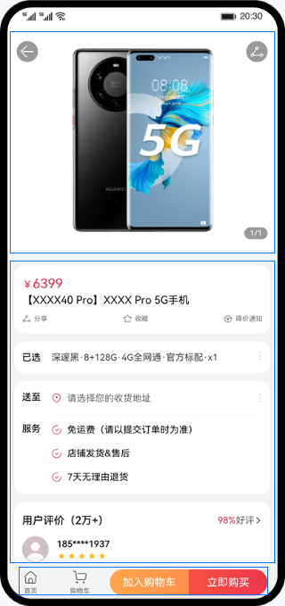
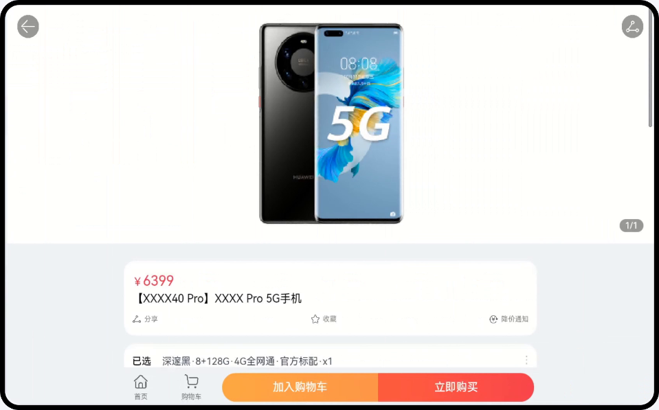
5.5 商品详情页
商品详情页整体由轮播图、商品信息、底部按钮栏组成,通过响应式布局能力的栅格布局,实现不同设备类型显示不同的效果,并通过自适应布局的拉伸能力,设置flexGrow属性使按钮位于底部。
- 在sm断点下,轮播图占4个栅格,商品信息占4个栅格,底部按钮栏占4个栅格。
- 在md断点下,轮播图占8个栅格,商品信息占8个栅格,底部按钮栏占8个栅格。
- 在lg断点下,轮播图占12个栅格,商品信息占8个栅格偏移2个栅格,底部按钮栏占8个栅格偏移2个栅格。
- // CommodityDetail.ets
- build() {
- Stack({ alignContent: Alignment.TopStart }) {
- Flex({ direction: FlexDirection.Column }) {
- Scroll() {
- GridRow({
- columns: {
- sm: GridConstants.COLUMN_FOUR,
- md: GridConstants.COLUMN_EIGHT,
- lg: GridConstants.COLUMN_TWELVE
- },
- gutter: GridConstants.GUTTER_TWELVE
- }) {
- GridCol({
- span: {
- sm: GridConstants.SPAN_FOUR,
- md: GridConstants.SPAN_EIGHT,
- lg: GridConstants.SPAN_TWELVE }
- }) {
- this.CustomSwiper(this.info.images)
- }
- GridCol({
- span: {
- sm: GridConstants.SPAN_FOUR,
- md: GridConstants.SPAN_EIGHT,
- lg: GridConstants.SPAN_EIGHT
- },
- offset: { lg: GridConstants.OFFSET_TWO }
- }) {
- Column() {
- ...
- }
- }
- }
- }
- .flexGrow(StyleConstants.FLEX_GROW)
- GridRow({
- columns: {
- sm: GridConstants.COLUMN_FOUR,
- md: GridConstants.COLUMN_EIGHT,
- lg: GridConstants.COLUMN_TWELVE
- },
- gutter: GridConstants.GUTTER_TWELVE
- }) {
- GridCol({
- span: {
- sm: GridConstants.SPAN_FOUR,
- md: GridConstants.SPAN_EIGHT,
- lg: GridConstants.SPAN_EIGHT
- },
- offset: { lg: GridConstants.OFFSET_TWO } }) {
- this.BottomMenu()
- }
- }
- }
- ...
- }
- }
手机运行效果图:
折叠屏运行效果图:

平板运行效果图:
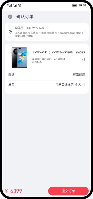
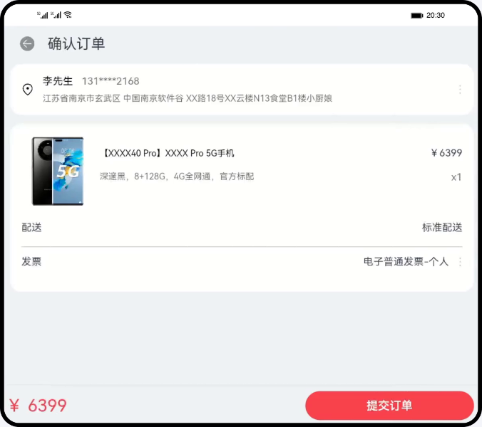
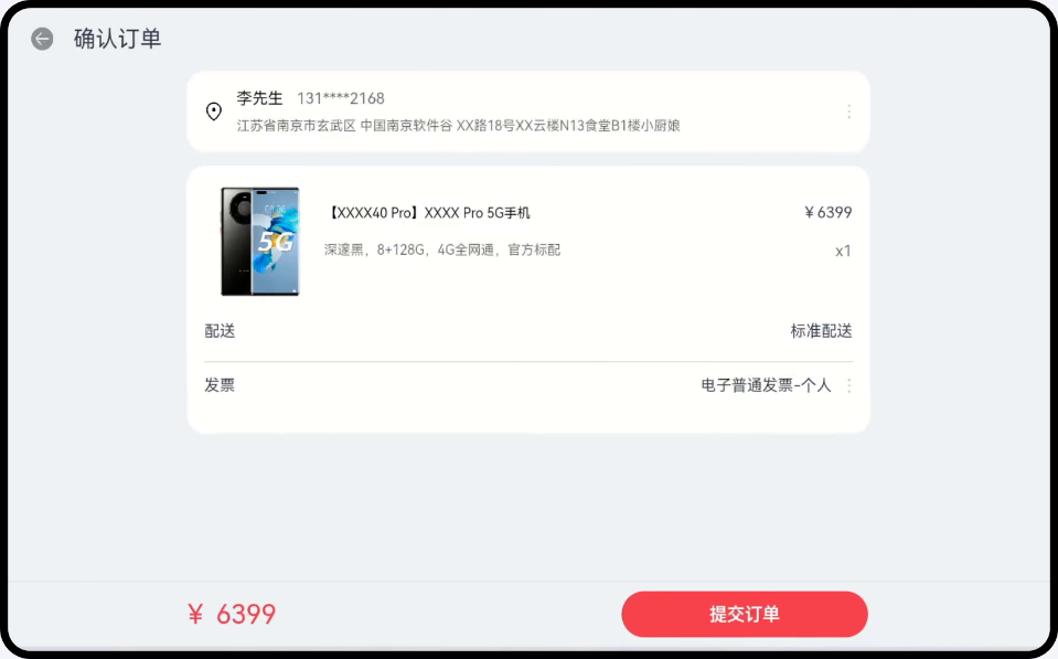
5.6 订单确认页
订单确认页由上方收件信息、订单信息、底部的总价和提交订单按钮组成,通过响应式布局的栅格布局,实现不同设备类型显示不同的效果,并通过自适应布局的拉伸能力,设置flexGrow属性使总价和提交订单按钮位于底部。
- 在sm断点下,上方收件信息和订单信息占4个栅格,底部总价占2个栅格,底部提交订单按钮占2个栅格。
- 在md断点下,上方收件信息和订单信息占8个栅格,底部总价占2个栅格,底部按钮占3个栅格偏移3个栅格。
- 在lg断点下,上方收件信息和订单信息占8个栅格偏移2个栅格,底部总价占2个栅格偏移2个栅格,底部按钮占3个栅格偏移3个栅格。
- // ConfirmOrder.ets
- build() {
- Flex({ direction: FlexDirection.Column }) {
- HeaderBar({
- ...
- })
- Column(){
- Scroll() {
- GridRow({
- columns: {
- sm: GridConstants.COLUMN_FOUR,
- md: GridConstants.COLUMN_EIGHT,
- lg: GridConstants.COLUMN_TWELVE
- }
- }) {
- GridCol({
- span: {
- sm: GridConstants.SPAN_FOUR,
- md: GridConstants.SPAN_EIGHT,
- lg: GridConstants.SPAN_EIGHT
- },
- offset: { lg: GridConstants.OFFSET_TWO }
- }) {
- Column() {
- AddressInfo()
- CommodityOrderList()
- }
- }
- }
- }
- .scrollBar(BarState.Off)
- }
- .flexGrow(StyleConstants.FLEX_GROW)
- .padding({ left: $r('app.float.vp_twelve'), right: $r('app.float.vp_twelve') })
- GridRow({
- columns: {
- sm: GridConstants.COLUMN_FOUR,
- md: GridConstants.COLUMN_EIGHT,
- lg: GridConstants.COLUMN_TWELVE
- },
- gutter: GridConstants.GUTTER_TWELVE
- }) {
- GridCol({
- span: {
- sm: GridConstants.SPAN_TWO,
- md: GridConstants.SPAN_TWO,
- lg: GridConstants.SPAN_TWO
- },
- offset: { lg: GridConstants.OFFSET_TWO }
- }) {
- Text($r('app.string.bottom_bar_amount', this.amount))
- ...
- }
- GridCol({
- span: {
- sm: GridConstants.SPAN_TWO,
- md: GridConstants.SPAN_THREE,
- lg: GridConstants.SPAN_THREE
- },
- offset: {
- md: GridConstants.OFFSET_THREE,
- lg: GridConstants.OFFSET_THREE
- }
- }) {
- Button($r('app.string.bottom_bar_button'))
- ...
- }
- }
- ...
- }
- ...
- }
手机运行效果图:
折叠屏运行效果图:
平板运行效果图:
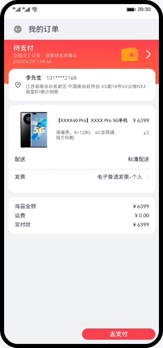
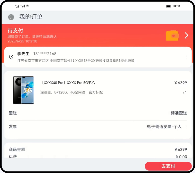
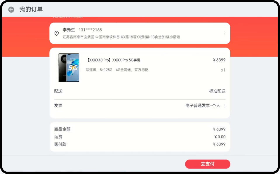
5.7 订单支付页
订单支付页整体由上方订单信息和底部的去支付按钮组成,通过使用响应式布局的栅格布局实现不同设备类型显示不同效果,并通过自适应布局的拉伸能力,设置flexGrow属性使去支付按钮位于底部。
- 在sm断点下,上方订单信息占4个栅格,底部去支付按钮占2个栅格偏移2个栅格。
- 在md断点下,上方订单信息占8个栅格,底部去支付按钮占2个栅格偏移6个栅格。
- 在lg断点下,上方订单信息占8个栅格偏移2个栅格,底部去支付按钮占2个栅格偏移8个栅格。
- // PayOrder.ets
- build() {
- Flex({ direction: FlexDirection.Column }) {
- HeaderBar({
- ...
- })
- Stack({ alignContent: Alignment.TopStart }) {
- ...
- Column() {
- Scroll() {
- GridRow({
- columns: {
- sm: GridConstants.COLUMN_FOUR,
- md: GridConstants.COLUMN_EIGHT,
- lg: GridConstants.COLUMN_TWELVE
- }
- }) {
- GridCol({
- span: {
- sm: GridConstants.SPAN_FOUR,
- md: GridConstants.SPAN_EIGHT,
- lg: GridConstants.SPAN_EIGHT
- },
- offset: { lg: GridConstants.OFFSET_TWO }
- }) {
- Column() {
- this.OrderStatus()
- ...
- }
- }
- }
- }
- .scrollBar(BarState.Off)
- }
- .padding({ left: $r('app.float.vp_twelve'), right: $r('app.float.vp_twelve') })
- }
- .flexGrow(StyleConstants.FLEX_GROW)
-
- GridRow({
- columns: {
- sm: GridConstants.COLUMN_FOUR,
- md: GridConstants.COLUMN_EIGHT,
- lg: GridConstants.COLUMN_TWELVE
- }
- }) {
- GridCol({
- span: {
- sm: GridConstants.SPAN_TWO,
- md: GridConstants.SPAN_TWO,
- lg: GridConstants.SPAN_TWO
- },
- offset: {
- sm: GridConstants.OFFSET_TWO,
- md: GridConstants.OFFSET_SIX,
- lg: GridConstants.OFFSET_EIGHT
- }
- }) {
- this.BottomBar()
- }
- }
- }
- ...
- }
手机运行效果图:
折叠屏运行效果图:
平板运行效果图:
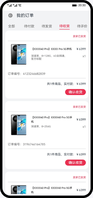
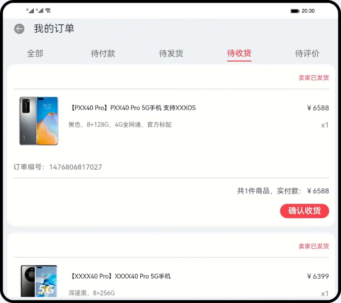
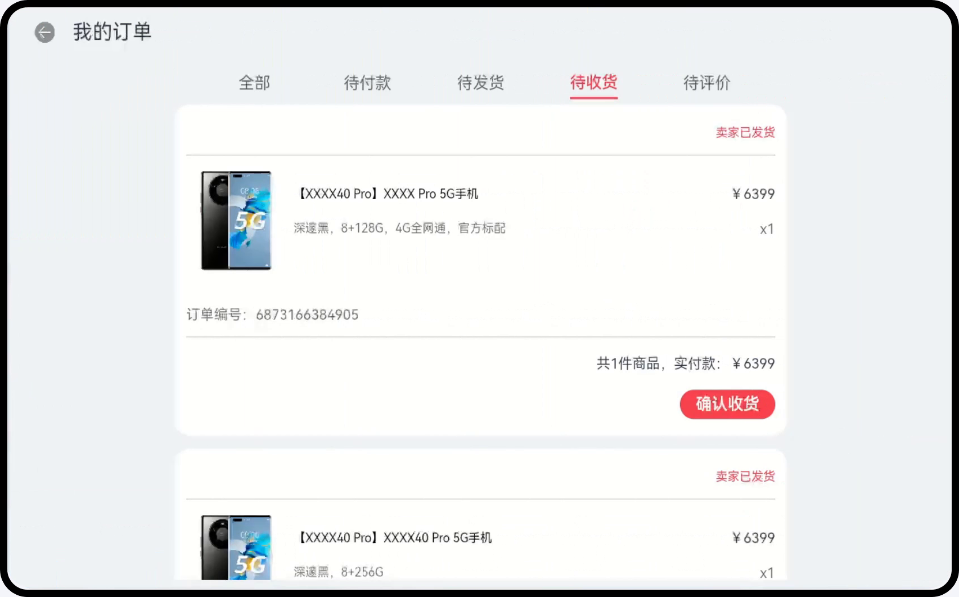
5.8 订单列表页
订单列表页整体布局通过响应式布局的栅格布局,实现不同设备类型显示不同的效果。
- 在sm断点下,整体UX占4个栅格。
- 在md断点下,整体UX占8个栅格。
- 在lg断点下,整体UX占8个栅格偏移2个栅格。
- // OrderListContent.ets
- build() {
- Column() {
- Scroll() {
- GridRow({
- columns: {
- sm: GridConstants.COLUMN_FOUR,
- md: GridConstants.COLUMN_EIGHT,
- lg: GridConstants.COLUMN_TWELVE
- }
- }) {
- GridCol({
- span: {
- sm: GridConstants.SPAN_FOUR,
- md: GridConstants.SPAN_EIGHT,
- lg: GridConstants.SPAN_EIGHT
- },
- offset: { lg: GridConstants.OFFSET_TWO }
- }) {
- Column() {
- ...
- }
- }
- }
- }
- .scrollBar(BarState.Off)
- }
- ...
- }
手机运行效果图:
折叠屏运行效果图:
平板运行效果图:
六. 总结
您已经完成了本次Codelab的学习,并了解到以下知识点:
- 针对不同屏幕尺寸的设备完成一次开发,多端部署页面设计。
- 按照三层工程结构划分模块、组织代码。
- 通过自适应布局、响应式布局、栅格布局实现一次开发,多端部署。

