
- 1vue-cli安装scss,element-ui,md5,vuex_./src/styles/common.scss
- 2小程序二级页面tabbar_微信小程序自定义tabbar
- 3目标检测算法 YOLOv8 原理解析|包揽目标检测、实例分割 SOTA_yolov8算法
- 4npm安装时一直idealTree:npm: sill idealTree buildDeps解决方案
- 5基于C#的AE二次开发之地图放大、缩小、平移、漫游、选择等等_ae开发arcmap10.2c#地图放大缩小
- 6python中Turtle的方向介绍_python turtle面向方向
- 7前端开发之el-table 表头不换行且宽度自适应
- 8SystemUI架构分析学习
- 9Docker存储空间清理
- 10Uipath 学习栏目基础教学:8、uipath 屏幕抓取获取文本_uipath获取文本
ant design Form 组件总结 结合Modal 自定义Modal的实现 (Upload Input Select DatePicker Cascader)_modalform 退出,渲染oncancel
赞
踩
起源
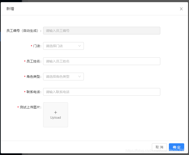
最近在项目中发现要写多个弹框(用于查看、编辑、新建XX信息),如下图。
像这样花里胡哨的弹框在一个大型的中台管理系统中,可能要写上好几遍的Modal
但是其实他们大同小异。
首先,他们的title是固定的(增、改、查)
底下的内容也是固定的,无非就是Upload Input Select DatePicker Cascader
(写不了<>。其实应该是ant design 的组件)
改进
所以我想自己写一个ModalView的组件。只需要传入这上面的数据类型,title之类的数据就可以完成渲染。
如下,这个是我项目中的一个例子
<ModalView
          onOk={this.edit}     // 点击Modal确定时的回调
          onCancel={this.hideModal}   // 点击Modal取消,或者点击mask时的回调
          show={visible}        // Modal的显隐
          category={category}      // Modal的title,通过category来判断(目前只有查看、编辑、新增)
          data={fStaffManage}     // 自定义Modal的核心,整个Modal的渲染
          showData={showData}    // 点击查看和编辑时的默认数据
/>
- 1
- 2
- 3
- 4
- 5
- 6
- 7
- 8
接下来是fStaffManage的数据结构
export const fStaffManage = [
  {
    label: '员工编号(自动生成)',
    key: 'id',
    type: 'input',
    Message: '请输入员工编号',
    disabled: true,
  },
  {
    label: '门店',
    key: 'storeNo',
    type: 'select',
    Message: '请选择门店',
    option: [],
  },
  {
    label: '员工姓名',
    key: 'userName',
    type: 'input',
    Message: '请输入员工姓名',
  },
  {
    label: '角色类型',
    key: 'roleCodes',
    type: 'select',
    Message: '请选择角色类型',
    option: [{ severKey: '店员', showValue: '店员' }, { severKey: '店长', showValue: '店长' }],
  },
  {
    label: '联系电话',
    key: 'mobile',
    type: 'input',
    Message: '请输入联系电话',
    pattern: '^1[34578]\\d{9}$',
  },
  {
    label: '测试上传图片',
    key: 'testImgUpload',
    type: 'imageUpload',
    Message: '请上传图片',
  },
];

- 1
- 2
- 3
- 4
- 5
- 6
- 7
- 8
- 9
- 10
- 11
- 12
- 13
- 14
- 15
- 16
- 17
- 18
- 19
- 20
- 21
- 22
- 23
- 24
- 25
- 26
- 27
- 28
- 29
- 30
- 31
- 32
- 33
- 34
- 35
- 36
- 37
- 38
- 39
- 40
- 41
- 42
Message 是用于Form表单的提示用于以及placeholder
label 是用于Form的label
key 是用于map循环时的key(防止warning和提升效率)
type 是用于显示那种类型的组件
pattern 是用于Form表单检测的正则表达式
/*
 * @Author: Derrick
 * @Date: 2019-04-04 16:53:05
 * @Last Modified by: Derrick
 * @Last Modified time: 2019-04-28 15:48:04
 */
import React, { PureComponent } from 'react';
import { Modal, Form, Button, Table, Upload, message, Row, Select } from 'antd';
import { connect } from 'dva';
import PropTypes from 'prop-types';
import componentAuth from '@/common/ComponentAuth';
import FormSelect from '@/common/FormItems/FormSelect';
import FormInput from '@/common/FormItems/FormInput';
import FormDataPicker from '@/common/FormItems/FormDataPicker';
import FormCascader from '@/common/FormItems/FormCascader';
import FormTextArea from '@/common/FormItems/FormTextArea';
import FormImageUpload from '@/common/FormItems/FormImageUpload';
import { HEADER_BASE, SEVER_URL_BASE } from '@/utils/constant';
import Col from 'antd/es/col';

const formItemLayout = {
  labelCol: {
    xs: { span: 24 },
    sm: { span: 5 },
  },
  wrapperCol: {
    xs: { span: 24 },
    sm: { span: 16 },
  },
};
const { Item } = Form;
const { Option } = Select;

@connect(({ mIdentifyCenter }) => ({
  mIdentifyCenter
}))
class ModalView extends PureComponent {
  state = {
    data: [],
    storeId: '',
  };

  // 返回title
  caseCategory = category => {
    switch (category) {
      case 'check':
        return { title: '查看' };
      case 'import':
        return { title: '导入', import: true };
      case 'create':
        return { title: '新增' };
      case 'edit':
        return { title: '编辑' };
      default:
        return { title: '查看' };
    }
  };

  showLabel = (type, label) => {
    const { category } = this.props;

    if (category === 'search') {
      if (type !== 'datePicker') {
        return undefined;
      }
      return label;
    }
    return label;
  };

  showRequire = disabled => {
    const { category } = this.props;
    if (category === 'search') {
      return false;
    }
    if (disabled) {
      return false;
    }
    return true;
  };

  form = () => {
    const {
      form: { getFieldDecorator },
      data,
      showData,
      category,
    } = this.props;

    let ShowType;

    return data.map(value => {
      const { label, key, type, Message, option, disabled, pattern } = value;
      if (!value) {
        return null;
      }
      switch (type) {
        case 'input':
          ShowType = FormInput;
          break;
        case 'select':
          ShowType = FormSelect;
          break;
        case 'datePicker':
          ShowType = FormDataPicker;
          break;
        case 'cascader':
          ShowType = FormCascader;
          showData.region = [showData.provinceId, showData.cityId, showData.countyId];
          break;
        case 'textArea':
          ShowType = FormTextArea;
          break;
        case 'imageUpload':
          ShowType = FormImageUpload;
          break;
        default:
          ShowType = null;
      }
      return (
        <Item label={this.showLabel(type, label)} key={key}>
          {getFieldDecorator(key, {
            rules: [
              {
                required: this.showRequire(disabled),
                message: Message,
                pattern: pattern || undefined,
                type: type === 'cascader' ? 'array' : 'string',
              },
            ],
            initialValue: showData[key] ? showData[key] : undefined,
          })(
            <ShowType
              option={option}
              message={Message}
              disabled={!!(disabled || category === 'check')}
            />
          )}
        </Item>
      );
    });
  };

  checkOk = () => {
    const { onOk, form } = this.props;
    form.validateFields((err, fieldsValue) => {
      if (!err) {
        onOk(fieldsValue);
      }
    });
  };

  closeModal = () => {
    const { onCancel, form: { resetFields } } = this.props;
    resetFields();
    onCancel();
  }

  render() {
    const { data } = this.state;
    const { show, category = '', importColums, downloadUrl } = this.props;
    const modalData = this.caseCategory(category);
    return (
      <Modal
        visible={show}
        onCancel={this.closeModal}
        onOk={category === 'import' ? this.importOk : this.checkOk}
        title={modalData.title}
        width="70%"
        footer={modalData.title === '查看' ? null : undefined}
      >
          <Form style={{ paddingTop: '20px' }} {...formItemLayout}>
            {this.form()}
          </Form>
      </Modal>
    );
  }
}

ModalView.propTypes = {
  onOk: PropTypes.func.isRequired, // 弹框点击确定
  onCancel: PropTypes.func.isRequired, // 隐藏弹框
  show: PropTypes.bool, // 是否显示弹窗
  category: PropTypes.string, // 弹框的类型(title显示
  data: PropTypes.arrayOf(PropTypes.object).isRequired, // 数据类型; 位置:'@/common/constant/sormView.js' 记得写注释; 格式: `s${文件名}`
  showData: PropTypes.object, // 查看或者编辑时的默认数据
  importCallBack: PropTypes.func, // 导入之后,点击确定的回调函数
  importColums: PropTypes.array, // 导入时候显示表格的表头
  downloadUrl: PropTypes.string, // 下载的模板的文件名
};

ModalView.defaultProps = {
  show: false,
  category: 'check',
  showData: {},
  importCallBack: () => {},
  importColums: [],
  downloadUrl: '',
};

export default Form.create()(ModalView);
- 1
- 2
- 3
- 4
- 5
- 6
- 7
- 8
- 9
- 10
- 11
- 12
- 13
- 14
- 15
- 16
- 17
- 18
- 19
- 20
- 21
- 22
- 23
- 24
- 25
- 26
- 27
- 28
- 29
- 30
- 31
- 32
- 33
- 34
- 35
- 36
- 37
- 38
- 39
- 40
- 41
- 42
- 43
- 44
- 45
- 46
- 47
- 48
- 49
- 50
- 51
- 52
- 53
- 54
- 55
- 56
- 57
- 58
- 59
- 60
- 61
- 62
- 63
- 64
- 65
- 66
- 67
- 68
- 69
- 70
- 71
- 72
- 73
- 74
- 75
- 76
- 77
- 78
- 79
- 80
- 81
- 82
- 83
- 84
- 85
- 86
- 87
- 88
- 89
- 90
- 91
- 92
- 93
- 94
- 95
- 96
- 97
- 98
- 99
- 100
- 101
- 102
- 103
- 104
- 105
- 106
- 107
- 108
- 109
- 110
- 111
- 112
- 113
- 114
- 115
- 116
- 117
- 118
- 119
- 120
- 121
- 122
- 123
- 124
- 125
- 126
- 127
- 128
- 129
- 130
- 131
- 132
- 133
- 134
- 135
- 136
- 137
- 138
- 139
- 140
- 141
- 142
- 143
- 144
- 145
- 146
- 147
- 148
- 149
- 150
- 151
- 152
- 153
- 154
- 155
- 156
- 157
- 158
- 159
- 160
- 161
- 162
- 163
- 164
- 165
- 166
- 167
- 168
- 169
- 170
- 171
- 172
- 173
- 174
- 175
- 176
- 177
- 178
- 179
- 180
- 181
- 182
- 183
- 184
- 185
- 186
- 187
- 188
- 189
- 190
- 191
- 192
- 193
- 194
- 195
- 196
- 197
- 198
- 199
- 200
- 201
- FormCascader
/*
 * @Author: Derrick
 * @Date: 2019-04-11 09:57:54
 * @Last Modified by: Derrick
 * @Last Modified time: 2019-04-28 16:52:57
 */
import React, { Component } from 'react';
import { Cascader } from 'antd';
import PropTypes from 'prop-types';
import regionData from '@/constant/regionData'

class FormCascader extends Component {

  change = (e) => {
    const {onChange} = this.props;
    onChange(e)
  }

  render() {
    const {value, disabled, message} = this.props;
    return (
      <Cascader placeholder={message} options={regionData} disabled={disabled} value={value} onChange={this.change} />
    );
  }
}

FormCascader.propsType = {
  disabled: PropTypes.bool, // 是否不可选
  message: PropTypes.string, // 默认文字(placeholder
}

FormCascader.defalutProps = {
  disabled: false,
  message: '',
}

export default FormCascader;
- 1
- 2
- 3
- 4
- 5
- 6
- 7
- 8
- 9
- 10
- 11
- 12
- 13
- 14
- 15
- 16
- 17
- 18
- 19
- 20
- 21
- 22
- 23
- 24
- 25
- 26
- 27
- 28
- 29
- 30
- 31
- 32
- 33
- 34
- 35
- 36
- 37
- FormDataPicker
/*
 * @Author: Derrick
 * @Date: 2019-04-10 10:57:08
 * @Last Modified by: Derrick
 * @Last Modified time: 2019-04-15 14:28:40
 */
import React, { Component } from 'react';
import PropTypes from 'prop-types';
import { DatePicker } from 'antd';

class FormDataPicker extends Component {

  change = (e) => {
    const {onChange} = this.props
    onChange(e)
  }

  render() {
    const {value, disabled} = this.props;
    return (
      <DatePicker disabled={disabled} value={value} onChange={this.change} />
      );
  }
}

FormDataPicker.propsType = {
  disabled: PropTypes.bool, // 是否不可选
}

FormDataPicker.defalutProps = {
  disabled: false,
}

export default FormDataPicker;
- 1
- 2
- 3
- 4
- 5
- 6
- 7
- 8
- 9
- 10
- 11
- 12
- 13
- 14
- 15
- 16
- 17
- 18
- 19
- 20
- 21
- 22
- 23
- 24
- 25
- 26
- 27
- 28
- 29
- 30
- 31
- 32
- 33
- 34
- FormImageUpload
/*
 * @Author: Derrick
 * @Date: 2019-04-26 14:20:20
 * @Last Modified by: Derrick
 * @Last Modified time: 2019-04-28 18:11:44
 */
import React, { PureComponent } from 'react';
import { Upload, Icon, message } from 'antd';
import { PICTURE_UPLOAD, HEADER_BASE } from '@/utils/constant';

class FormImageUpload extends PureComponent {

  state = {
    loading: false,
  };

  uploadButton = () => {
    const { loading } = this.state;
    return (
      <div>
        <Icon type={loading ? 'loading' : 'plus'} />
        <div className="ant-upload-text">Upload</div>
      </div>
    )
  }

  handleChange = (info) => {
    if (info.file.status === 'uploading') {
      this.setState({ loading: true });
      return;
    }
    if (info.file.status === 'done') {
      const {onChange} = this.props
      this.setState({imageUrl: info.file.response.data[0], loading: false,})
      onChange(info.file.response.data[0])
    }
  }

  beforeUpload = (file) => {
    const isJPG = file.type === 'image/jpeg';
    if (!isJPG) {
      message.error('只能上传JPG的图片!');
    }
    const isLt2M = file.size / 1024 / 1024 < 2;
    if (!isLt2M) {
      message.error('图片大小不能大于2MB!');
    }
    return isJPG && isLt2M;
  }

  upLoadProps = () => {
    HEADER_BASE.user_id = window.sessionStorage.getItem('userId');
    HEADER_BASE.token_id = window.sessionStorage.getItem('tokenId');
    const props = {
      name: 'file',
      action: PICTURE_UPLOAD,
      headers: HEADER_BASE,
      onChange: this.handleChange,
      showUploadList: false,
      beforeUpload: this.beforeUpload,
    };
    return props;
  };

  render() {

    const { imageUrl } = this.state;

    return (
      <Upload
        listType="picture-card"
        {...this.upLoadProps()}

      >
        {imageUrl ? <img src={imageUrl} alt="avatar" /> : this.uploadButton()}
      </Upload>
    )
  }
}

export default FormImageUpload;
- 1
- 2
- 3
- 4
- 5
- 6
- 7
- 8
- 9
- 10
- 11
- 12
- 13
- 14
- 15
- 16
- 17
- 18
- 19
- 20
- 21
- 22
- 23
- 24
- 25
- 26
- 27
- 28
- 29
- 30
- 31
- 32
- 33
- 34
- 35
- 36
- 37
- 38
- 39
- 40
- 41
- 42
- 43
- 44
- 45
- 46
- 47
- 48
- 49
- 50
- 51
- 52
- 53
- 54
- 55
- 56
- 57
- 58
- 59
- 60
- 61
- 62
- 63
- 64
- 65
- 66
- 67
- 68
- 69
- 70
- 71
- 72
- 73
- 74
- 75
- 76
- 77
- 78
- 79
- 80
- 81
- FormInput
/*
 * @Author: Derrick
 * @Date: 2019-04-10 10:57:08
 * @Last Modified by: Derrick
 * @Last Modified time: 2019-04-15 14:46:23
 */
import React, { Component } from 'react';
import { Input } from 'antd';
import PropTypes from 'prop-types';

class FormInput extends Component {

  change = (e) => {
    const {onChange} = this.props;
    onChange(e)
  }

  render() {
    const {message, value, disabled} = this.props;
    return (
      <Input disabled={disabled} placeholder={message} value={value} onChange={this.change} />
      );
  }
}

FormInput.propsType = {
  disabled: PropTypes.bool, // 是否不可选
  message: PropTypes.string, // 默认文字(placeholder
}

FormInput.defalutProps = {
  disabled: false,
  message: '',
}

export default FormInput;
- 1
- 2
- 3
- 4
- 5
- 6
- 7
- 8
- 9
- 10
- 11
- 12
- 13
- 14
- 15
- 16
- 17
- 18
- 19
- 20
- 21
- 22
- 23
- 24
- 25
- 26
- 27
- 28
- 29
- 30
- 31
- 32
- 33
- 34
- 35
- 36
- FormSelect
/*
 * @Author: Derrick
 * @Date: 2019-04-10 10:13:58
 * @Last Modified by: Derrick
 * @Last Modified time: 2019-04-28 15:59:22
 */
import React, { Component } from 'react';
import { Select } from 'antd';
import PropTypes, { object } from 'prop-types';

const { Option } = Select;
class FormSelect extends Component {

  option = () => {
    const {option = []} = this.props;
    return option.map((v) => {
      const {showValue, severKey} = v;
      return <Option value={severKey} key={severKey}>{showValue}</Option>
    })
  }

  selectCurrency = (e) => {
    const {onChange} = this.props
    onChange(e)
  }

  render() {
    const {message, value, disabled} = this.props;
    return (
      <Select disabled={disabled} value={value} placeholder={message} style={{width: '170px'}} onSelect={this.selectCurrency}>
        {this.option()}
      </Select>
      );
  }
}

FormSelect.propsType = {
  disabled: PropTypes.bool, // 是否不可选
  message: PropTypes.string, // 默认文字(placeholder
  option: PropTypes.arrayOf(object), // 选择框的选项
}

FormSelect.defalutProps = {
  disabled: false,
  message: '',
  option: [],
}

export default FormSelect;
- 1
- 2
- 3
- 4
- 5
- 6
- 7
- 8
- 9
- 10
- 11
- 12
- 13
- 14
- 15
- 16
- 17
- 18
- 19
- 20
- 21
- 22
- 23
- 24
- 25
- 26
- 27
- 28
- 29
- 30
- 31
- 32
- 33
- 34
- 35
- 36
- 37
- 38
- 39
- 40
- 41
- 42
- 43
- 44
- 45
- 46
- 47
- 48
- 49
- FormTextArea
/*
 * @Author: Derrick
 * @Date: 2019-04-23 10:20:36
 * @Last Modified by: Derrick
 * @Last Modified time: 2019-04-23 10:21:33
 */
import React, { Component } from 'react';
import { Input } from 'antd';
import PropTypes from 'prop-types';

const { TextArea } = Input;
class FormTextArea extends Component {

  change = (e) => {
    const {onChange} = this.props;
    onChange(e)
  }

  render() {
    const {message, value, disabled} = this.props;
    return (
      <TextArea rows={4} disabled={disabled} placeholder={message} value={value} onChange={this.change} />
      );
  }
}

FormTextArea.propsType = {
  disabled: PropTypes.bool, // 是否不可选
  message: PropTypes.string, // 默认文字(placeholder
}

FormTextArea.defalutProps = {
  disabled: false,
  message: '',
}

export default FormTextArea;
- 1
- 2
- 3
- 4
- 5
- 6
- 7
- 8
- 9
- 10
- 11
- 12
- 13
- 14
- 15
- 16
- 17
- 18
- 19
- 20
- 21
- 22
- 23
- 24
- 25
- 26
- 27
- 28
- 29
- 30
- 31
- 32
- 33
- 34
- 35
- 36
- 37
核心
const {onChange} = this.props;
onChange(XX)
- 1
- 2
这个onChange是可以直接改变FormItem的值。
接下来可以加入您自己喜欢的组件,都是大同小异,基本上都离不开这个onChange。
以上就是本人最近封装的一个组件,我感觉很好用所以想分享出来。
项目源码(最近公司的项目就是在我原来的Web控制台上面做的,我个人比较走心,可能没有太多时间更新这个,因为都是重复性的工作。但是服务端还是会继续探索的,如果 有时间的话。)
(服务端)
https://github.com/DerrickTel/YiJiClientServer
(Web控制台(React))
https://github.com/DerrickTel/YiJiWeb
(RN APP端)
https://github.com/DerrickTel/YiJi

