
- 1Linux Ubuntu如何使用Docker部署Redis并实现公网远程访问本地数据库_修改redis容器可以远程连接
- 2华为设备核查命令下
- 3【深度学习】如何选择适合你的模型训练方法:Fine Tuning、DreamBooth、LoRA与Textual Inversion详细指南_dreambooth lora模型训练和lora
- 4Windows下的TCP UDP网络调试工具-NetAssist以及Linux下的nc网络调试工具_tcp网络调试工具(1)
- 5【性能测试】ChaosTesting(混沌测试)&ChaosBlade(混沌实验工具)(三)-docker容器混沌实验_混沌测试工具命令
- 6【洛谷算法题】B2025-输出字符菱形【入门1顺序结构】Java题解_洛谷如何用java输出字符串
- 7基于springboot的人事管理系统_人事系统开源框架
- 8【点云处理教程】05-Python 中的点云分割_点云目标数据的分割教程及步骤
- 9入职嵌入式开发,第三个星期开始让写代码,要求两周完成,但是完全不会写怎么办?_试用期多久开始写代码
- 10学习html+css+js笔记_mkqqpr
微信小程序开发-实现选项切换功能,通过实现微信小程序页面滑动功能,同一页面设置多个选项,可以切换显示不同选项,实现选项的显示和隐藏,新手级教程_微信小程序选项卡切换怎么实现
赞
踩
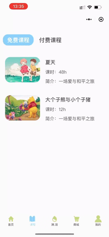
需求背景:通过实现微信小程序页面滑动功能,可以在同一个页面设置多个选项,并切换显示不同选项,实现选项的显示和隐藏。
使用的开发工具为:微信小程序开发工具
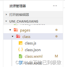
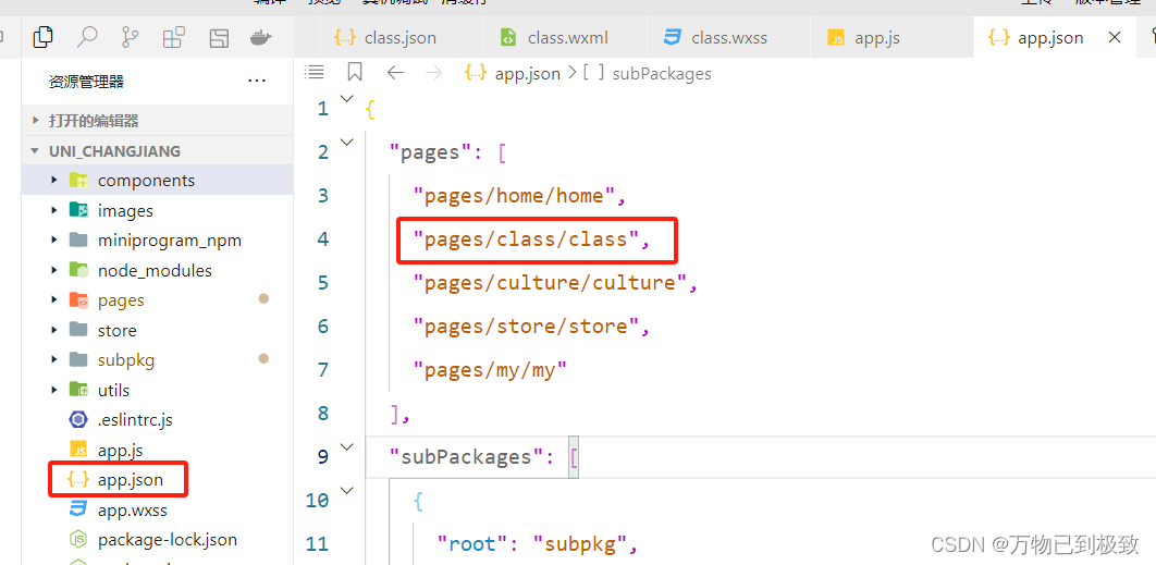
在微信小程序中的page目录下的新建class页面,并在app.json文件中的"pages"数组里面配置class路径,这样才会显示出这个页面
接着执行以下操作,读者可根据代码示例与代码说明、注释结合来看,并根据实际需求来做调整:
第一步:在class页面的js文件中,使用小程序框架提供的 Page() 函数来创建页面实例,并将需要绑定的数据和事件处理函数添加到实例中。在小程序运行时,这些数据和函数将被绑定到对应的页面元素上,以实现数据驱动和交互功能。
代码示例:
- // pages/class/class.js
- Page({
-
- /**
- * 页面的初始数据
- */
- data: {
- // tab选项
- tabList: [
- {title: "免费课程",index: "0",},
- {title: "付费课程",index: "1",}
- ],
- tabsId: 0, //默认选型为免费课程
- },
- // 滑动时触发的事件
- slideOn(e) {
- // 拿到当前索引并动态改变
- this.setData({
- tabsId: e.detail.current
- })
- },
-
- //点击tab时触发
- tabsOn(e) {
- this.setData({
- //拿到当前索引并动态改变
- tabsId: e.currentTarget.dataset.idx
- })
- },
-
- })

代码说明:
1. `data` 对象定义了页面的初始数据。其中包含了两个属性:
- `tabList` 是一个数组,包含了两个对象,每个对象表示一个选项卡。每个选项卡对象有两个属性:`title` 表示选项卡标题,`index` 表示选项卡的索引。
- `tabsId` 是一个数字,表示当前选中的选项卡的索引,默认为 0。
2. `slideOn(e)` 函数是滑动时触发的事件处理函数。当滑动到不同的选项卡时,通过获取滑动事件 `e.detail.current` 的值来动态改变当前选中的选项卡索引,并更新到 `tabsId` 中。
3. `tabsOn(e)` 函数是点击选项卡时触发的事件处理函数。通过获取点击事件 `e.currentTarget.dataset.idx` 的值来动态改变当前选中的选项卡索引,并更新到 `tabsId` 中。
第二步:在class页面的js文件中引用van图标组件
代码示例:
- // pages/class/class.json
- {
- "usingComponents": {
- "van-icon": "@vant/weapp/icon/index"// 引用van图标组件
- }
- }
第三步:在class页面的wxml的文件中来做一个页面布局,通过循环渲染选项卡并监听滑动事件来实现在不同内容之间进行切换,并且根据当前选择的选项卡显示对应内容。
代码示例:
- <!--pages/class/class.wxml-->
- <view class="top-box">
- <!-- Tab布局 -->
- <view class="navBox">
- <view class="titleBox" wx:for="{{tabList}}" wx:key="index" bindtap="tabsOn" data-idx="{{item.index}}">
- <text class="{{item.index == tabsId ? 'fontColorBox' : ''}}">{{item.title}}</text>
- </view>
- </view>
- <!-- 内容布局 -->
- <swiper class="swiperTtemBox" bindchange="slideOn" current="{{tabsId}}" circular>
- <!-- circular 启用循环滑动 -->
- <swiper-item>
- <view class="buttum-free-box">
- <view class="buttum-free-box1">
- <view class="buttum-free-img1">
- <image class="img1" src="https://ts1.cn.mm.bing.net/th/id/R-C.3de08811a0039edc107724a80006d99d?rik=ORTjMJ2MD0JMCQ&riu=http%3a%2f%2fpic.rmb.bdstatic.com%2f3de08811a0039edc107724a80006d99d.jpeg&ehk=8MwsIqU00BkjlfPY8jS47noobfo7y4Zvh9aKHoBPzRc%3d&risl=&pid=ImgRaw&r=0" mode="aspectFill"/>
- </view>
- <view class="buttum-free-txt">
- <text class="buttum-free-text1">夏天</text>
- <text class="buttum-free-text2">课时:48h</text>
- <text class="buttum-free-text3">简介:一场爱与和平之旅</text>
- </view>
-
- </view>
- <view class="buttum-free-box2">
- <view class="buttum-free-img2">
- <image class="img2" src="https://2f.zol-img.com.cn/product/144/343/ceyLgJjKf4U6.jpg" mode="aspectFill"/>
- </view>
- <view class="buttum-free-txt">
- <text class="buttum-free-text1">大个子熊与小个子猪</text>
- <text class="buttum-free-text2">课时:12h</text>
- <text class="buttum-free-text3">简介:一场爱与和平之旅</text>
- </view>
-
- </view>
-
- </view>
- </swiper-item>
- <swiper-item>
- <!-- 第一行 -->
- <view class="buttum-pay-line1">
- <text class="buttum-pay-line1-text">一年级语文</text>
- <view class="pay-icon1">
- <image class="queen" src="/images/tabs/皇冠-黄色.png"></image>
- <text class="pay-icon1-num">18/40</text>
- </view>
- </view>
- <!-- 第二行 -->
- <view class="buttum-pay-line2">
- <view class="buttum-pay-left-box">
- <view class="Unit">Unit 1</view>
- <view class="queenANDschedule">
- <image class="queen1" src="/images/tabs/皇冠-灰色.png" mode="aspectFill"></image>
- <image class="queen2" src="/images/tabs/皇冠-黄色.png" mode="aspectFill"></image>
- <view class="scheduleout">
- <view class="schedulein"></view>
- </view>
- </view>
- </view>
- <view class="buttum-pay-right-box">
- <image class="lock" src="/images/tabs/锁.png"></image>
- </view>
- </view>
-
- <!-- 第三行 -->
- <view class="buttum-pay-line1">
- <text class="buttum-pay-line1-text">绘本</text>
- <view class="pay-icon1">
- <image class="queen" src="/images/tabs/皇冠-黄色.png"></image>
- <text class="pay-icon1-num">18/40</text>
- </view>
- </view>
- <!-- 第四行 -->
- <view class="buttum-pay-line2">
- <view class="buttum-pay-left-box">
- <view class="Unit">Unit 1</view>
- <view class="queenANDschedule">
- <image class="queen1" src="/images/tabs/皇冠-灰色.png" mode="aspectFill"></image>
- <image class="queen2" src="/images/tabs/皇冠-黄色.png" mode="aspectFill"></image>
- <view class="scheduleout">
- <view class="schedulein"></view>
- </view>
- </view>
- </view>
- <view class="buttum-pay-right-box">
- <image class="lock" src="/images/tabs/锁.png"></image>
- </view>
- </view>
- </swiper-item>
- </swiper>
-
- </view>
代码说明:
1. `<view class="top-box">...</view>`:顶部容器,包含了选项卡和内容布局。
2. `<view class="navBox">...</view>`:选项卡容器,用于展示选项卡列表。
3. `<view class="titleBox" wx:for="{{tabList}}" wx:key="index" bindtap="tabsOn" data-idx="{{item.index}}">...</view>`:每个选项卡的容器。通过 `wx:for` 循环遍历 `tabList` 数组,并使用 `bindtap` 绑定点击事件处理函数 `tabsOn`。使用 `data-idx="{{item.index}}"` 将当前选项卡的索引传递给事件处理函数。
4. `<text class="{{item.index == tabsId ? 'fontColorBox' : ''}}">{{item.title}}</text>`:选项卡标题文本。根据当前选中的选项卡索引与循环遍历的索引进行比较,如果相等则添加 `fontColorBox` 样式类,用于标识当前选中的选项卡。
5. `<swiper class="swiperTtemBox" bindchange="slideOn" current="{{tabsId}}" circular>...</swiper>`:内容布局容器,使用滑动视图来实现切换不同内容区域。
6. `<swiper-item>...</swiper-item>`:每个内容区域的容器。可以包含不同的子元素来展示不同内容。
在这段代码中,有两个 swiper-item 子元素用于展示免费课程和付费课程的内容。每个 swiper-item 中包含了一些 view 元素和 image 元素来展示具体的课程信息、图片等。根据需要可以添加更多 swiper-item 来展示更多不同类型的内容。
第四步:在class页面的WXSS文件中设置页面的样式,包含了选项卡、免费课程和付费课程等元素的样式。
代码示例:
- /* pages/class/class.wxss */
- .top-box {
- padding: 0 10px;
- }
-
-
- /* 选项事件盒子 */
- .navBox {
- /* tab整体样式 */
- height: 100rpx;
- display: flex;
- align-items: center;
- position: relative;
- bottom: -25px;
- left: -10px;
- }
-
- .fontColorBox {
- /* 选中tab样式 */
- color: white;
-
- font-weight: bold;
- display: flex;
- flex-direction: column;
- align-items: center;
- justify-content: center;
- background-color: #8ad1fa;
- height: 40px;
- width: 110px;
- border-radius: 18px;
- }
-
- .titleBox {
- /* 未选中tab样式 */
- color: #565656;
- font-size: 20px;
- font-weight: 700;
- display: flex;
- flex-direction: column;
- align-items: center;
- padding: 0 10px;
- }
-
- .swiperTtemBox {
- /* 内容样式 */
- padding: 16rpx;
- height: calc(100vh - 150rpx);
- }
- .buttum-free-box {
- display: flex;
- flex-direction: column;
- justify-content: space-between;
- padding: 100rpx 0;
-
- }
- .buttum-free-box1 {
- display: flex;
- justify-content: space-between;
- width: 330px;
- }
- .buttum-free-box2 {
- display: flex;
- justify-content: space-between;
- width: 330px;
- position: relative;
- bottom: -30px;
- }
- .img1 {
- height: 90px;
- width: 125px;
- border-radius: 18px;
- }
- .img2 {
- height: 90px;
- width: 125px;
- border-radius: 18px;
- position: relative;
- bottom: -3px;
- }
- .buttum-free-txt {
- display: flex;
- flex-direction: column;
- justify-content: center;
- position: relative;
- left: -10px;
-
- }
-
-
- .buttum-free-text1{
- font-size: 18px;
- font-weight: 700;
- color: #565656;
- padding: 5px 0;
-
- }
- .buttum-free-text2{
- font-size: 16px;
- color: #565656;
- padding: 5px 0;
- }
- .buttum-free-text3{
- font-size: 16px;
- color: #565656;
- padding: 5px 0;
- }
-
- /* 付费课程 */
- /* 第一行 */
- .buttum-pay-line1 {
- display: flex;
- justify-content: space-between;
- position: relative;
- bottom: -20px;
- padding: 10px 0;
-
- }
- .buttum-pay-line1-text {
- display: flex;
- align-items: center;
- color: #000000;
- font-size: 18px;
- font-weight: 300;
- }
- .pay-icon1{
- display: flex;
- align-items: center;
- }
- .queen{
- width: 80rpx;
- height: 80rpx;
- }
- .pay-icon1-num{
- font-size: 19px;
- font-weight: 300;
- color: #646464;
- }
- /* 第二行 */
- .buttum-pay-line2 {
- display: flex;
- justify-content: space-between;
- position: relative;
- bottom: -25px;
-
- }
- .buttum-pay-left-box {
- background-color: white;
- display: flex;
- flex-direction: column;
- align-items: center;
- justify-content: space-around;
- width: 330rpx;
- height: 260rpx;
- border-radius: 18px;
- }
- .Unit{
- padding: 10px 0;
- font-size: 50rpx;
- }
- .queenANDschedule {
- display: flex;
- width: 340rpx;
- height: 80rpx;
- }
- .queen1 {
- width: 100rpx;
- height: 100rpx;
- position: relative;
- left: 8px;
- bottom: 8px;
- }
- .queen2 {
- width: 89rpx;
- height: 89rpx;
- position: relative;
- left: -24px;
- bottom: 5px;
- }
- .scheduleout {
- background-color: #b9babc;
- width: 310rpx;
- height: 30rpx;
- border-top-right-radius: 18px;
- border-bottom-right-radius: 18px;
- position: relative;
- bottom: -18px;
- left: -15px;
- }
- .schedulein {
- background-color: #f0c263;
- width: 130rpx;
- height: 30rpx;
- border-top-right-radius: 18px;
- border-bottom-right-radius: 18px;
- position: relative;
- left: -6px;
- }
- .buttum-pay-right-box {
- background-color: white;
- display: flex;
- flex-direction: column;
- justify-content: center;
- align-items: center;
- width: 330rpx;
- height: 260rpx;
- border-radius: 18px;
- }
- .lock {
- width: 150rpx;
- height: 150rpx;
- }
欢迎在评论区留言讨论~

