
- 1uniapp 使用定时器和取消定时器
- 22024年度鸿蒙(HarmonyOS)学习全景指南:最新学习路线图+权威资料免费赠送_鸿蒙系统学习路线
- 3ueditor百度编辑器常见报错的解决方法_使用ueditor报错找不到actionenter类
- 4文本的检测、识别实战:使用 Tesseract 进行 OpenCV OCR 和文本识别_文本的检测、识别实战:使用 tesseract 进行 opencv ocr 和文本识别
- 5PostgreSQL整体架构和存储源码的大体分析
- 6Flutter入门与实战 | Flutter完整开发实战详解_flutter开发
- 7解决nRF Connect for PC无法连接网络的问题(非翻墙)_鈥減c-nrfconnect-programmer-1.4.4.tgz
- 8Android.mk各种文件编译汇总_local_module_suffix
- 9uniapp+uni.request获取response Headers里的值_uniapp请求中如何获取response header
- 10python接口自动化(三十八)-python操作mysql数据库(详解)_python数据库接口
鸿蒙一次开发,多端部署(十)音乐专辑页
赞
踩
本小节将以音乐专辑页为例,介绍如何使用自适应布局能力和响应式布局能力适配不同尺寸窗口。
页面设计
音乐专辑页的页面设计如下。

同样观察音乐专辑的页面设计,不同断点下的页面设计有较多相似的地方。
据此,我们可以将页面分拆为多个组成部分。
- 标题栏
- 歌单封面
- 歌单列表
- 播放控制栏

标题栏
不同断点下,标题栏始终只显示“返回按钮”、“歌单”以及“更多按钮”,但“歌单”与“更多按钮”之间的间距不同。由于不同断点下标题栏的背景色也有较大差异,因此无法使用拉伸能力实现,此场景更适合使用栅格实现。我们可以将标题栏划分为“返回按钮及歌单”和“更多按钮”两部分,这两部分在不同断点下占据的列数如下图所示。另外,还可以借助OnBreakpointChange事件,调整不同断点下这两部分的背景色。

@Component
export struct Header {
  @State moreBackgroundColor: Resource = $r('app.color.play_list_cover_background_color');
  build() {
    GridRow() {
      GridCol({span: {sm:6, md: 6, lg:4}}) {
        Row() {
          Image($r('app.media.ic_back')).height('24vp').width('24vp')
        }
        .width('100%')
        .height('50vp')
        .justifyContent(FlexAlign.Start)
        .alignItems(VerticalAlign.Center)
        .padding({left:$r('app.float.default_margin')})
        .backgroundColor($r('app.color.play_list_cover_background_color'))
      }
      GridCol({span: {sm:6, md: 6, lg:8}}) {
        Row() {
          Image($r('app.media.ic_add')).height('24vp').width('24vp')
        }
        .width('100%')
        .height('50vp')
        .justifyContent(FlexAlign.End)
        .alignItems(VerticalAlign.Center)
        .padding({right:$r('app.float.default_margin')})
        .backgroundColor(this.moreBackgroundColor)
      }
    }.onBreakpointChange((currentBreakpoint) => {
      // 调整不同断点下返回按钮及歌单的背景色
      if (currentBreakpoint === 'sm') {
        this.moreBackgroundColor = $r('app.color.play_list_cover_background_color');
      } else {
        this.moreBackgroundColor = $r('app.color.play_list_songs_background_color');
      }
    }).height('100%').width('100%')
  }
}

- 1
- 2
- 3
- 4
- 5
- 6
- 7
- 8
- 9
- 10
- 11
- 12
- 13
- 14
- 15
- 16
- 17
- 18
- 19
- 20
- 21
- 22
- 23
- 24
- 25
- 26
- 27
- 28
- 29
- 30
- 31
- 32
- 33
- 34
- 35
- 36
- 37
歌单封面
歌单封面由封面图片、歌单介绍及常用操作三部分组成,这三部分的布局在md和lg断点下完全相同,但在sm断点下有较大差异。此场景同样可以用栅格实现。

import { optionList } from '../model/SongList'

@Component
export default struct PlayListCover {
    @State imgHeight: number = 0;
    @StorageProp('coverMargin') coverMargin: number = 0;
    @StorageProp('currentBreakpoint') currentBreakpoint: string = 'sm';
    @StorageProp('fontSize') fontSize: number = 0;

    @Builder
    CoverImage() {
      Stack({ alignContent: Alignment.BottomStart }) {
        Image($r('app.media.pic_album'))
          .width('100%')
          .aspectRatio(1)
          .borderRadius(8)
          .onAreaChange((oldArea: Area, newArea: Area) => {
            this.imgHeight = newArea.height as number
          })
        Text($r('app.string.collection_num'))
          .letterSpacing(1)
          .fontColor('#fff')
          .fontSize(this.fontSize - 4)
          .translate({ x: 10, y: '-100%' })
      }
      .width('100%')
      .height('100%')
      .aspectRatio(1)
    }

    @Builder
    CoverIntroduction() {
      Column() {
        Text($r('app.string.list_name'))
          .opacity(0.9)
          .fontWeight(500)
          .fontColor('#556B89')
          .fontSize(this.fontSize + 2)
          .margin({ bottom: 10 })

        Text($r('app.string.playlist_Introduction'))
          .opacity(0.6)
          .width('100%')
          .fontWeight(400)
          .fontColor('#556B89')
          .fontSize(this.fontSize - 2)
      }
      .width('100%')
      .height(this.currentBreakpoint === 'sm' ? this.imgHeight : 70)
      .alignItems(HorizontalAlign.Start)
      .justifyContent(FlexAlign.Center)
      .padding({ left: this.currentBreakpoint === 'sm' ? 20 : 0 })
      .margin({
        top: this.currentBreakpoint === 'sm' ? 0 : 30,
        bottom: this.currentBreakpoint === 'sm' ? 0 : 20
      })
    }

    @Builder
    CoverOptions() {
      Row() {
        ForEach(optionList, item => {
          Column({ space: 4 }) {
            Image(item.image).height(30).width(30)
            Text(item.text)
              .fontColor('#556B89')
              .fontSize(this.fontSize - 1)
          }
        })
      }
      .width('100%')
      .height(70)
      .padding({
        left: this.currentBreakpoint === 'sm' ? 20 : 0,
        right: this.currentBreakpoint === 'sm' ? 20 : 0
      })
      .margin({
        top: this.currentBreakpoint === 'sm' ? 15 : 0,
        bottom: this.currentBreakpoint === 'sm' ? 15 : 0
      })
      .justifyContent(FlexAlign.SpaceBetween)
    }
  build() {
    Column() {
      // 借助栅格组件实现总体布局
      GridRow() {
        // 歌单图片
        GridCol({ span: { sm: 4, md: 10 }, offset: { sm: 0, md: 1, lg: 1 } }) {
          this.CoverImage()
        }
        // 歌单介绍
        GridCol({ span: { sm: 8, md: 10 }, offset: { sm: 0, md: 2, lg: 2 } }) {
          this.CoverIntroduction()
        }
        // 歌单操作
        GridCol({ span: { sm: 12, md: 10 }, offset: { sm: 0, md: 2, lg: 2 } }) {
          this.CoverOptions()
        }.margin({
          top: this.currentBreakpoint === 'sm' ? 15 : 0,
          bottom: this.currentBreakpoint === 'sm' ? 15 : 0
        })
      }
      .margin({ left: this.coverMargin, right: this.coverMargin })
    }
    .height('100%')
    .padding({ top: this.currentBreakpoint === 'sm' ? 50 : 70 })
  }
}
- 1
- 2
- 3
- 4
- 5
- 6
- 7
- 8
- 9
- 10
- 11
- 12
- 13
- 14
- 15
- 16
- 17
- 18
- 19
- 20
- 21
- 22
- 23
- 24
- 25
- 26
- 27
- 28
- 29
- 30
- 31
- 32
- 33
- 34
- 35
- 36
- 37
- 38
- 39
- 40
- 41
- 42
- 43
- 44
- 45
- 46
- 47
- 48
- 49
- 50
- 51
- 52
- 53
- 54
- 55
- 56
- 57
- 58
- 59
- 60
- 61
- 62
- 63
- 64
- 65
- 66
- 67
- 68
- 69
- 70
- 71
- 72
- 73
- 74
- 75
- 76
- 77
- 78
- 79
- 80
- 81
- 82
- 83
- 84
- 85
- 86
- 87
- 88
- 89
- 90
- 91
- 92
- 93
- 94
- 95
- 96
- 97
- 98
- 99
- 100
- 101
- 102
- 103
- 104
- 105
- 106
- 107
- 108
歌单列表
不同断点下,歌单列表的样式基本一致,但sm和md断点下是歌单列表是单列显示,lg断点下是双列显示。可以通过 List组件 的lanes属性实现这一效果。
import { songList } from '../model/SongList';
import MyDataSource from '../model/SongModule'

@Component
export default struct PlayList {
  @StorageProp('currentBreakpoint') currentBreakpoint: string = 'sm';
  @StorageProp('fontSize') fontSize: number = 0;
  @Consume coverHeight: number;
   @Builder
  PlayAll() {
    Row() {
      Image($r("app.media.ic_play_all"))
        .height(23)
        .width(23)
      Text($r('app.string.play_all'))
        .maxLines(1)
        .padding({ left: 10 })
        .fontColor('#000000')
        .fontSize(this.fontSize)
      Blank()
      Image($r('app.media.ic_order_play'))
        .width(24)
        .height(24)
        .margin({ right: 16 })
      Image($r('app.media.ic_sort_list'))
        .height(24)
        .width(24)
    }
    .height(60)
    .width('100%')
    .padding({ left: 12, right: 12 })
  }

  @Builder
  SongItem(title: string, label: Resource, singer: string) {
    Row() {
      Column() {
        Text(title)
          .fontColor('#000000')
          .fontSize(this.fontSize)
          .margin({ bottom: 4 })
        Row() {
          Image(label)
            .width(16)
            .height(16)
            .margin({ right: 4 })
          Text(singer)
            .opacity(0.38)
            .fontColor('#000000')
            .fontSize(this.fontSize - 4)
        }
      }
      .alignItems(HorizontalAlign.Start)

      Blank()
      Image($r('app.media.ic_list_more'))
        .height(24)
        .width(24)
    }
    .height(60)
    .width('100%')
  }
  build() {
    Column() {
      this.PlayAll()
      Scroll() {
        List() {
          LazyForEach(new MyDataSource(songList), item => {
            ListItem() {
              this.SongItem(item.title, item.label, item.singer)
            }
          })
        }
        .width('100%')
        .height('100%')
        // 配置不同断点下歌单列表的列数
        .lanes(this.currentBreakpoint === 'lg' ? 2 : 1)
      }
      .backgroundColor('#fff')
      .margin({ top: 50, bottom: this.currentBreakpoint === 'sm' ? this.coverHeight : 0 })
    }
    .padding({top: 50,bottom: 48})
  }
}
- 1
- 2
- 3
- 4
- 5
- 6
- 7
- 8
- 9
- 10
- 11
- 12
- 13
- 14
- 15
- 16
- 17
- 18
- 19
- 20
- 21
- 22
- 23
- 24
- 25
- 26
- 27
- 28
- 29
- 30
- 31
- 32
- 33
- 34
- 35
- 36
- 37
- 38
- 39
- 40
- 41
- 42
- 43
- 44
- 45
- 46
- 47
- 48
- 49
- 50
- 51
- 52
- 53
- 54
- 55
- 56
- 57
- 58
- 59
- 60
- 61
- 62
- 63
- 64
- 65
- 66
- 67
- 68
- 69
- 70
- 71
- 72
- 73
- 74
- 75
- 76
- 77
- 78
- 79
- 80
- 81
- 82
- 83
- 84
播放控制栏
在不同断点下,播放控制栏显示的内容完全一致,唯一的区别是歌曲信息与播放控制按钮之间的间距有差异,这是典型的拉伸能力的使用场景。
@Component
export default struct Player {
  @StorageProp('fontSize') fontSize: number = 0;
  build() {
    Row() {
      Image($r('app.media.pic_album')).height(32).width(32).margin({right: 12})
      Column() {
        Text($r('app.string.song_name'))
          .fontColor('#000000')
          .fontSize(this.fontSize - 1)
        Row() {
          Image($r('app.media.ic_vip'))
            .height(16)
            .width(16)
            .margin({ right: 4 })
          Text($r('app.string.singer'))
            .fontColor('#000000')
            .fontSize(this.fontSize - 4)
            .opacity(0.38)
        }
      }
      .alignItems(HorizontalAlign.Start)
      // 通过Blank组件实现拉伸能力
      Blank()
      Image($r('app.media.icon_play')).height(26).width(26).margin({right: 16})
      Image($r('app.media.ic_next')).height(24).width(24).margin({right: 16})
      Image($r('app.media.ic_Music_list')).height(24).width(24)
    }
    .width('100%')
    .height(48)
    .backgroundColor('#D8D8D8')
    .alignItems(VerticalAlign.Center)
    .padding({left: 16, right: 16})
  }
}
- 1
- 2
- 3
- 4
- 5
- 6
- 7
- 8
- 9
- 10
- 11
- 12
- 13
- 14
- 15
- 16
- 17
- 18
- 19
- 20
- 21
- 22
- 23
- 24
- 25
- 26
- 27
- 28
- 29
- 30
- 31
- 32
- 33
- 34
- 35
运行效果
将页面中的四部分组合在一起,即可显示完整的页面。
其中歌单封面和歌单列表这两部分的相对位置,在sm断点下是上下排布,在md和lg断点下是左右排布,也可以用栅格来实现目标效果。

import PlayListCover from '../common/PlayListCover';
import PlayList from '../common/PlayList';

@Component
export default struct Content {
  // ...
  build() {
    GridRow() {
      // 歌单封面
      GridCol({ span: { xs: 12, sm: 12, md: 6, lg: 4 } }) {
        PlayListCover()
      }
      // 歌单列表
      GridCol({ span: { xs: 12, sm: 12, md: 6, lg: 8 } }) {
        PlayList()
      }
    }
    .height('100%')
  }
}
- 1
- 2
- 3
- 4
- 5
- 6
- 7
- 8
- 9
- 10
- 11
- 12
- 13
- 14
- 15
- 16
- 17
- 18
- 19
- 20
最后将页面各部分组合在一起即可。
import Header from '../common/Header';
import Player from '../common/Player';
import Content from '../common/Content';

@Entry
@Component
struct Index {
  build() {
    Column() {
      // 标题栏
      Header()
      // 歌单
      Content()
      // 播放控制栏
      Player()
    }.width('100%').height('100%')
  }
}
- 1
- 2
- 3
- 4
- 5
- 6
- 7
- 8
- 9
- 10
- 11
- 12
- 13
- 14
- 15
- 16
- 17
- 18
音乐专辑页面的运行效果如下所示。

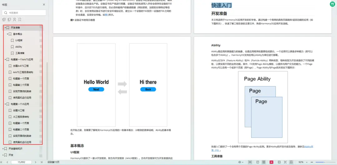
为了能让大家更好的学习鸿蒙(HarmonyOS NEXT)开发技术,这边特意整理了《鸿蒙开发学习手册》(共计890页),希望对大家有所帮助:https://qr21.cn/FV7h05
《鸿蒙开发学习手册》:
如何快速入门:https://qr21.cn/FV7h05
- 基本概念
- 构建第一个ArkTS应用
- ……
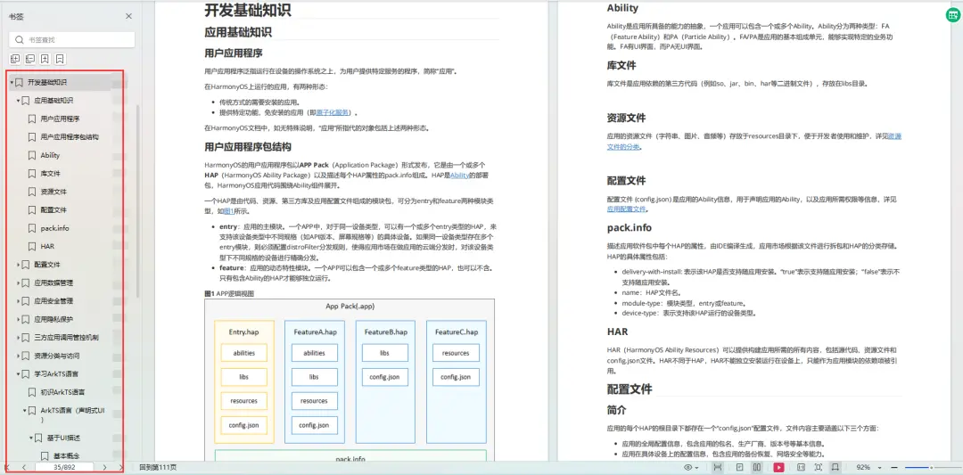
开发基础知识:https://qr21.cn/FV7h05
- 应用基础知识
- 配置文件
- 应用数据管理
- 应用安全管理
- 应用隐私保护
- 三方应用调用管控机制
- 资源分类与访问
- 学习ArkTS语言
- ……
基于ArkTS 开发:https://qr21.cn/FV7h05
- Ability开发
- UI开发
- 公共事件与通知
- 窗口管理
- 媒体
- 安全
- 网络与链接
- 电话服务
- 数据管理
- 后台任务(Background Task)管理
- 设备管理
- 设备使用信息统计
- DFX
- 国际化开发
- 折叠屏系列
- ……

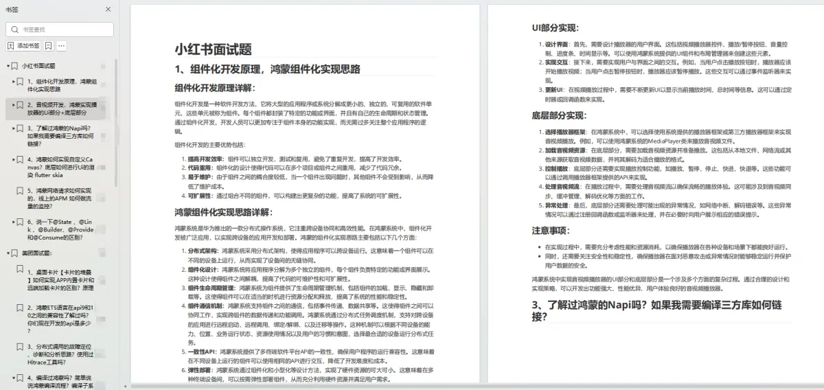
鸿蒙开发面试真题(含参考答案):https://qr18.cn/F781PH
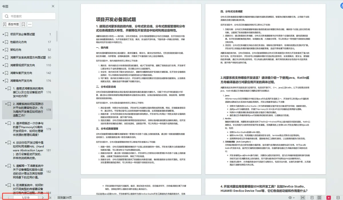
鸿蒙开发面试大盘集篇(共计319页):https://qr18.cn/F781PH
1.项目开发必备面试题
2.性能优化方向
3.架构方向
4.鸿蒙开发系统底层方向
5.鸿蒙音视频开发方向
6.鸿蒙车载开发方向
7.鸿蒙南向开发方向
Copyright © 2003-2013 www.wpsshop.cn 版权所有,并保留所有权利。

