
- 1第6讲:用树莓派搭建FM广播,播放音乐和实时语音_树莓派收音机
- 2树莓派4B-搭建一个本地车牌识别服务器
- 3Python数据挖掘与可视化
- 4基于机器学习算法的糖尿病预测模型研究论文研读笔记
- 5市场战略和经营方式模型理论的代码实现(3)_企业管理运营、产品开发和市场销售的关系模型
- 6移动电视盒子cm311-1a安装armbian 运行MMDVMHost 成功_cm311-1a armbian
- 7C++ vector容器 assign()用法_c++ vector assign
- 8【uni-app 时间选择器,任意选择器】_uniapp时间时分秒范围选择器
- 9xilinx基础篇Ⅱ(4)生产MCS或BIN文件_promgen xilinx bin转mcs
- 10WebSocket学习笔记以及用户与客服聊天案例简单实现(springboot+vue)_websocket实现客服
2d、3d转换,适配问题
赞
踩
前端讨论班--第三周培训
一、平面转换(transform)
1.基本介绍
1)作用:
伪元素添加动态效果,一般与过渡配合使用
2)概念:
改变盒子在平面内的形态(位移、旋转、缩放、倾斜)
平面转换又叫2D转换
2.平面转换--平移
1)属性:
transform:translate(x轴移动距离,y轴移动距离)
2)取值:
-
像素单位数值
-
正负均可
3)技巧:
1.translate()只写一个值,表示沿着x轴移动
2.单独设置X或Y轴移动距离:translateX()或translateY()
4)效果图
<!DOCTYPE html>
<html lang="en">
<head>
<meta charset="UTF-8">
<meta name="viewport" content="width=device-width, initial-scale=1.0">
<title>Document</title>
<style>
.father{
width: 500px;
height: 300px;
margin: 100px auto;
border: 1px solid #000;
}
.son{
width: 200px;
height: 100px;
background-color: pink;
transition: all 0.5s;
}
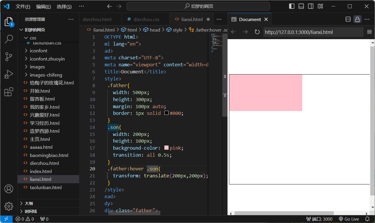
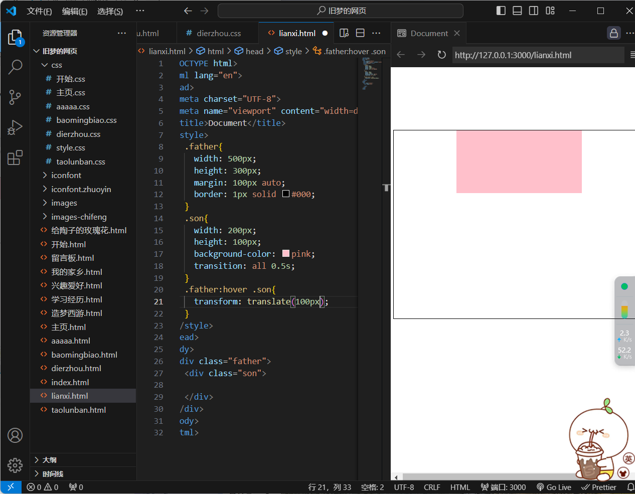
.father:hover .son{
transform: translate(200px,200px);
}
</style>
</head>
<body>
<div class="father">
<div class="son">
</div>
</div>
</body>
</html>
<!DOCTYPE html>
<html lang="en">
<head>
<meta charset="UTF-8">
<meta name="viewport" content="width=device-width, initial-scale=1.0">
<title>Document</title>
<style>
.father{
width: 500px;
height: 300px;
margin: 100px auto;
border: 1px solid #000;
}
.son{
width: 200px;
height: 100px;
background-color: pink;
transition: all 0.5s;
}
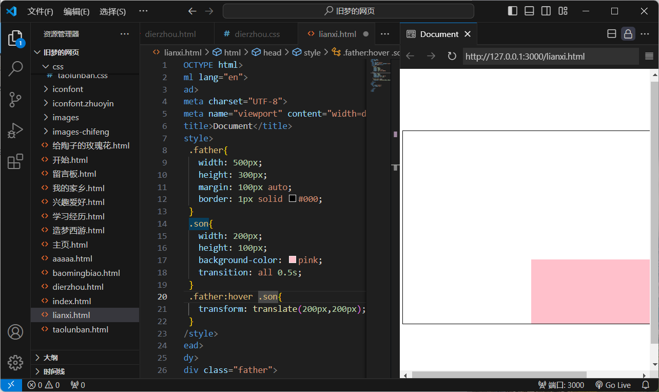
.father:hover .son{
transform: translate(50%,100%);
}
</style>
</head>
<body>
<div class="father">
<div class="son">
</div>
</div>
</body>
</html>
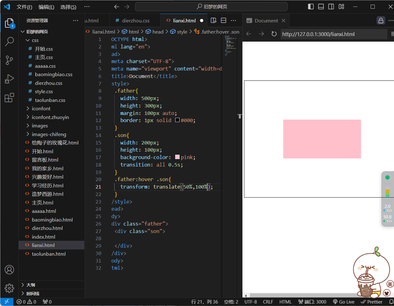
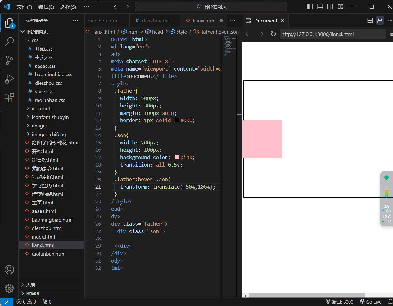
注:使用百分比的话,是相对于自身的宽和高
<!DOCTYPE html>
<html lang="en">
<head>
<meta charset="UTF-8">
<meta name="viewport" content="width=device-width, initial-scale=1.0">
<title>Document</title>
<style>
.father{
width: 500px;
height: 300px;
margin: 100px auto;
border: 1px solid #000;
}
.son{
width: 200px;
height: 100px;
background-color: pink;
transition: all 0.5s;
}
.father:hover .son{
transform: translate(-50%,100%);
}
</style>
</head>
<body>
<div class="father">
<div class="son">
</div>
</div>
</body>
</html>
<!DOCTYPE html>
<html lang="en">
<head>
<meta charset="UTF-8">
<meta name="viewport" content="width=device-width, initial-scale=1.0">
<title>Document</title>
<style>
.father{
width: 500px;
height: 300px;
margin: 100px auto;
border: 1px solid #000;
}
.son{
width: 200px;
height: 100px;
background-color: pink;
transition: all 0.5s;
}
.father:hover .son{
transform: translate(100px);
}
</style>
</head>
<body>
<div class="father">
<div class="son">
</div>
</div>
</body>
</html>
注:只写一个值,只在水平方向移动(由于translatex(100px)与上面这个效果相同,便不再书写)
<!DOCTYPE html>
<html lang="en">
<head>
<meta charset="UTF-8">
<meta name="viewport" content="width=device-width, initial-scale=1.0">
<title>Document</title>
<style>
.father{
width: 500px;
height: 300px;
margin: 100px auto;
border: 1px solid #000;
}
.son{
width: 200px;
height: 100px;
background-color: pink;
transition: all 0.5s;
}
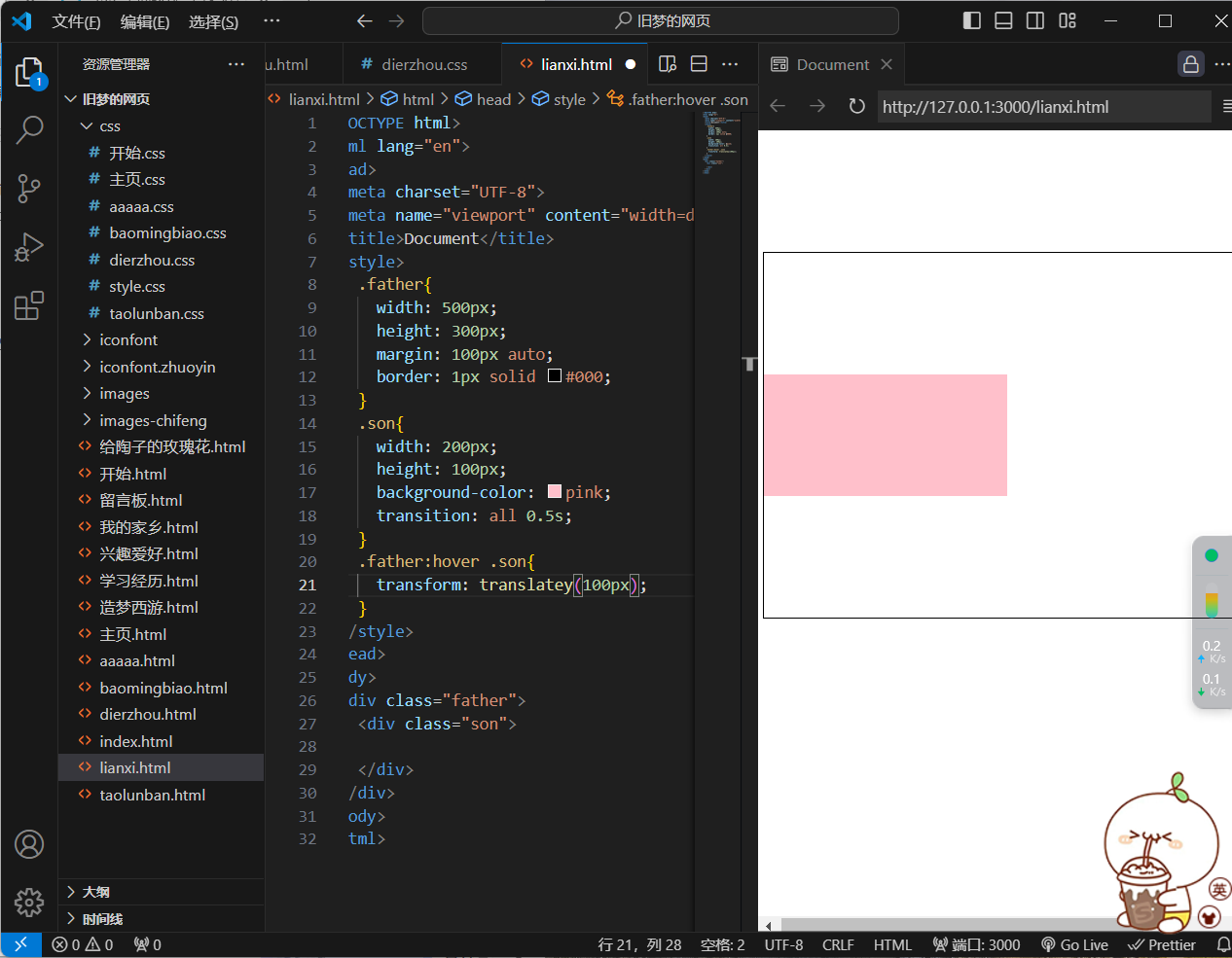
.father:hover .son{
transform: translatey(100px);
}
</style>
</head>
<body>
<div class="father">
<div class="son">
</div>
</div>
</body>
</html>
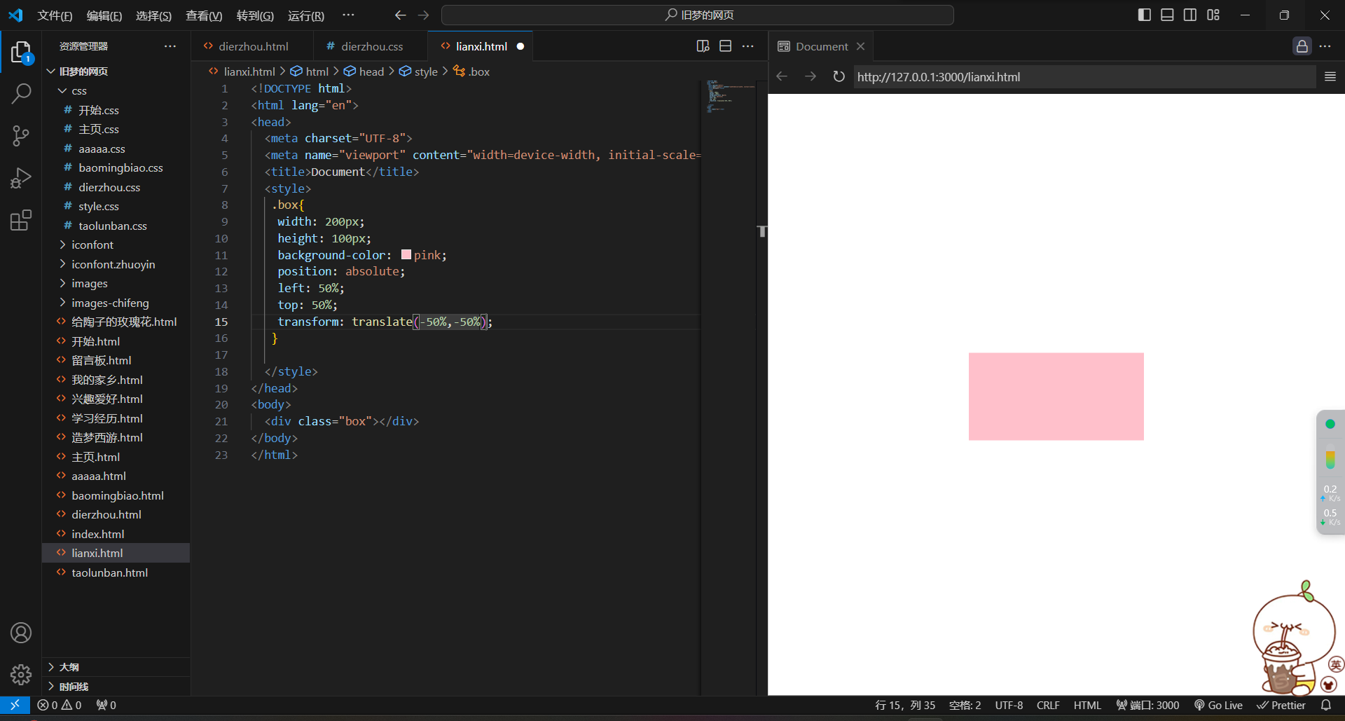
3.平移实现居中效果
<!DOCTYPE html>
<html lang="en">
<head>
<meta charset="UTF-8">
<meta name="viewport" content="width=device-width, initial-scale=1.0">
<title>Document</title>
<style>
.box{
width: 200px;
height: 100px;
background-color: pink;
position: absolute;
left: 50%;
top: 50%;
transform: translate(-50%,-50%);
}
</style>
</head>
<body>
<div class="box"></div>
</body>
</html>
4.平面转换--旋转
1.属性:
transform:rotate(旋转角度) 单位:deg
2.技巧:
-
取值正负均可
-
取值为正、顺时针旋转
-
取值为负、逆时针旋转
3.效果图
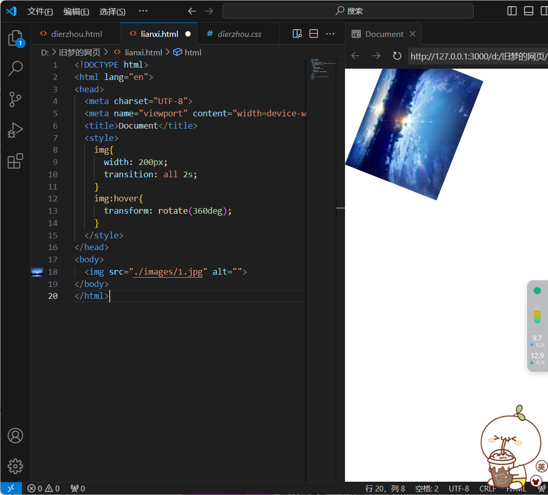
<!DOCTYPE html>
<html lang="en">
<head>
  <meta charset="UTF-8">
  <meta name="viewport" content="width=device-width, initial-scale=1.0">
  <title>Document</title>
  <style>
    img{
      width: 200px;
      transition: all 2s;
    }
    img:hover{
      transform: rotate(360deg);
    }
  </style>
</head>
<body>
  <img src="./images/1.jpg" alt="">
</body>
</html>
注:旋转角度为正,则顺时针旋转,旋转角度为负,则逆时针旋转
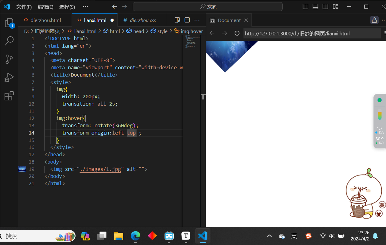
5.平面转换--改变转换原点
1.默认情况下,转换原点是盒子中心
2.属性:
transform-origin:水平原点位置 垂直原点位置;
3.取值
-
方位名词(left、top、right、bottom、center)
-
像素单位数值
-
百分比
4.效果图
<!DOCTYPE html>
<html lang="en">
<head>
  <meta charset="UTF-8">
  <meta name="viewport" content="width=device-width, initial-scale=1.0">
  <title>Document</title>
  <style>
    img{
      width: 200px;
      transition: all 2s;
    }
    img:hover{
      transform: rotate(360deg);
      transform-origin:left top ;
    }
  </style>
</head>
<body>
  <img src="./images/1.jpg" alt="">
</body>
</html>
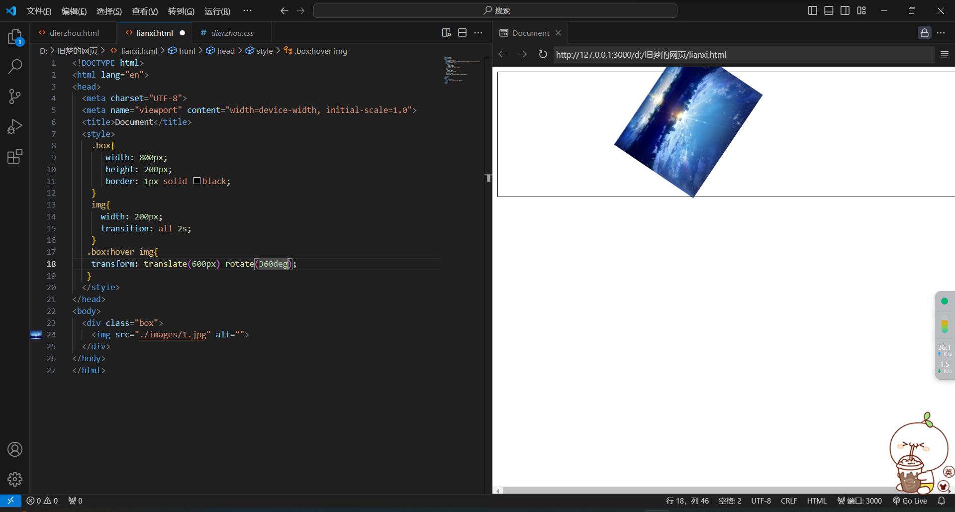
6.平面转化-多重转换
1.多重转换技巧:
先平移再旋转
transform:translate() rorate();
注:
1)旋转会改变坐标轴向
2)以第一种转化形态的坐标轴为准
3)想要边走边转动,必须这样书写,分开写样式会层叠,不能达到目标
2.效果图
<!DOCTYPE html>
<html lang="en">
<head>
  <meta charset="UTF-8">
  <meta name="viewport" content="width=device-width, initial-scale=1.0">
  <title>Document</title>
  <style>
    .box{
       width: 800px;
       height: 200px;
       border: 1px solid black;
    }
    img{
      width: 200px;
      transition: all 2s;
    }
   .box:hover img{
    transform: translate(600px) rotate(360deg);
   }
  </style>
</head>
<body>
  <div class="box">
    <img src="./images/1.jpg" alt="">
  </div>
</body>
</html>
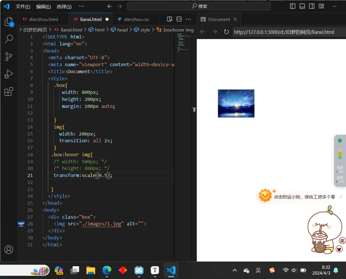
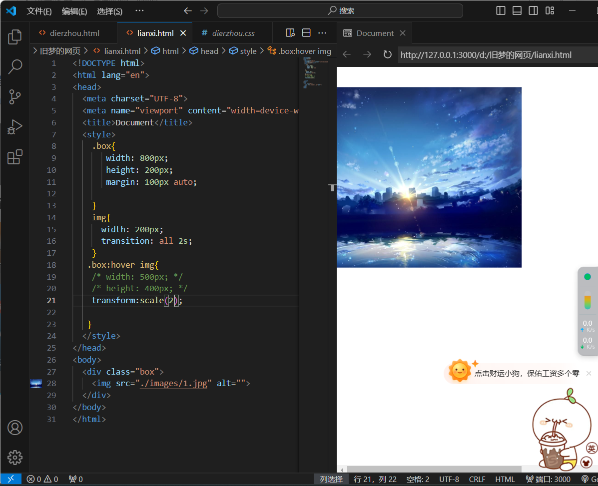
7.平面转换--缩放
1.属性:
transform:scale(缩放倍数);
transform:scale(x轴缩放倍数,y轴缩放倍数);
2.技巧:
-
通常只为scale()设置一个值,表示x轴和y轴等比缩放
-
取值大于1表示放大,取值小于1表示缩小
3.效果图
取值小于1

取值大于1
<!DOCTYPE html>
<html lang="en">
<head>
  <meta charset="UTF-8">
  <meta name="viewport" content="width=device-width, initial-scale=1.0">
  <title>Document</title>
  <style>
    .box{
       width: 800px;
       height: 200px;
       margin: 100px auto;

    }
    img{
      width: 200px;
      transition: all 2s;
    }
   .box:hover img{
    /* width: 500px; */
    /* height: 400px; */
    transform:scale(2);

   }
  </style>
</head>
<body>
  <div class="box">
    <img src="./images/1.jpg" alt="">
  </div>
</body>
</html>
注:如果取值为1,则大小不变化。
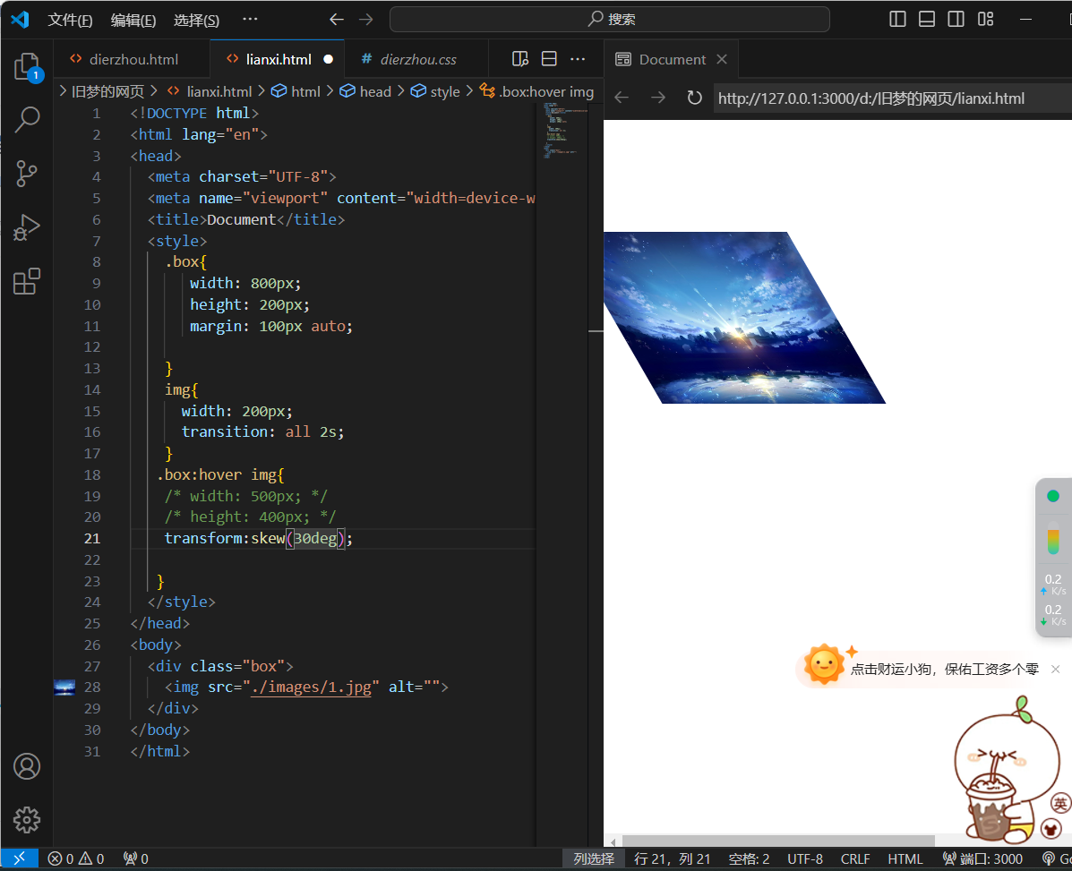
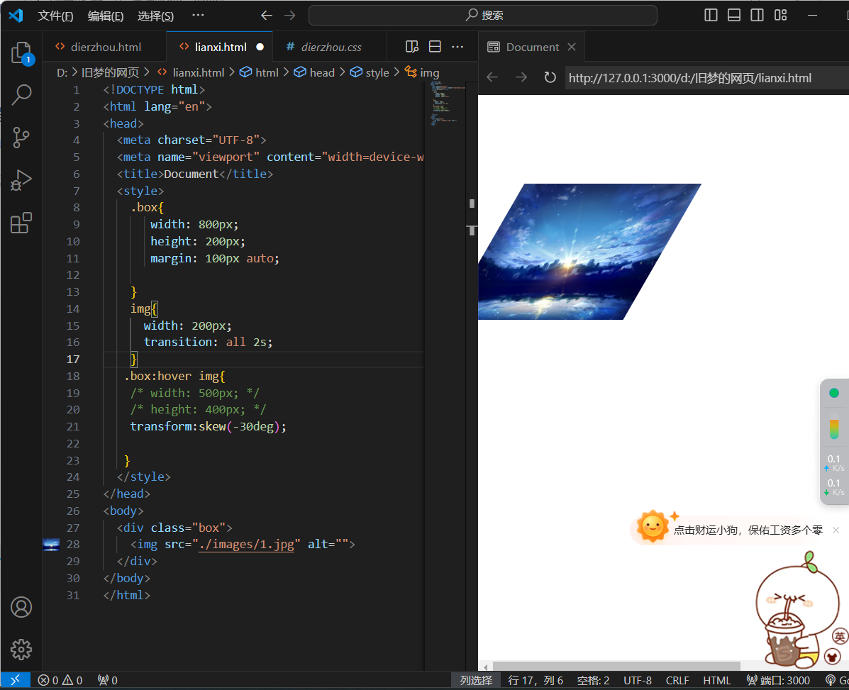
8.平面变换--倾斜
1.属性:
transform:skew();
2.取值:
-
角度度数deg
3.效果图
<!DOCTYPE html>
<html lang="en">
<head>
  <meta charset="UTF-8">
  <meta name="viewport" content="width=device-width, initial-scale=1.0">
  <title>Document</title>
  <style>
    .box{
       width: 800px;
       height: 200px;
       margin: 100px auto;

    }
    img{
      width: 200px;
      transition: all 2s;
    }
   .box:hover img{
    /* width: 500px; */
    /* height: 400px; */
    transform:skew(30deg);

   }
  </style>
</head>
<body>
  <div class="box">
    <img src="./images/1.jpg" alt="">
  </div>
</body>
</html>
<!DOCTYPE html>
<html lang="en">
<head>
  <meta charset="UTF-8">
  <meta name="viewport" content="width=device-width, initial-scale=1.0">
  <title>Document</title>
  <style>
    .box{
       width: 800px;
       height: 200px;
       margin: 100px auto;

    }
    img{
      width: 200px;
      transition: all 2s;
    }
   .box:hover img{
    /* width: 500px; */
    /* height: 400px; */
    transform:skew(-30deg);

   }
  </style>
</head>
<body>
  <div class="box">
    <img src="./images/1.jpg" alt="">
  </div>
</body>
</html>
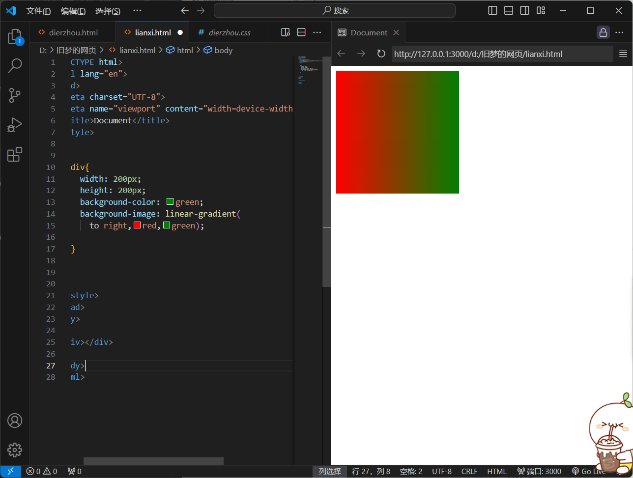
9.平面转换--渐变
1.作用
渐变是多个颜色逐渐变化的效果,一般用于设置盒子背景
2.分类
-
线性渐变
-
径向渐变
3.线性渐变
1)属性
background-image:linear-gradient(渐变方向,颜色1 终点位置,颜色2 终点位置,.......)
注:位置可以省略
2)取值
-
渐变方向:可选(to方位名词,角度度数)
-
终点位置:可选(百分比)
3)效果图
<!DOCTYPE html>
<html lang="en">
<head>
  <meta charset="UTF-8">
  <meta name="viewport" content="width=device-width, initial-scale=1.0">
  <title>Document</title>
  <style>


    div{
      width: 200px;
      height: 200px;
      background-color: green;
      background-image: linear-gradient(
        to right,red,green);

    }


  </style>
</head>
<body>

  <div></div>

</body>
</html>
<!DOCTYPE html>
<html lang="en">
<head>
<meta charset="UTF-8">
<meta name="viewport" content="width=device-width, initial-scale=1.0">
<title>Document</title>
<style>
div{
width: 200px;
height: 200px;
background-color: green;
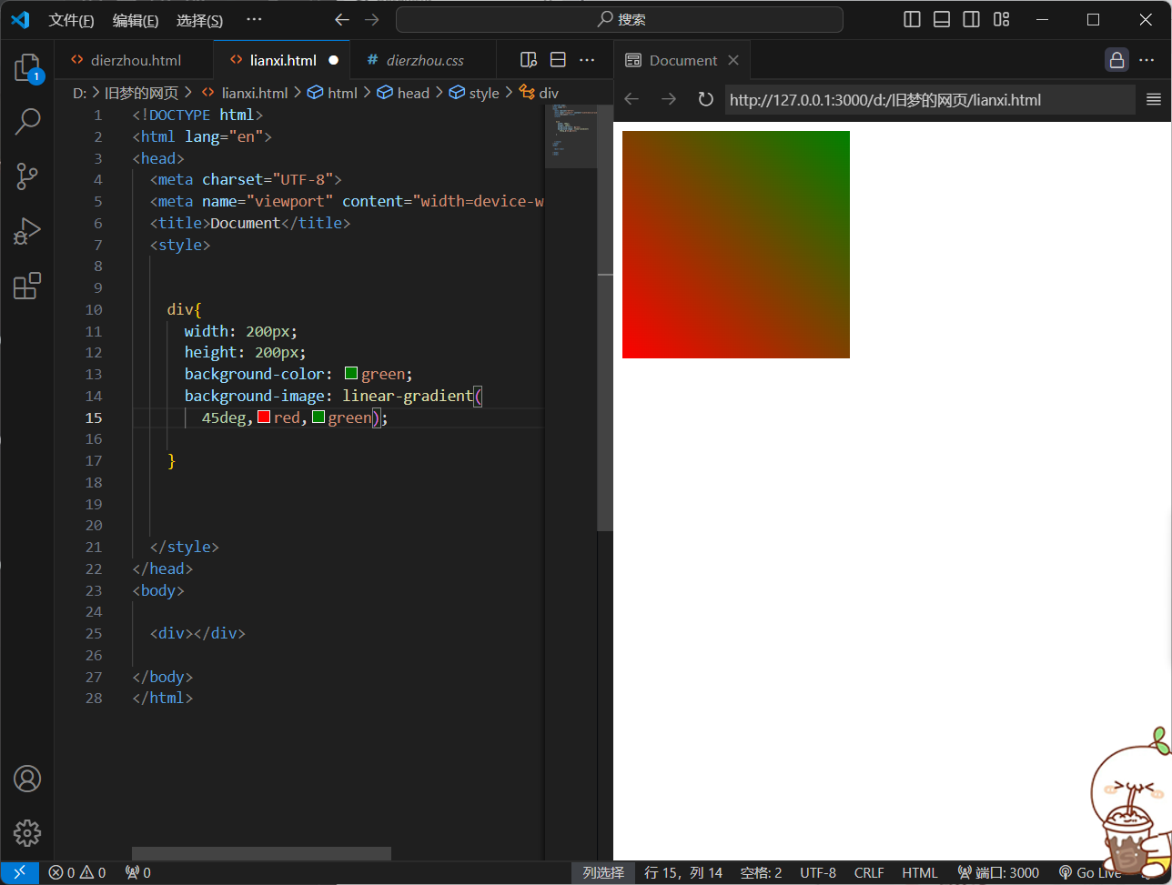
background-image: linear-gradient(
45deg,red,green);
}
</style>
</head>
<body>
<div></div>
</body>
</html>
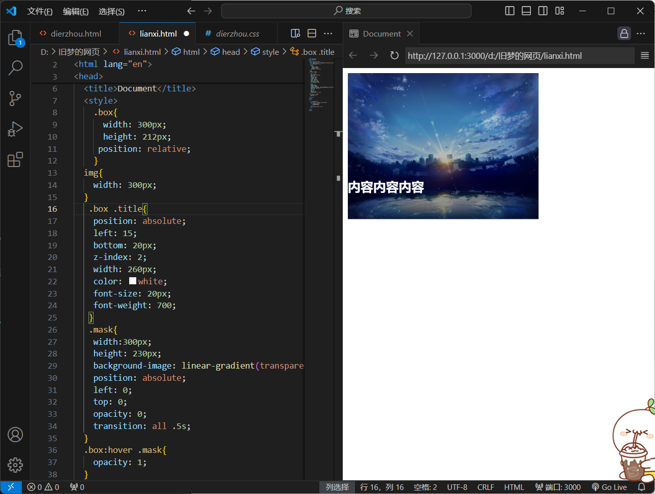
渐变背景
<!DOCTYPE html>
<html lang="en">
<head>
  <meta charset="UTF-8">
  <meta name="viewport" content="width=device-width, initial-scale=1.0">
  <title>Document</title>
  <style>
    .box{
      width: 300px;
      height: 212px;
     position: relative;
    }
  img{
    width: 300px;
  }
   .box .title{
    position: absolute;
    left: 15;
    bottom: 20px;
    z-index: 2;
    width: 260px;
    color: white;
    font-size: 20px;
    font-weight: 700;
   }
   .mask{
    width:300px;
    height: 230px;
    background-image: linear-gradient(transparent,rgba(0,0,0,0.5));
    position: absolute;
    left: 0;
    top: 0;
    opacity: 0;
    transition: all .5s;
  }
  .box:hover .mask{
    opacity: 1;
  }
  </style>
</head>
<body>

  <div class="box">
    <img src="./images/1.jpg" alt="">
    <div class="title">
        内容内容内容
    </div>
    <div class="mask"></div>
  </div>

</body>
</html>
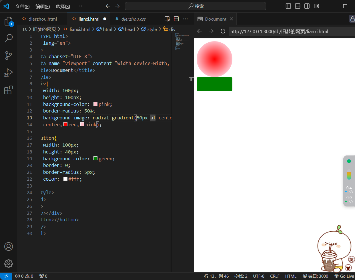
4.径向渐变
1)作用:
给按钮添加高光效果
2)属性:
background-image:radial-gradient(
半径 at 圆心位置,颜色1 终点位置,颜色2 终点位置,......);
3)取值:
-
半径可以是2条,则为椭圆
-
圆心位置取值:像素单位数值/百分比/方位名词
4)效果图
<!DOCTYPE html>
<html lang="en">
<head>
  <meta charset="UTF-8">
  <meta name="viewport" content="width=device-width, initial-scale=1.0">
  <title>Document</title>
  <style>
    div{
      width: 100px;
      height: 100px;
      background-color: pink;
      border-radius: 50%;
      background-image: radial-gradient(50px at center
      center,red,pink);
    }
    button{
      width: 100px;
      height: 40px;
      background-color: green;
      border: 0;
      border-radius: 5px;
      color: #fff;
    }
  </style>
</head>
<body>
  <div></div>
  <button></button>
</body>
</html>

<!DOCTYPE html>
<html lang="en">
<head>
  <meta charset="UTF-8">
  <meta name="viewport" content="width=device-width, initial-scale=1.0">
  <title>Document</title>
  <style>
    div{
      width: 100px;
      height: 100px;
      background-color: pink;
      border-radius: 50%;
      background-image: radial-gradient(50px 20px at center
      center,red,pink);
    }
    button{
      width: 100px;
      height: 40px;
      background-color: green;
      border: 0;
      border-radius: 5px;
      color: #fff;
    }
  </style>
</head>
<body>
  <div></div>
  <button></button>
</body>
</html>
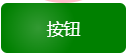
镜像渐变
<!DOCTYPE html>
<html lang="en">
<head>
  <meta charset="UTF-8">
  <meta name="viewport" content="width=device-width, initial-scale=1.0">
  <title>Document</title>
  <style>
    div{
      width: 100px;
      height: 100px;
      background-color: pink;
      border-radius: 50%;
      background-image: radial-gradient(50px 20px at center
      center,red,pink);
    }
    button{
      width: 100px;
      height: 40px;
      background-color: green;
      border: 0;
      border-radius: 5px;
      color: #fff;
      background-image: radial-gradient(
        30px at 30px 20px ,rgba(255,255,255,0.2),
        transparent
      );
    }
  </style>
</head>
<body>
  <div></div>
  <button>按钮</button>
</body>
</html>
at后面两个像素数值,先x轴后y轴
二、空间转换
1.空间转换--平移与视距
1.属性:
transform:translate3d(x,y,z)
transform:translateX()
transform:translateY()
transform:translateZ()
2.取值:
-
像素单位数值
-
百分比(参照盒子自身尺寸计算结果)
3.效果图
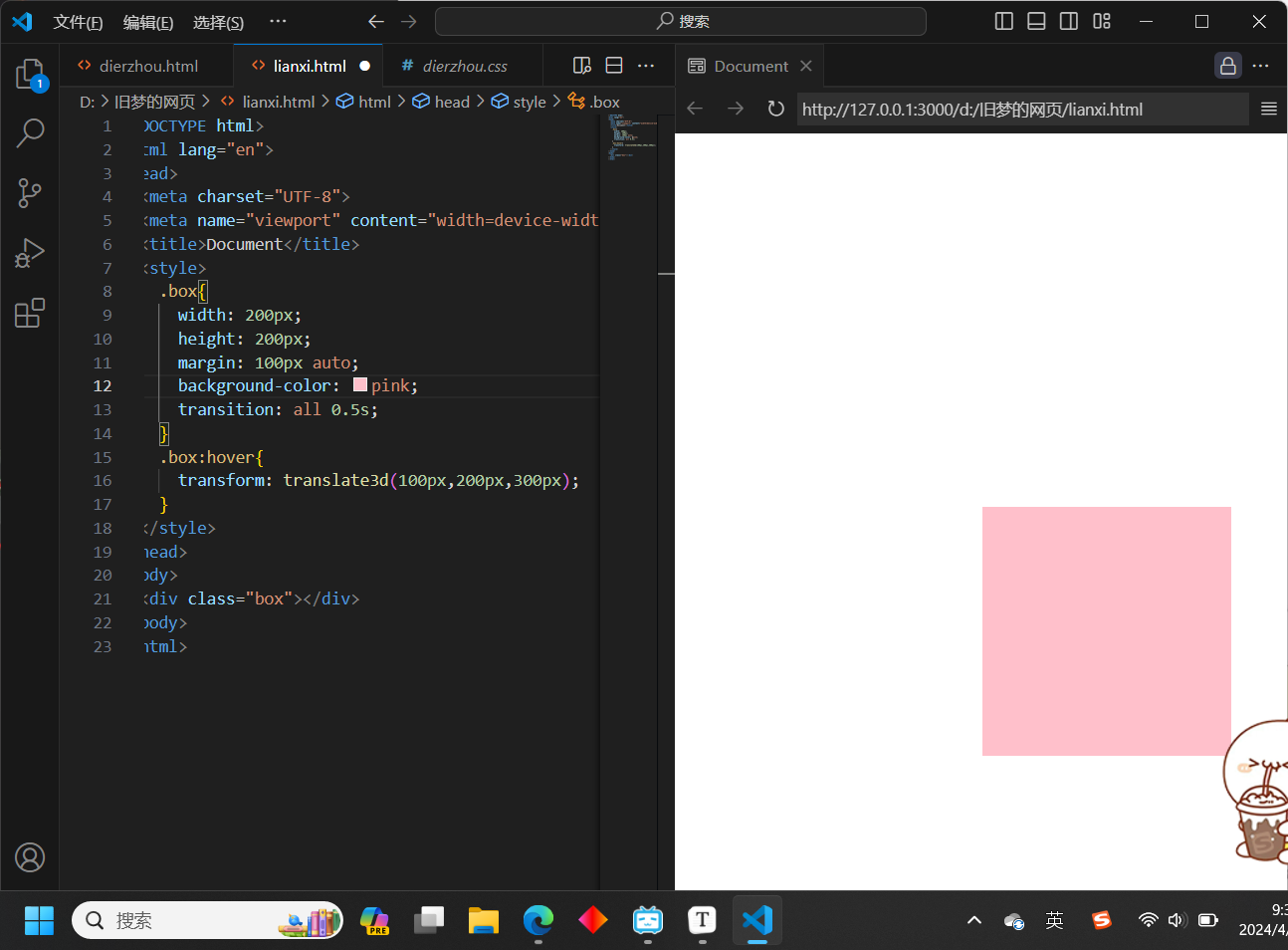
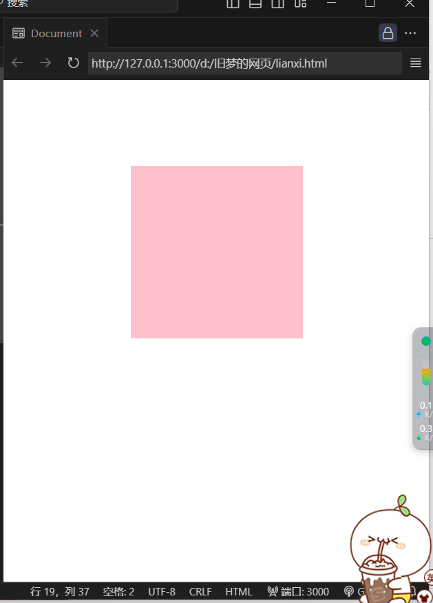
<!DOCTYPE html>
<html lang="en">
<head>
  <meta charset="UTF-8">
  <meta name="viewport" content="width=device-width, initial-scale=1.0">
  <title>Document</title>
  <style>
    .box{
      width: 200px;
      height: 200px;
      margin: 100px auto;
      background-color: pink;
      transition: all 0.5s;
    }
    .box:hover{
      transform: translate3d(100px,200px,300px);
    }
  </style>
</head>
<body>
  <div class="box"></div>
</body>
</html>
注:但是z轴效果看不见
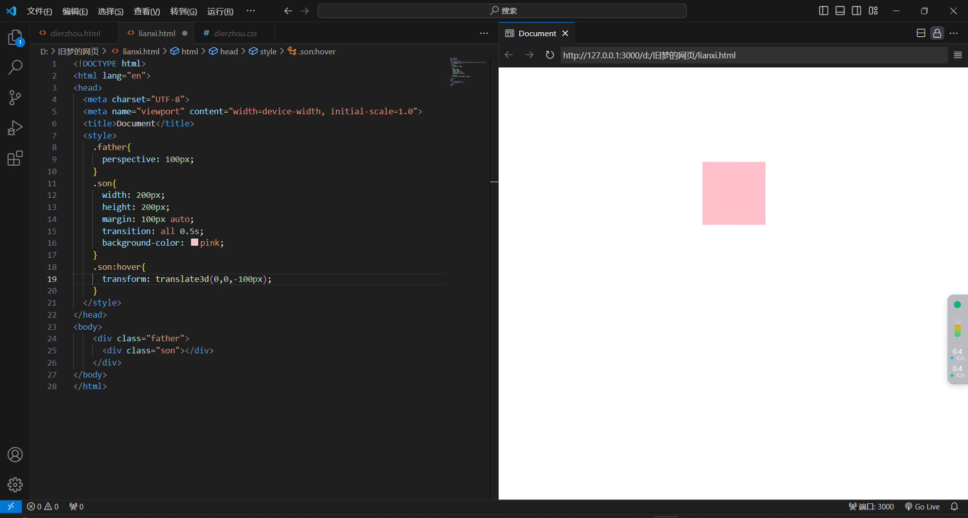
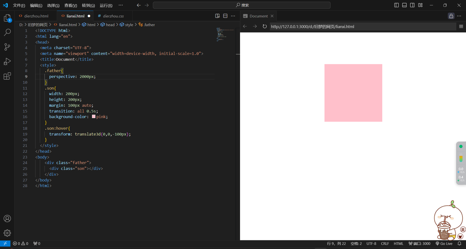
4.视距(perspective)
1.作用:
制定了观察者与z=0平面的距离,为元素添加透视效果
透视效果:近大远小,近实远虚
2.属性:
添加给直接父级,取值范围800-1200
perspective:视距;
3.效果图

<!DOCTYPE html>
<html lang="en">
<head>
  <meta charset="UTF-8">
  <meta name="viewport" content="width=device-width, initial-scale=1.0">
  <title>Document</title>
  <style>
    .father{
      perspective: 1000px;
    }
    .son{
      width: 200px;
      height: 200px;
      margin: 100px auto;
      transition: all 0.5s;
      background-color: pink;
    }
    .son:hover{
      transform: translateZ(-300px);
    }
  </style>
</head>
<body>
    <div class="father">
      <div class="son"></div>
    </div>
</body>
</html>
<!DOCTYPE html>
<html lang="en">
<head>
  <meta charset="UTF-8">
  <meta name="viewport" content="width=device-width, initial-scale=1.0">
  <title>Document</title>
  <style>
    .father{
      perspective: 100px;
    }
    .son{
      width: 200px;
      height: 200px;
      margin: 100px auto;
      transition: all 0.5s;
      background-color: pink;
    }
    .son:hover{
      transform: translate3d(0,0,-100px);
    }
  </style>
</head>
<body>
    <div class="father">
      <div class="son"></div>
    </div>
</body>
</html>
<!DOCTYPE html>
<html lang="en">
<head>
  <meta charset="UTF-8">
  <meta name="viewport" content="width=device-width, initial-scale=1.0">
  <title>Document</title>
  <style>
    .father{
      perspective: 2000px;
    }
    .son{
      width: 200px;
      height: 200px;
      margin: 100px auto;
      transition: all 0.5s;
      background-color: pink;
    }
    .son:hover{
      transform: translate3d(0,0,-100px);
    }
  </style>
</head>
<body>
    <div class="father">
      <div class="son"></div>
    </div>
</body>
</html>
注:perspective的值过大过小都不易观察
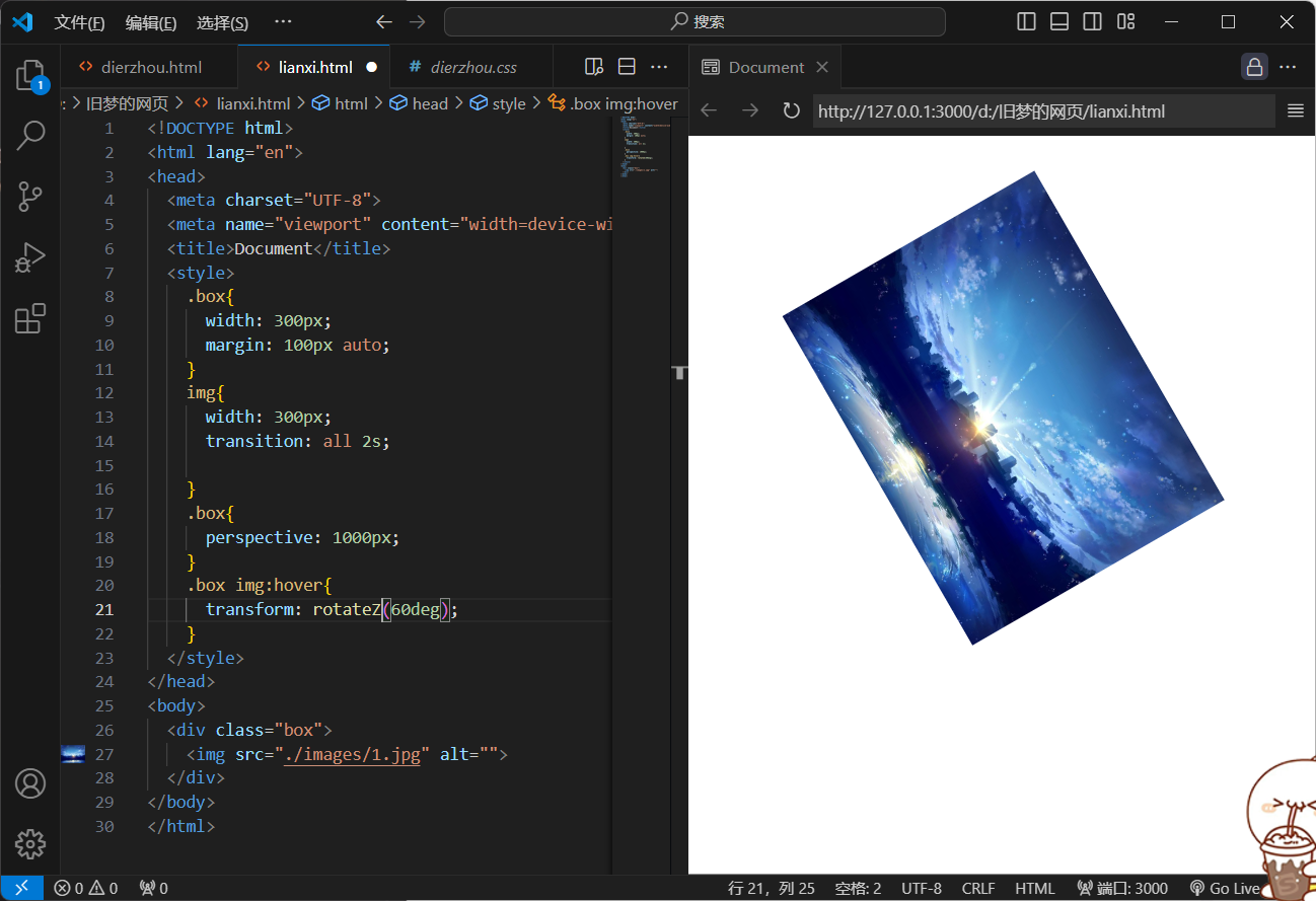
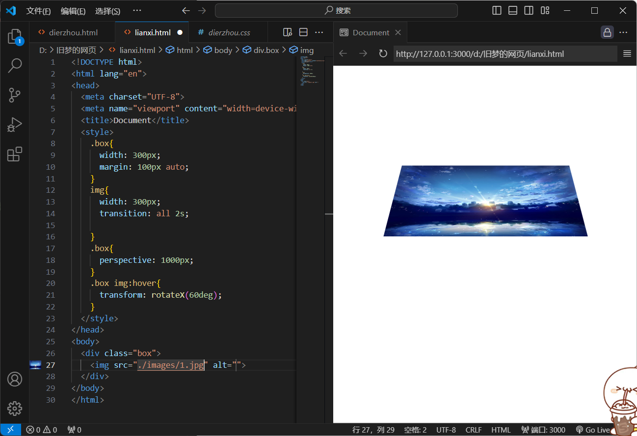
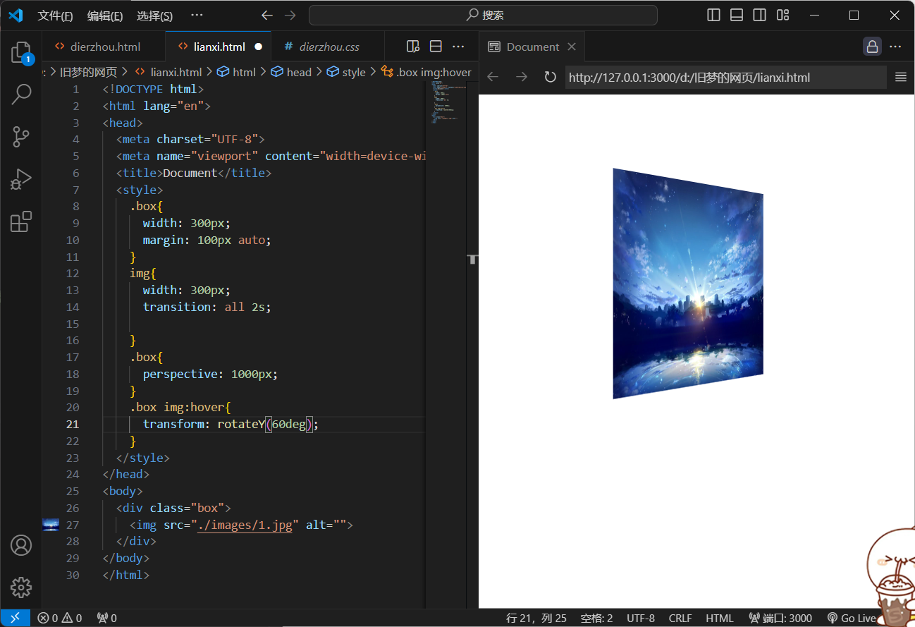
2.空间转换--旋转
1.属性:
transform-rotateZ(值);
transform-rotateX(值);
transform-rotateY(值);
2.效果图
<!DOCTYPE html>
<html lang="en">
<head>
<meta charset="UTF-8">
<meta name="viewport" content="width=device-width, initial-scale=1.0">
<title>Document</title>
<style>
.box{
width: 300px;
margin: 100px auto;
}
img{
width: 300px;
transition: all 2s;
}
.box{
perspective: 1000px;
}
.box img:hover{
transform: rotateZ(60deg);
}
</style>
</head>
<body>
<div class="box">
<img src="./images/1.jpg" alt="">
</div>
</body>
</html>
<!DOCTYPE html>
<html lang="en">
<head>
  <meta charset="UTF-8">
  <meta name="viewport" content="width=device-width, initial-scale=1.0">
  <title>Document</title>
  <style>
    .box{
      width: 300px;
      margin: 100px auto;
    }
    img{
      width: 300px;
      transition: all 2s;

    }
    .box{
      perspective: 1000px;
    }
    .box img:hover{
      transform: rotateX(60deg);
    }
  </style>
</head>
<body>
  <div class="box">
    <img src="./images/1.jpg" alt="">
  </div>
</body>
</html>
<!DOCTYPE html>
<html lang="en">
<head>
<meta charset="UTF-8">
<meta name="viewport" content="width=device-width, initial-scale=1.0">
<title>Document</title>
<style>
.box{
width: 300px;
margin: 100px auto;
}
img{
width: 300px;
transition: all 2s;
}
.box{
perspective: 1000px;
}
.box img:hover{
transform: rotateY(60deg);
}
</style>
</head>
<body>
<div class="box">
<img src="./images/1.jpg" alt="">
</div>
</body>
</html>
3.空间-旋转
1)左手法则-根据旋转方向确定取值正负
左手握住旋转轴,木质指向正值方向,其他四个手指弯曲方向为旋转正值方向
2)拓展
-
rotate(x,y,z,角度度数):涌来设置自定义旋转轴的位置及旋转的角度
-
x,y,z取值为0-1之间的数字
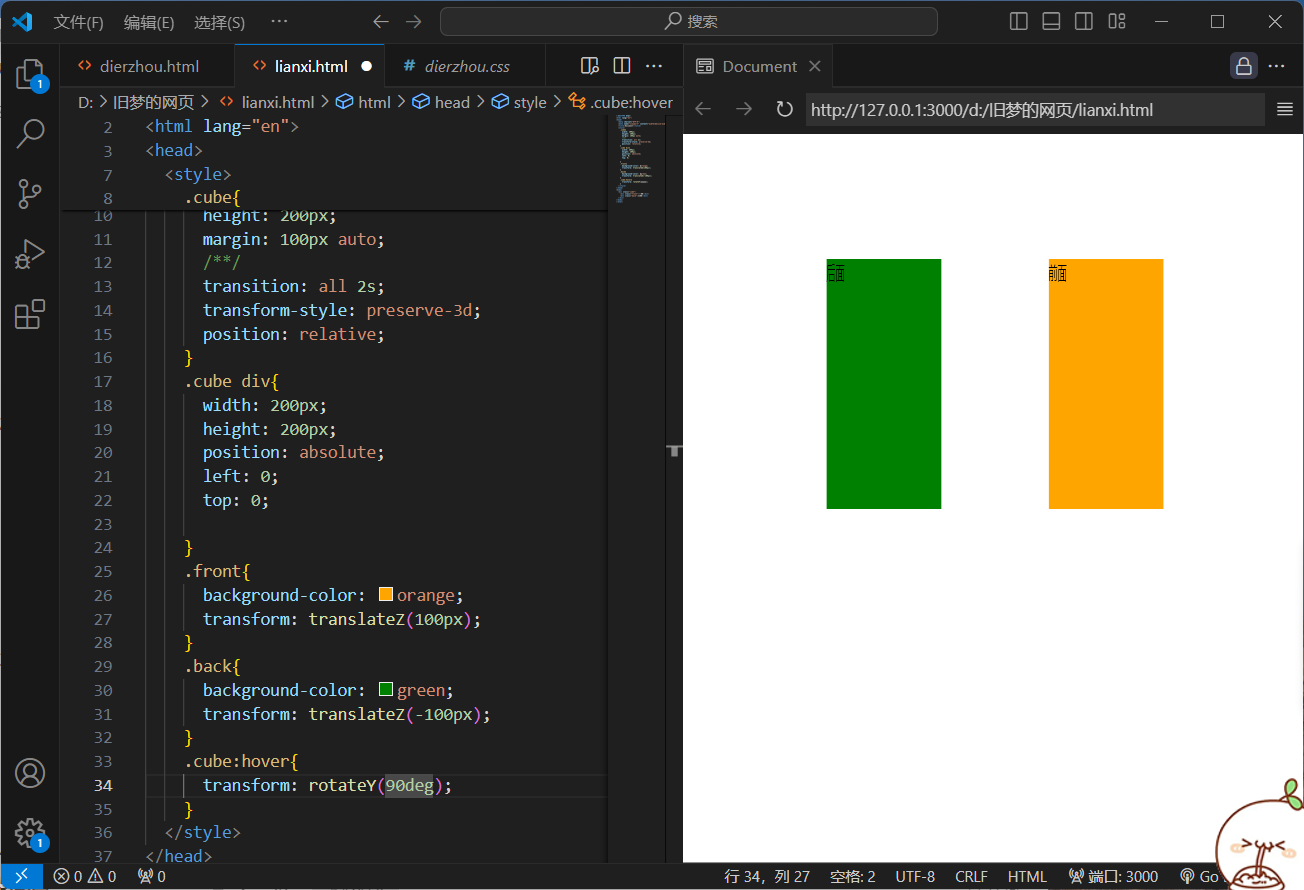
3.立体呈现
1.作用:
设置元素的子元素是位于3D空间中还是平面中
2.属性名:
transform-style
3.属性值:
flat:自己处于平面中
preserve-3d:子级处于3D空间中
4.呈现立体图形步骤
1)(直接)父元素添加transform-style:preserve-3d;
2)子级定位
3)调整盒子的位置(位移或旋转)
5.效果图
<!DOCTYPE html>
<html lang="en">
<head>
  <meta charset="UTF-8">
  <meta name="viewport" content="width=device-width, initial-scale=1.0">
  <title>Document</title>
  <style>
    .cube{
      width: 200px;
      height: 200px;
      margin: 100px auto;
      transition: all 2s;
      transform-style: preserve-3d;
      position: relative;
    }
    .cube div{
      width: 200px;
      height: 200px;
      position: absolute;
      left: 0;
      top: 0;

    }
    .front{
      background-color: orange;
      transform: translateZ(100px);
    }
    .back{
      background-color: green;
      transform: translateZ(-100px);
    }
    .cube:hover{
      transform: rotateY(90deg);
    }
  </style>
</head>
<body>
  <div class="cube">
    <div class="front">前面</div>
    <div class="back">后面</div>
  </div>
</body>
</html>
<!DOCTYPE html>
<html lang="en">
<head>
  <meta charset="UTF-8">
  <meta name="viewport" content="width=device-width, initial-scale=1.0">
  <title>Document</title>
  <style>
    img{
      width: 200px;
      height: 200px;
    }
    .bigbox{
      height: 200px;
      width: 200px;
      position: relative;
      margin: 100px auto;
      transform-style: preserve-3d;
      transition: all 2s;
    }
    .bigbox div{
      width: 200px;
      height: 200px;
      position: absolute;
      left: 0;
      top:0;
    }
    .smallbox1{
      transform: translateZ(100px);
    }
    .smallbox2{
      transform: translateZ(-100px);
    }
    .bigbox:hover{
      transform: rotateY(90deg);
    }
  </style>
</head>
<body>
  <div class="bigbox">
    <div class="smallbox1"><img src="./images-chifeng/1.jpg" alt=""></div>
    <div class="smallbox2"><img src="./images-chifeng/2.jpg" alt=""></div>
  </div>
</body>
</html>
<!DOCTYPE html>
<html lang="en">
<head>
<meta charset="UTF-8">
<meta name="viewport" content="width=device-width, initial-scale=1.0">
<title>Document</title>
<style>
img{
width: 200px;
height: 200px;
}
.bigbox{
height: 200px;
width: 200px;
position: relative;
margin: 100px auto;
transform-style: preserve-3d;
transition: all 2s;
}
.bigbox div{
width: 200px;
height: 200px;
position: absolute;
left: 0;
top:0;
}
.smallbox1{
transform: translateZ(100px);
}
.smallbox2{
transform: translateZ(-100px);
}
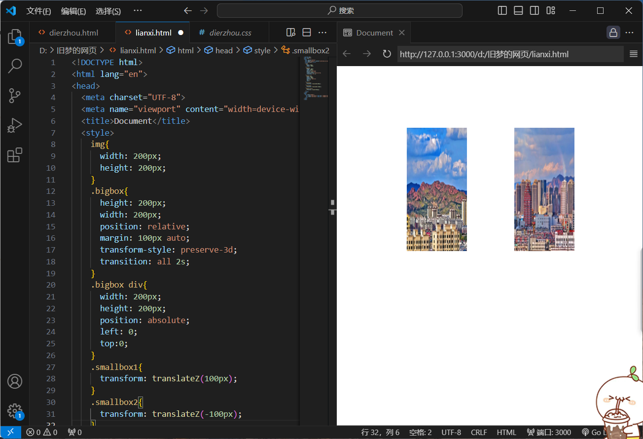
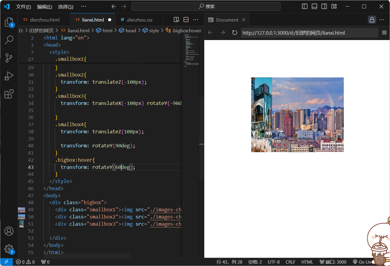
.smallbox3{
transform: translateX(-100px) rotateY(-90deg);
}
.smallbox4{
transform: translateZ(100px);
transform: rotateY(90deg);
}
.bigbox:hover{
transform: rotateY(60deg);
}
</style>
</head>
<body>
<div class="bigbox">
<div class="smallbox1"><img src="./images-chifeng/1.jpg" alt=""></div>
<div class="smallbox2"><img src="./images-chifeng/2.jpg" alt=""></div>
<div class="smallbox3"><img src="./images-chifeng/3.jpg" alt=""></div>
</div>
</body>
</html>
4.空间转换--缩放
1.属性:
transform:scale3d(x,y,z);
transform:scaleX();
transform:scaleY();
transform:scaleZ();
2.效果图

<!DOCTYPE html>
<html lang="en">
<head>
  <meta charset="UTF-8">
  <meta name="viewport" content="width=device-width, initial-scale=1.0">
  <title>Document</title>
  <style>
    img{
      width: 200px;
      height: 200px;
    }
    .bigbox{
      height: 200px;
      width: 200px;
      position: relative;
      margin: 100px auto;
      transform-style: preserve-3d;
      transition: all 2s;
      transform:scale(0.5);
    }
    .bigbox div{
      width: 200px;
      height: 200px;
      position: absolute;
      left: 0;
      top:0;

    }
    .smallbox1{
      transform: translateZ(100px);
    }
    .smallbox2{
      transform: translateZ(-100px);

    }
    .smallbox3{
      transform: translateX(-100px) rotateY(-90deg);

    }
    .smallbox4{
      transform: translateX(100px) rotateY(90deg);
    }
    .bigbox:hover{
      transform: rotateY(90deg);
    }
  </style>
</head>
<body>
  <div class="bigbox">
    <div class="smallbox1"><img src="./images-chifeng/1.jpg" alt=""></div>
    <div class="smallbox2"><img src="./images-chifeng/2.jpg" alt=""></div>
    <div class="smallbox3"><img src="./images-chifeng/3.jpg" alt=""></div>
    <div class="smallbox4"><img src="./images-chifeng/4.jpg" alt=""></div>
  </div>
</body>
</html>
5.动画
1.对比
过度:实现两个状态间的变化过程
动画:实现多个状态间的变化过程,动画过程可控(重复播放、最终画面、是否暂停)
2.实现步骤
1)定义动画
方法一:
@keyframes 动画名称{
from {}
to{}
}
方法二:
@keyframes 动画名称{
0%{}
10%{}
......
100%{}
}
2)使用动画
animation:动画名称 动画花费时长;
3.效果图
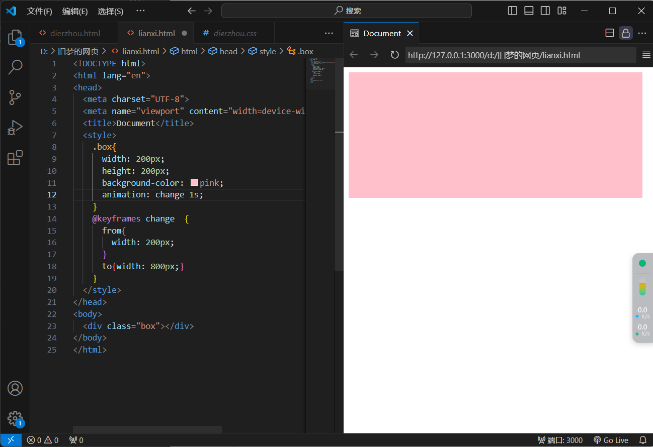
<!DOCTYPE html>
<html lang="en">
<head>
  <meta charset="UTF-8">
  <meta name="viewport" content="width=device-width, initial-scale=1.0">
  <title>Document</title>
  <style>
    .box{
      width: 200px;
      height: 200px;
      background-color: pink;
      animation: change 1s;
    }
    @keyframes change  {
      from{
        width: 200px;
      }
      to{width: 800px;}
    }
  </style>
</head>
<body>
  <div class="box"></div>
</body>
</html>
<!DOCTYPE html>
<html lang="en">
<head>
  <meta charset="UTF-8">
  <meta name="viewport" content="width=device-width, initial-scale=1.0">
  <title>Document</title>
  <style>
    .box{
      width: 200px;
      height: 200px;
      background-color: pink;
      animation: change 1s;
    }
    @keyframes change {
      0% {
        width: 200px;
        height: 100px;
    }
      20%{
        width: 300px;
        height: 300px;
      }
      100%{
        width: 800;
        height: 500px;
      }
    }
  </style>
</head>
<body>
  <div class="box"></div>
</body>
</html>
注:百分比可以完成多个状态,百分比表示的意思是动画时长的百分比
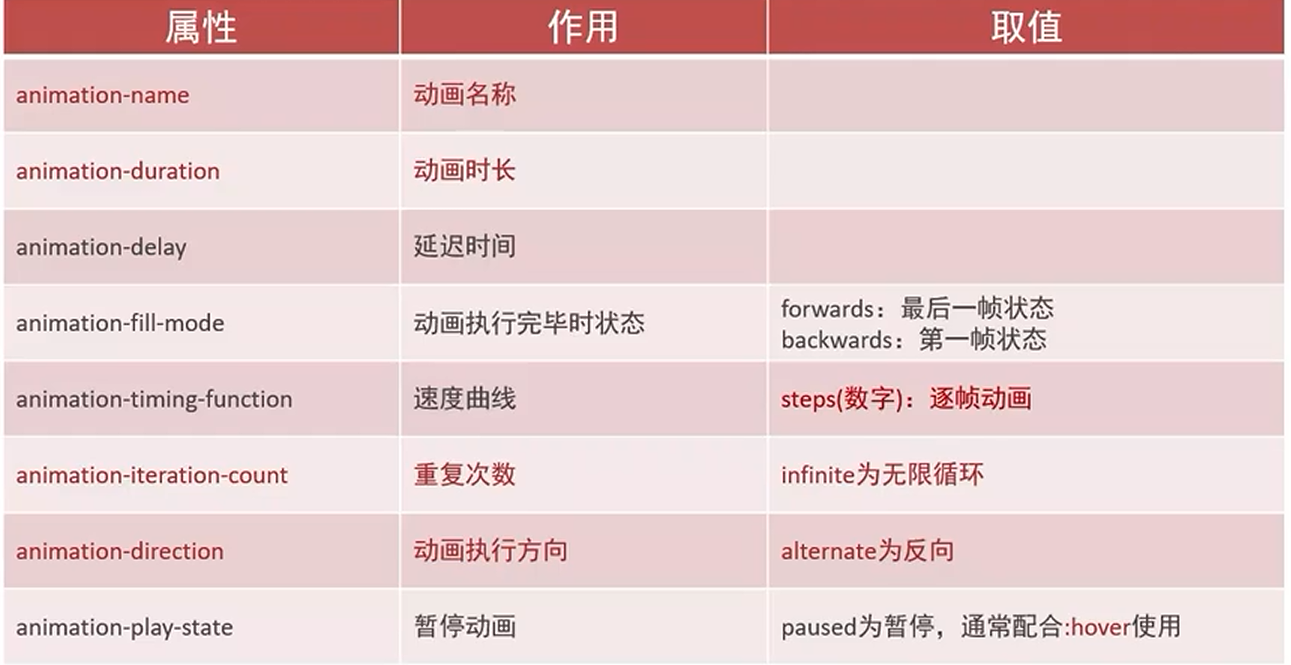
4.动画-animation
animation:动画名称 动画时长 速度曲线 延迟时间 重复次数 动画方向 执行完毕时的状态
提示:
-
动画名称和动画时长必须复制
-
取值不分先后顺序
-
如果有两个时间值,第一个时间表示动画时长,第二个表示延迟时间
速度曲线:linear 匀速 steps() 分步进行
重复播放:写一个数字表示重复几次,如果想一直播放,则需要写infinite
动画方向:alternate是反向
执行完毕:forwards是停在结束状态
拆分属性
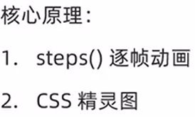
6.逐帧动画
1.属性:
animation-timing-function
2.作用:
速度曲线
3.取值:
steps(数字):逐帧动画
7.多组动画
animation:
动画1,
动画2,
动画n;
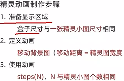
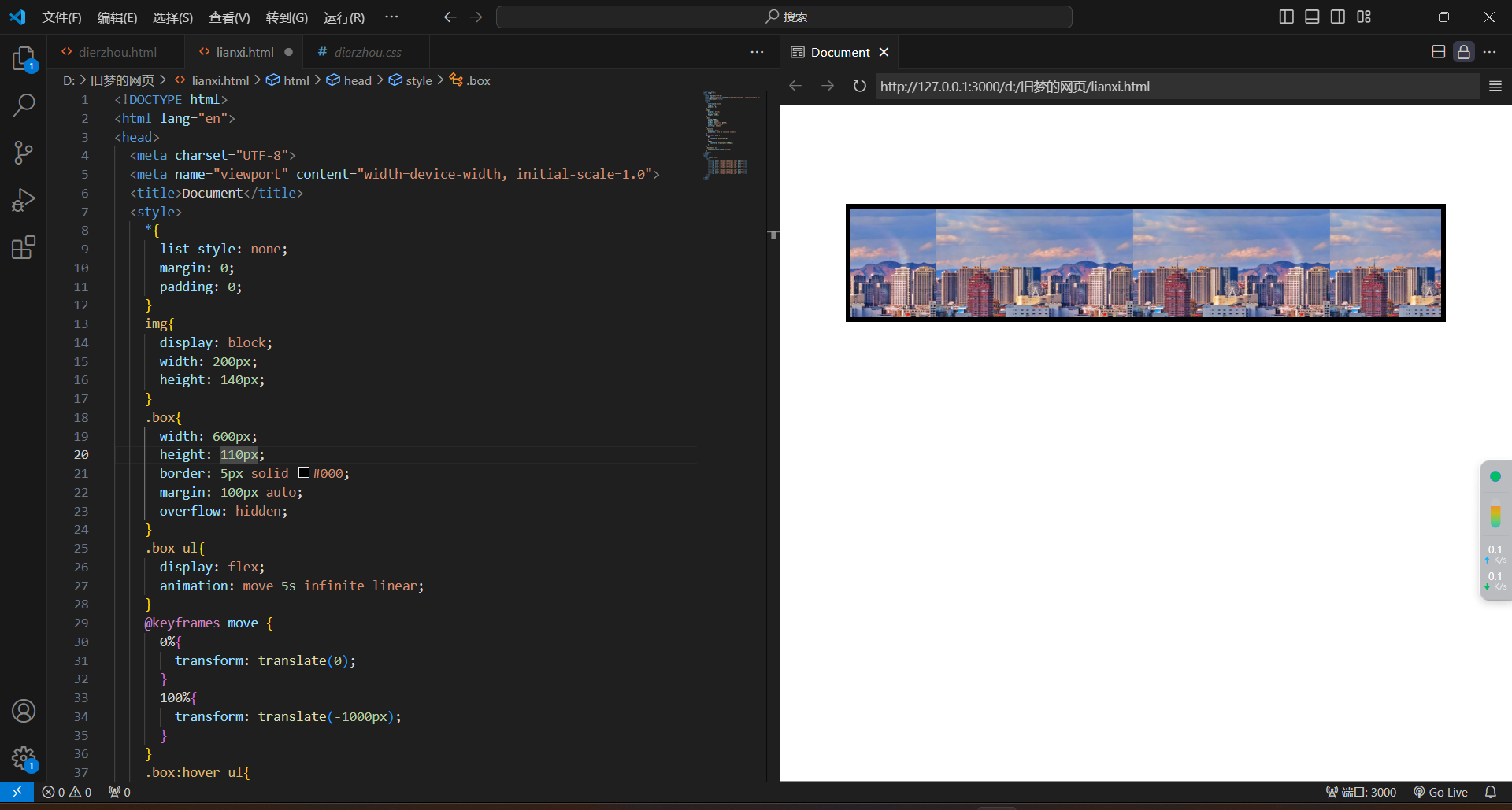
8.走马灯
<!DOCTYPE html>
<html lang="en">
<head>
  <meta charset="UTF-8">
  <meta name="viewport" content="width=device-width, initial-scale=1.0">
  <title>Document</title>
  <style>
    *{
      list-style: none;
      margin: 0;
      padding: 0;
    }
    img{
      display: block;
      width: 200px;
      height: 140px;
    }
    .box{
      width: 600px;
      height: 110px;
      border: 5px solid #000;
      margin: 100px auto;
      overflow: hidden;
    }
    .box ul{
      display: flex;
      animation: move 5s infinite linear;
    }
    @keyframes move {
      0%{
        transform: translate(0);
      }
      100%{
        transform: translate(-1000px);
      }
    }
    .box:hover ul{
      animation-play-state: paused;
    }
  </style>
</head>
<body>
  <div class="box">
    <ul>
      <li><img src="./images-chifeng/1.jpg" alt=""></li>
      <li><img src="./images-chifeng/1.jpg" alt=""></li>
      <li><img src="./images-chifeng/1.jpg" alt=""></li>
      <li><img src="./images-chifeng/1.jpg" alt=""></li>
      <li><img src="./images-chifeng/1.jpg" alt=""></li>
      <!-- 填补空白 -->
      <li><img src="./images-chifeng/1.jpg" alt=""></li>
      <li><img src="./images-chifeng/1.jpg" alt=""></li>
      <li><img src="./images-chifeng/1.jpg" alt=""></li>
    </ul>
  </div>
</body>
</html>
三、rem
1.rem简介
-
rem单位,是相对单位
-
rem单位是相对于HTML标签的字号计算结果
-
1rem=1HTML字号大小(需要先给html加字号)
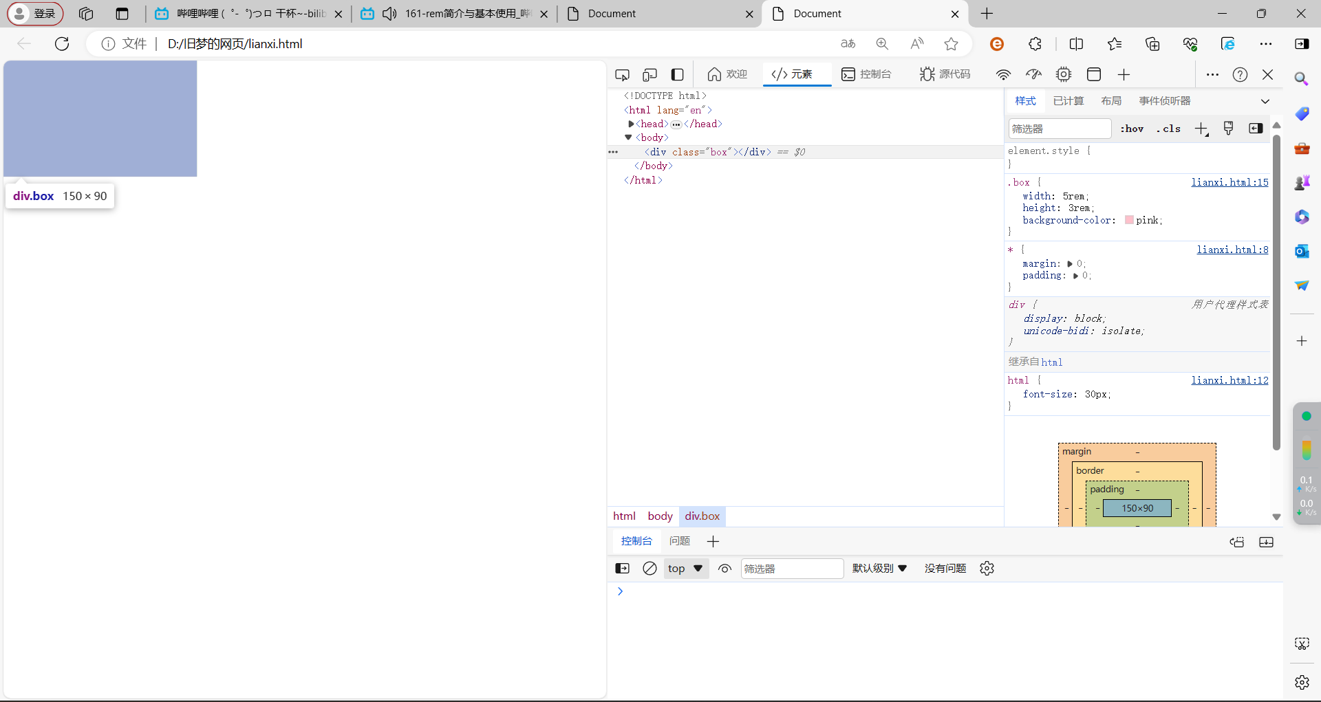
<!DOCTYPE html>
<html lang="en">
<head>
  <meta charset="UTF-8">
  <meta name="viewport" content="width=device-width, initial-scale=1.0">
  <title>Document</title>
  <style>
    *{
      margin: 0;
      padding: 0;
    }
    html{
      font-size: 30px;
    }
    .box{
      width: 5rem;
      height: 3rem;
      background-color: pink;
    }
  </style>
</head>
<body>
  <div class="box"></div>
</body>
</html>
2.rem适配
媒体查询
-
媒体查询能够检查视口的宽度,执行差异化的CSS样式
-
当某个条件成立,执行对应的CSS
属性
@media(媒体特性){
选择器{
CSS属性
}
}
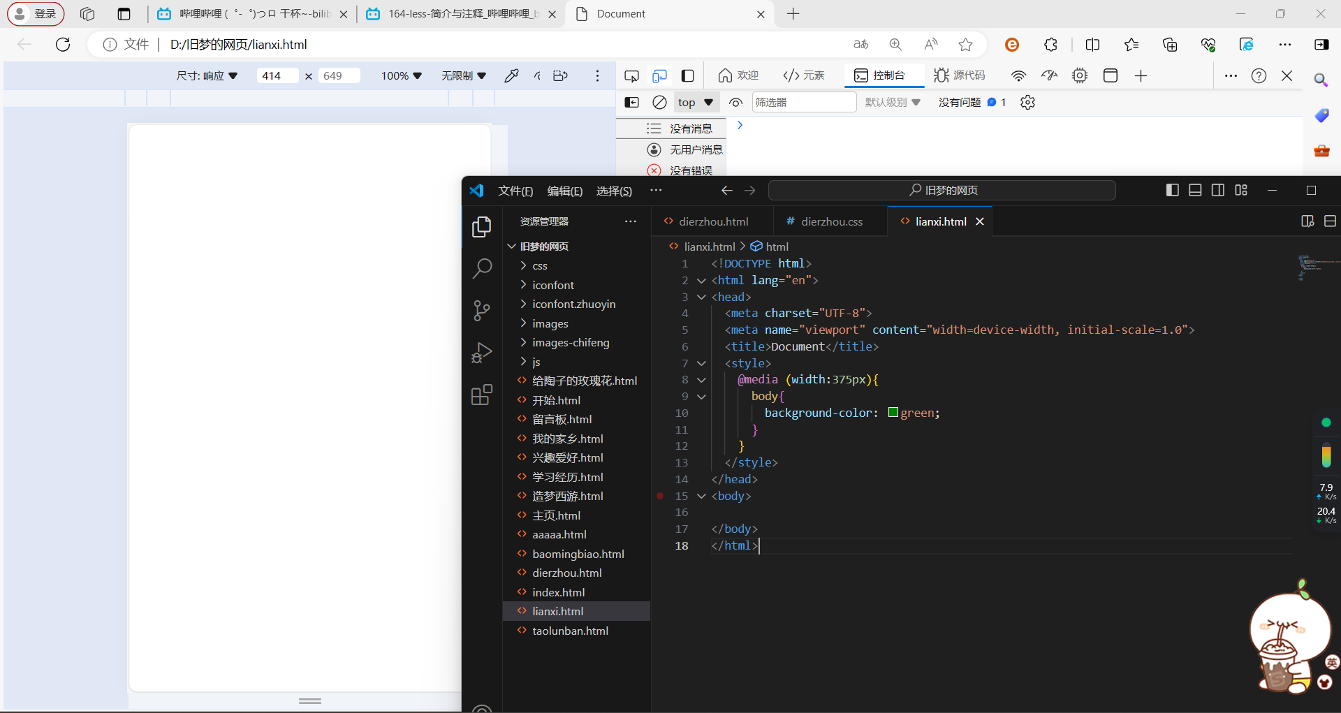
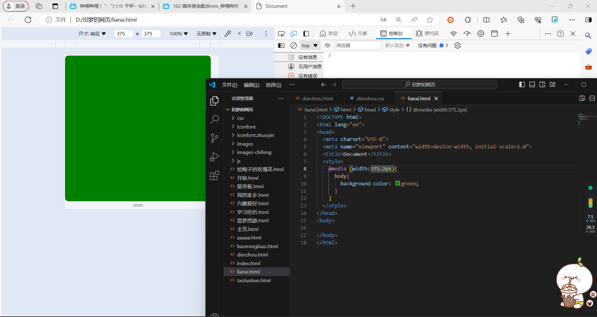
<!DOCTYPE html>
<html lang="en">
<head>
  <meta charset="UTF-8">
  <meta name="viewport" content="width=device-width, initial-scale=1.0">
  <title>Document</title>
  <style>
    @media (width:375px){
      body{
        background-color: green;
      }
    }
  </style>
</head>
<body>

</body>
</html>
3.rem-flexible.js
1.标签
`<body>
<script src="./js/flexible.js"></script>
</body>`
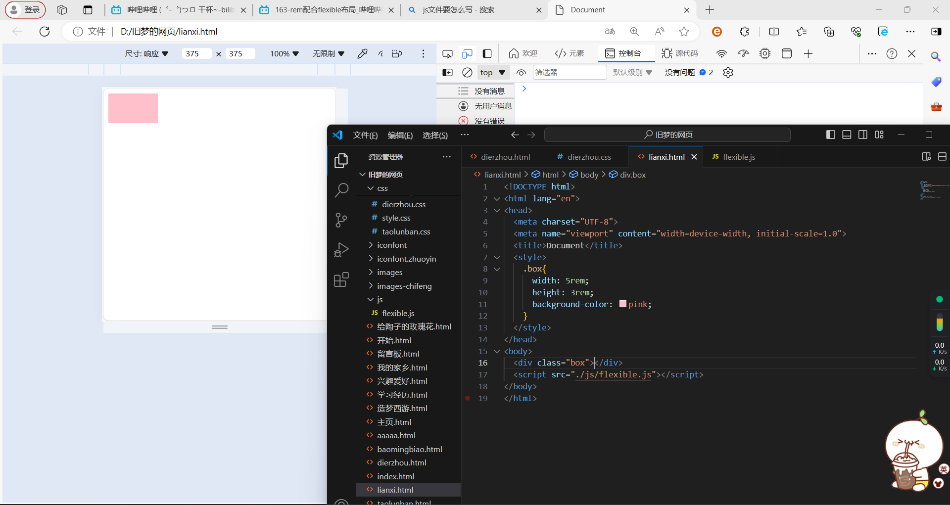
<!DOCTYPE html>
<html lang="en">
<head>
  <meta charset="UTF-8">
  <meta name="viewport" content="width=device-width, initial-scale=1.0">
  <title>Document</title>
  <style>
    .box{
      width: 5rem;
      height: 3rem;
      background-color: pink;
    }
  </style>
</head>
<body>
  <div class="box"></div>
  <script src="./js/flexible.js"></script>
</body>
</html>
4.rem-移动适配
rem单位尺寸=px单位数值/基准根字号
四、less
1.简介
-
less是一个CSS预处理器,Less文件后缀是.less。扩充了CSS语言,使CSS具备一定的逻辑性、计算能力
-
注意:浏览器不识别less代码,目前阶段网页要引入对应的CSS文件
2.less-注释
1.单行注释
语法://注释内容
快捷键:ctrl+/
2.块注释
语法:/注释内容/
快捷键:Shift+Alt+A
3.less-运算
运算:
加减乘除直接写计算表达式
除法需要添加小括号或。
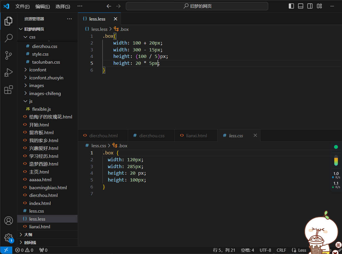
`.box{
width: 100 + 20px;
width: 300 - 15px;
height: (100 / 5)px;
height: 20 * 5px;
}`
注:如果有多个单位,则以第一个出现的单位为准
4.less-嵌套
.父级选择器{
.子级选择器{
}
}
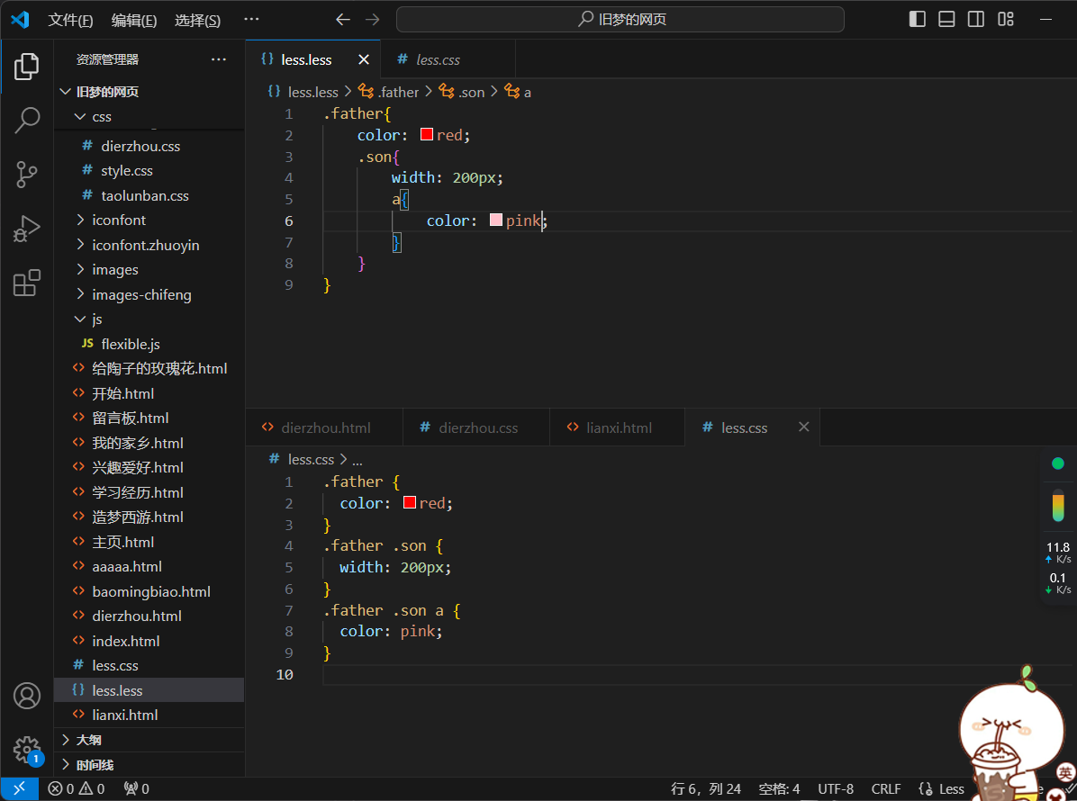
`.father{
color: red;
.son{
width: 200px;
a{
color: pink;
}
}
}`
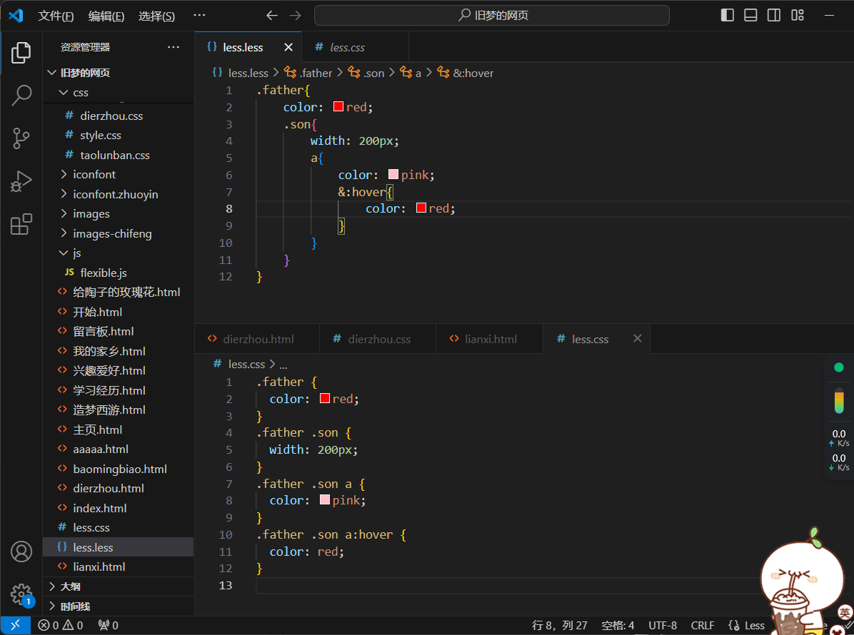
`.father{
color: red;
.son{
width: 200px;
a{
color: pink;
&:hover{
color: red;
}
}
}
}`
用&不会生成后代选择器
5.less-变量
概念:容器,存储数据
作用:存储数据,方便使用和修改
语法:
定义变量:@变量名:数据;
使用变量:CSS属性:@变量名;
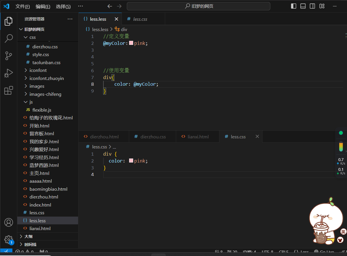
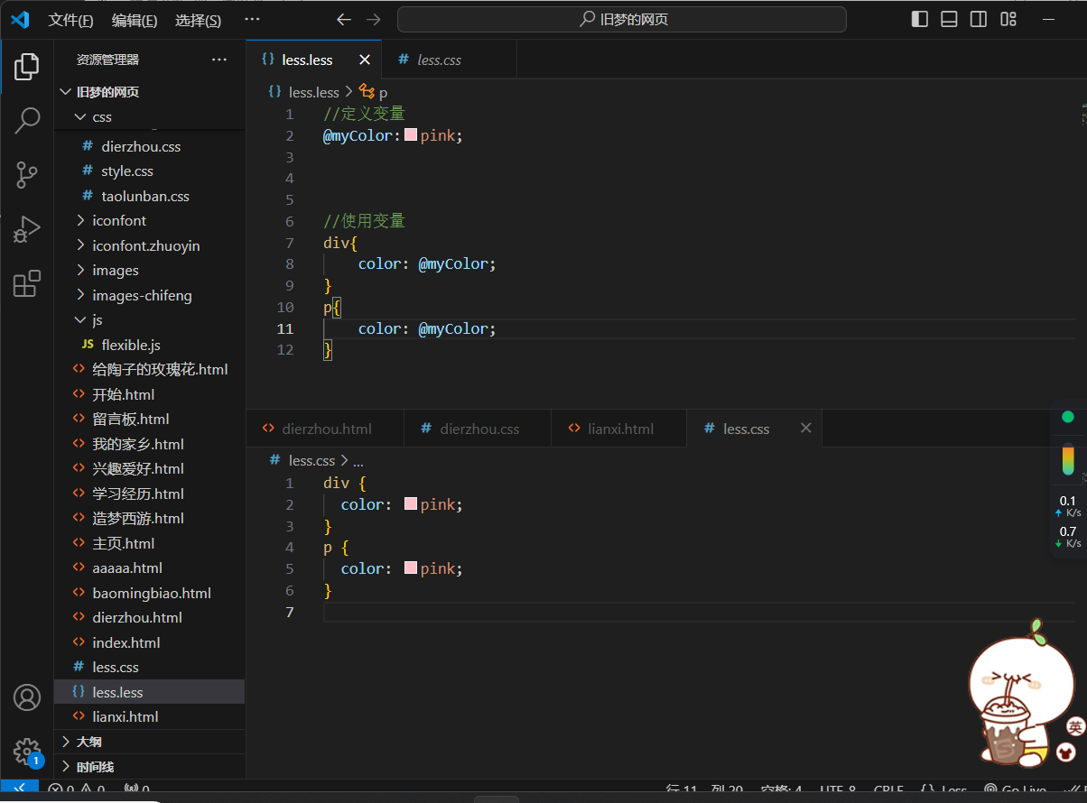
//定义变量
@myColor:pink;
//使用变量
div{
color: @myColor;
}
6.less-导入
作用:导入less公共样式文件
语法:导入:@import "文件路径";
提示:如果是less文件可以省略后缀
@import './base.less'

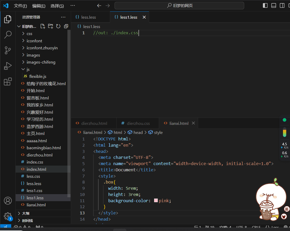
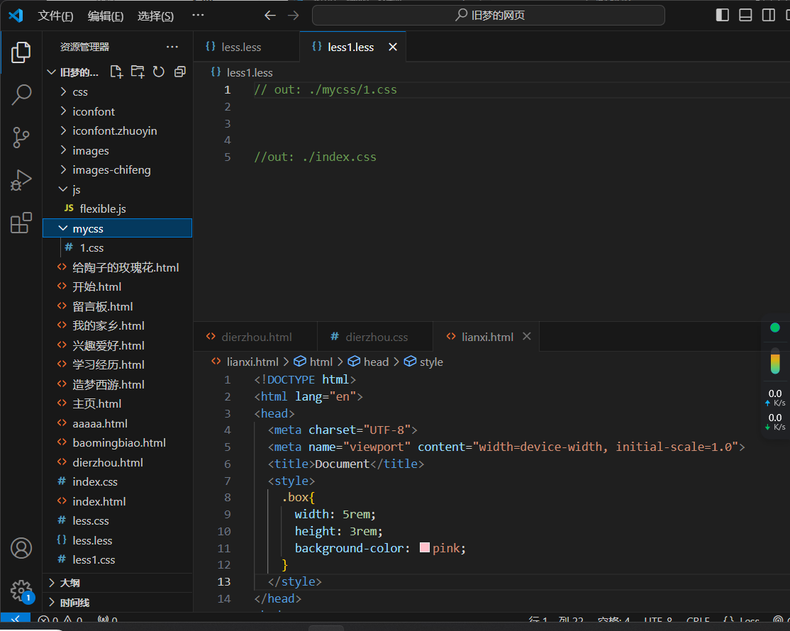
7.less-导出
写法 :在less文件的第一行添加//out:存储URL
提示:文件夹名称后面添加/
//out: ./index.css
8.less-禁止导出
写法:在less文件第一行添加://out:false
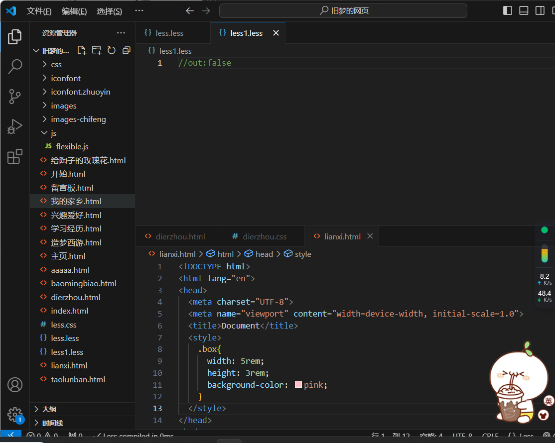
左侧并没有文件生成
五、适配方案
-
相对单位
-
相对视口的尺寸计算结果
-
vw:viewport width
-
1vw = 1 / 100视口宽度
-
vh:viewport height
-
1vh = 1 / 100视口高度
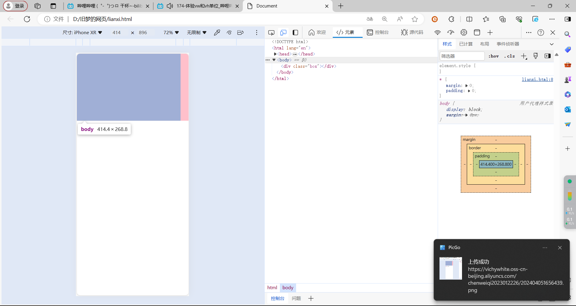
vw
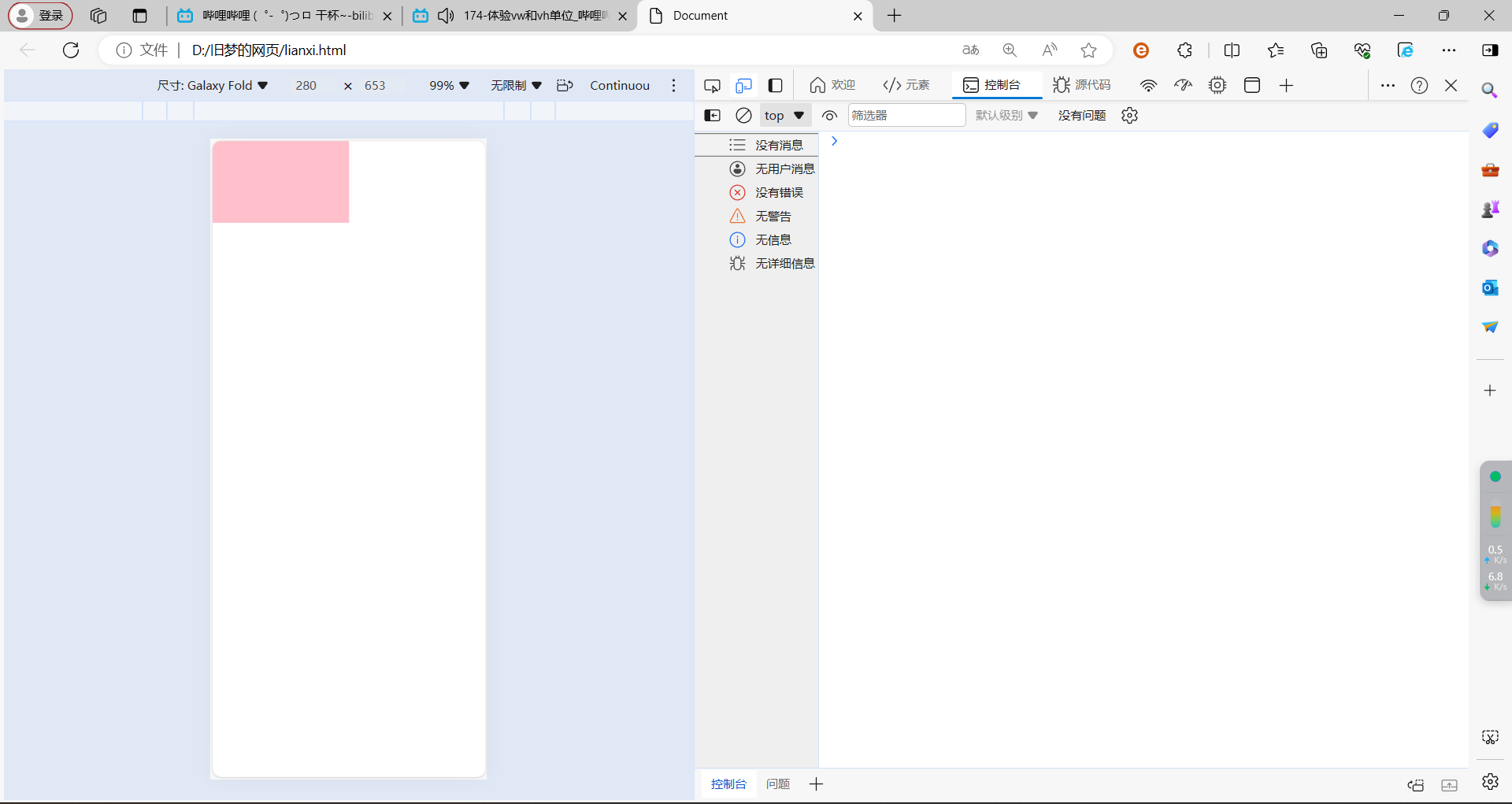
<!DOCTYPE html>
<html lang="en">
<head>
  <meta charset="UTF-8">
  <meta name="viewport" content="width=device-width, initial-scale=1.0">
  <title>Document</title>
  <style>
    *{
      margin: 0;
      padding: 0;
    }
    .box{
      width: 50vw;
      height: 30vw;
      background-color: pink;
    }
  </style>
</head>
<body>
  <div class="box"></div>

</body>
</html>
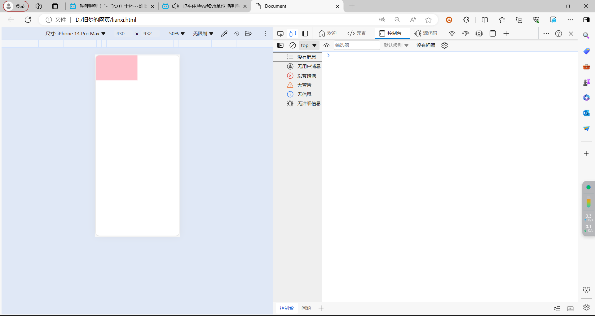
vh
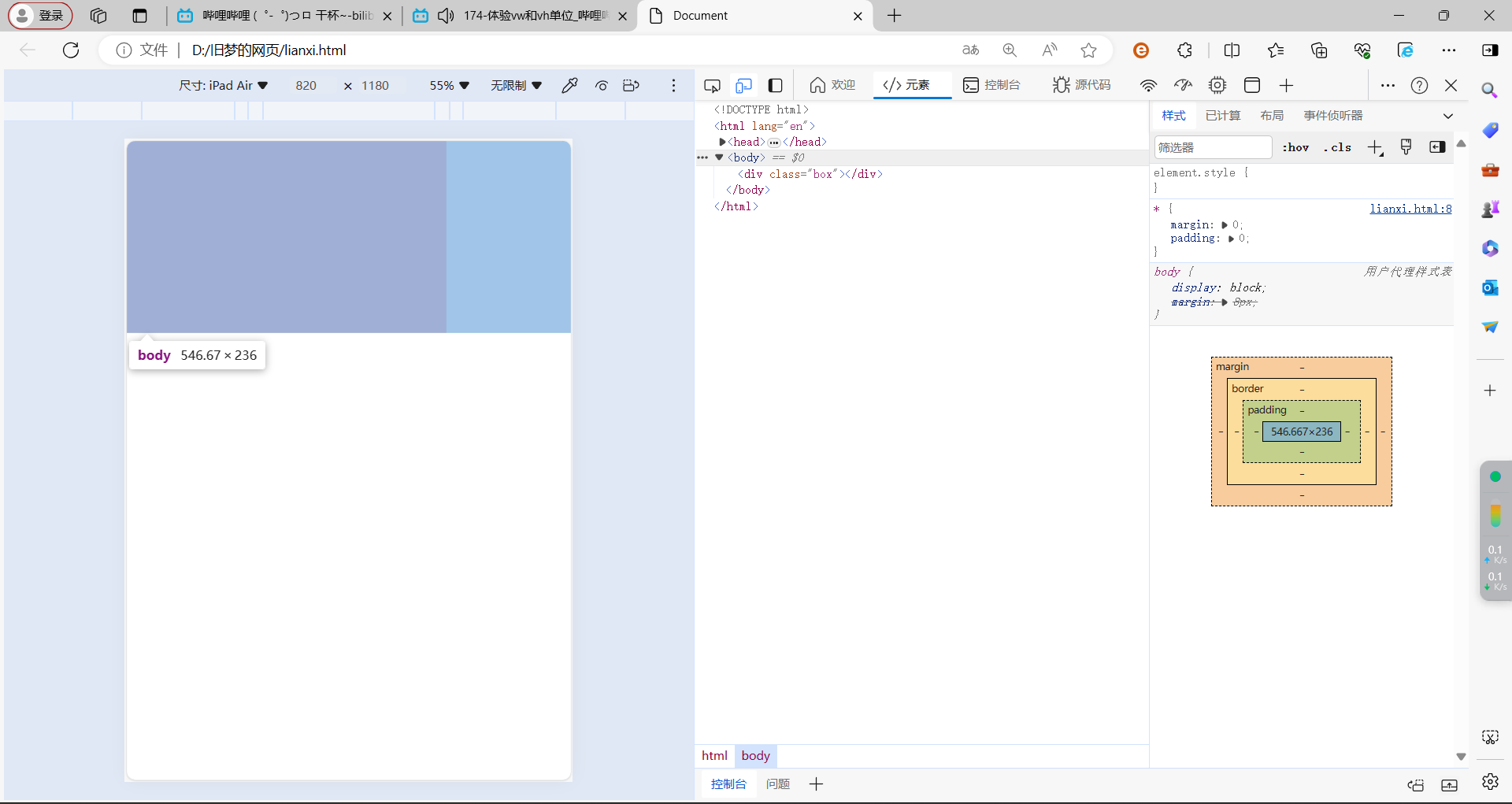
<!DOCTYPE html>
<html lang="en">
<head>
  <meta charset="UTF-8">
  <meta name="viewport" content="width=device-width, initial-scale=1.0">
  <title>Document</title>
  <style>
    *{
      margin: 0;
      padding: 0;
    }
    .box{
      width: 50vh;
      height: 30vh;
      background-color: pink;
    }
  </style>
</head>
<body>
  <div class="box"></div>

</body>
</html>

