
热门标签
当前位置: article > 正文
学习笔记:python数据可视化之气温折线图_python每5秒获取一个温度传感器的值,并绘制出数据折现图
作者:我家小花儿 | 2024-06-12 22:15:54
赞
踩
python每5秒获取一个温度传感器的值,并绘制出数据折现图
python可视化学习笔记,代码在下面。
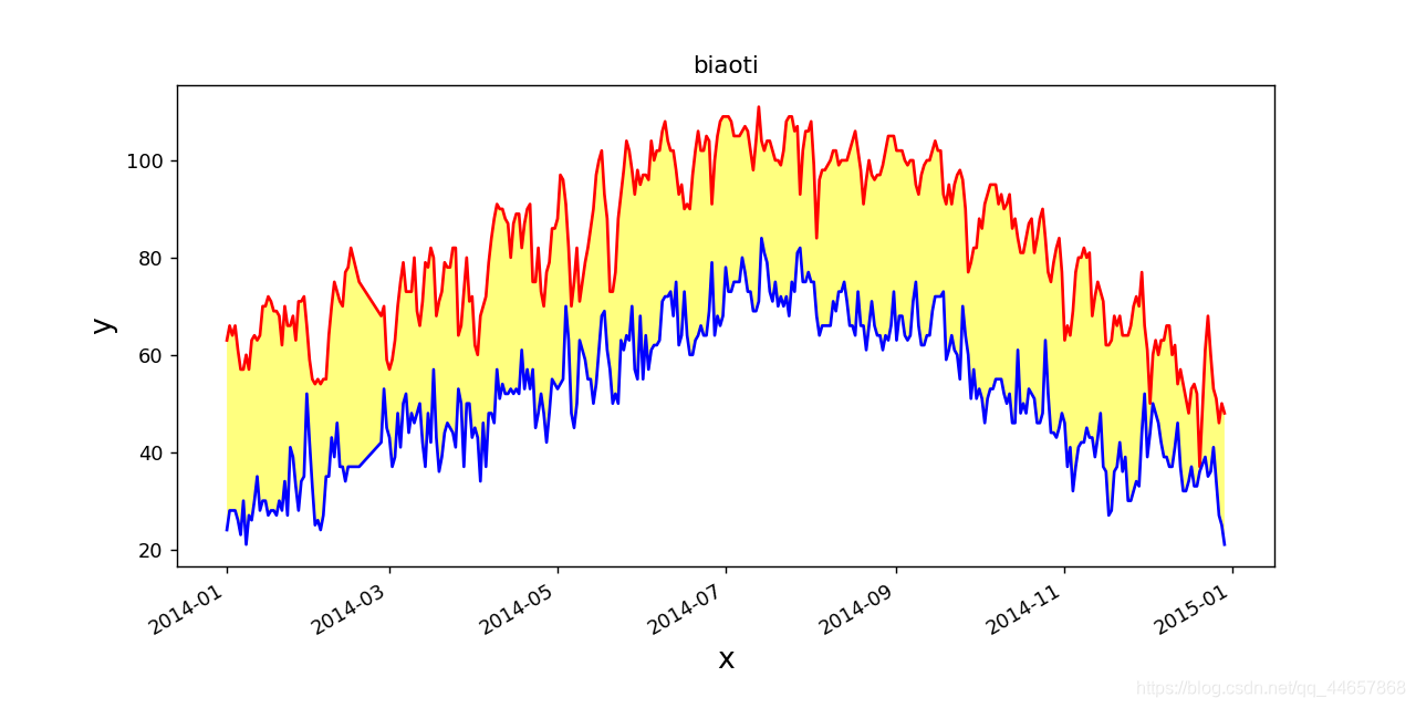
import csv
from matplotlib import pyplot as plt
from datetime import datetime


filename="death_valley_2014.csv"

#从文件中获取日期和最高气温
with open(filename) as f:
    reader = csv.reader(f)

    #读取第一行数据
    header_row=next(reader)


    #每一行为一个列表,读取每个列表的第二个元素
    dates,highs,lows=[],[],[]
    for row in reader:
        try:
            current_date=datetime.strptime(row[0],'%Y-%m-%d')
            high=int(row[1])
            low=int(row[3])
        except:
            print('未知错误')
        else:
            lows.append(low)
            dates.append(current_date)
            highs.append(high)

#设置分辨率跟窗口区域大小
fig=plt.figure(dpi=128,figsize=(10,5))

#将列表传给plot,alpha表示透明度(0-1)
plt.plot(dates,highs,c='red')
plt.plot(dates,lows,c='blue')
plt.fill_between(dates,highs,lows,facecolor='yellow',alpha=0.5)

#设置图表的格式
plt.title('biaoti')
plt.xlabel('x',fontsize=15)

#倾斜的
fig.autofmt_xdate()

plt.ylabel('y',fontsize=15)
plt.tick_params(axis='both',labelsize=10)

#显示图表
plt.show()

- 1
- 2
- 3
- 4
- 5
- 6
- 7
- 8
- 9
- 10
- 11
- 12
- 13
- 14
- 15
- 16
- 17
- 18
- 19
- 20
- 21
- 22
- 23
- 24
- 25
- 26
- 27
- 28
- 29
- 30
- 31
- 32
- 33
- 34
- 35
- 36
- 37
- 38
- 39
- 40
- 41
- 42
- 43
- 44
- 45
- 46
- 47
- 48
- 49
- 50
总结
- csv库用来打开.csv文件
- matplotlib中使用pyplot做折线图
- datetime将字符格式的日期转换为日期型
声明:本文内容由网友自发贡献,不代表【wpsshop博客】立场,版权归原作者所有,本站不承担相应法律责任。如您发现有侵权的内容,请联系我们。转载请注明出处:https://www.wpsshop.cn/w/我家小花儿/article/detail/709850
推荐阅读

相关标签

